“The UX of publishing for tablets and smartphones” - Martin Belam at #TAS12
This is an essay version of a talk I gave at the Tablet & App Summit at the World Publishing Expo in Frankfurt, October 2012.
For nearly all of my adult digital life, people have been telling me that next year is going to be the big breakthrough year for the mobile web. One year I got so excited about this that I even taught myself WML - a mark-up language somewhere between HTML and 1960s computer punch-cards. I thought I was going to be the most employable developer in town.
And what did I do with my exciting new skills? I made my own personalised BBC mobile homepage.
I worked for the BBC at the time, but on my Sony Ericsson T-610 it took ages to navigate through the real mobile site to the sections I knew I wanted to read. I wrote a script that took RSS feeds from some BBC Sport sections I was interested in, and then published the headlines and links out as a WML page. Data cost money, and bandwidth was low, so having a simple overview of the news I wanted to see as I headed off to work in the morning was an attractive proposition. I was in a hurry. I was on a bus. I only wanted to scan headlines and snack on information. I was a walking talking mobile use case cliché
This was in June 2004, and the Olympics were being held in Athens. This is so long ago that, in those days, the IOC asked that you send a fax to their lawyers requesting permission before you linked to their website. The award of the 2012 Olympic Games to London was still a year away. By the time they came around this year, it felt like we had finally reached a significant tipping point with mobile. After the Games finished, new media chief for London 2012 Alex Balfour published an analysis of usage of london2012.com during the event. One very telling statistic was that 60% of visits to the site during the course of the Olympics were from a mobile or tablet device.
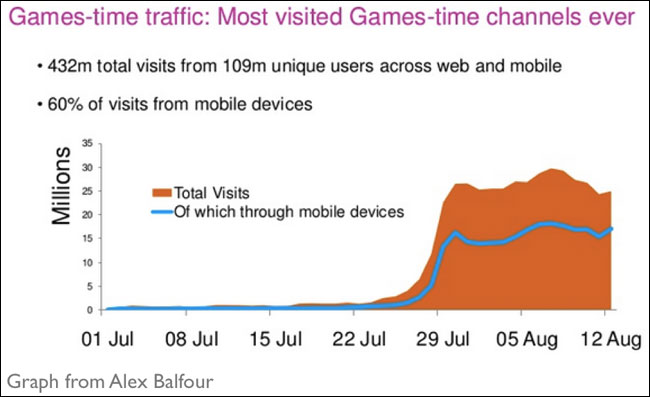
A graph from Alex Balfour’s presentation showing 60% of Olympic website visitors were on mobile devices.
The fact is that people love their touchscreen devices. I’ve seen a survey suggesting that most Europeans are never more than a metre from their phones — i.e. they carry them around with them all day, then put them down beside them at their bedside when they sleep. You know, in case they need to check their text messages at 4am. And we are now conditioned to expect touch. I keep making myself look ridiculous trying to buy tickets on various European urban transport systems by resolutely stabbing my fingers at some screen whilst ignoring the perfectly obvious buttons located next to it.
Touchscreen apps at the Guardian
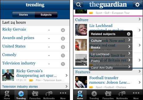
Over the course of my time at the Guardian I worked on several apps aimed at touchscreen devices, including the first Guardian iPhone app. A small team worked hard to bring a version of the Guardian to the phone that felt more naturally designed for the device, and to give a better user experience than the standard free mobile site. The app originally had a one-off download charge. Prior to launch, a lot of the wisdom in the market was that you couldn’t charge for general purpose news apps — and you certainly couldn’t charge for them if all of the content was available for free via the web browser on the same phone.
That “wisdom” was wrong, and the app was a success, to the extent that when we were running user testing sessions prior to developing version two, our own users were telling us that it was too cheap, and that they would have happily paid a subscription. User testing was an important part of ensuring that the product met the needs of users, and that the design and functionality are easily understood.
The Guardian iPhone app
I also worked on testing for the Guardian iPad edition. I think it is a beautifully designed reading experience on the device, but that doesn’t seem to have translated to mass take-up of the app. User testing prior to release showed up some flaws in the product proposition for the early adopter techie crowd — at the time of launch I described the testing on this blog as “showing a family saloon to some boy racers. They would grudgingly admit that it had four wheels and got you from A to B, but they weren’t excited about it, and didn’t find it digital enough.”
On that occasion, the business opted to take small details from the user testing sessions — for example adding tiny chevrons on every article to indicate that you can swipe from left to right — but not to fundamentally alter the static edition-based premise of the Guardian on iPad that many users were finding unsatisfactory.
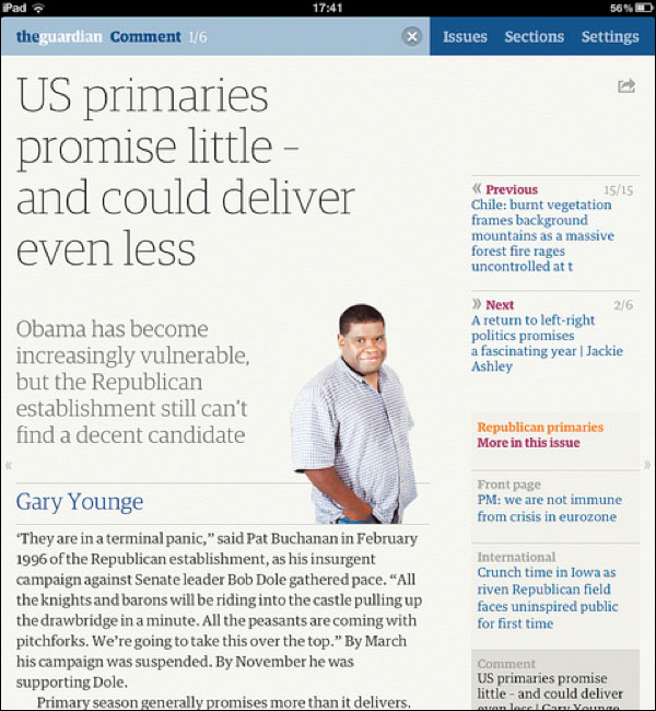
The Guardian iPad app features little chevrons to indicate where the user can swipe
We need to really understand our users, not just second-guess them. If you’ve never had the opportunity to observe a user testing session, I urge you to do so. Watching someone struggle to use the simplest of products you’ve had a hand in building reminds you that perfectly formed designs don’t just fall out of your head.
And people aren’t always running for buses or sitting on trains when using their smartphones or tablets. The idea that because a device is mobile it is always used in a mobile context is a fallacy. At Google, Hendrik Müller, Jennifer Gove and John Webb recently published a research paper describing a study into tablet usage in the US. They did a combination of “diary study, interview, and observational methods” with 33 participants, who were chosen to align to the general demographics of tablet ownership in the US.
One of the most interesting findings is the verification that tablets are overwhelmingly used in the house, with the couch and the bed being the two most popular locations. The most popular activities by far are checking email, playing games, checking social networks and looking for information.
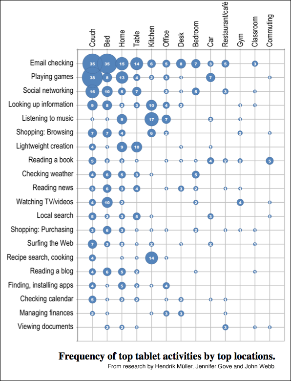
A diagram from the research by Müller, Gove and Webb, showing the activity and location of use recorded by participants in the study.
“Reading the news” was done on the tablet by around 45% of users:
“Participants primarily used native apps (e.g., Slate, Wall Street Journal, Fox News) and aggregators (e.g., Flipboard, Pulse) to access news content, though several reported using the browser to surf across favorite news sites (e.g., CNN, NYTimes, and local news providers).”
Notably, less instances of “Reading the news” were reported than instances of “light content creation” — which given the presumption that tablets are a lean-back consumption device struck me as slightly unexpected.
Patterns of usage change during the week:
“Weekdays showed more frequent email checking, managing of calendars, and checking the weather, but also included longer activities such as listening to music or social networking; however, activities such as watching videos, playing games, reading, and shopping were more frequently done on weekends.”
Users are also frequently doing something else at the same time as using their tablet device:
“41% [of uses of tablets reported in the study] showed partial engagement. Note that this number is to be considered as a lower bound as it is possible that participants under-reported or forgot to explain those activities they were engaged in outside their tablet use. The most frequently reported non-tablet activities that participants were doing at the same time they were using their tablet were: Watching TV, eating or drinking, cooking, waiting somewhere, getting dressed, talking with others, and exercising, among others.”
Do one thing, and do it well
If users are trying to do two things at once, then the chances are that are not concentrating fully on either, which tends to suggest apps need a simplicity at their heart. In fact, I’ll bet that the apps you use most on your phone or tablet do one thing, and do it very well.
What do I mean by doing one thing only? Well, consider Microsoft Outlook on the desktop. It sends and receives emails. It manages your contacts and address book. It does meeting requests and calendar management. It has a task list functionality. And a very cluttered UI.
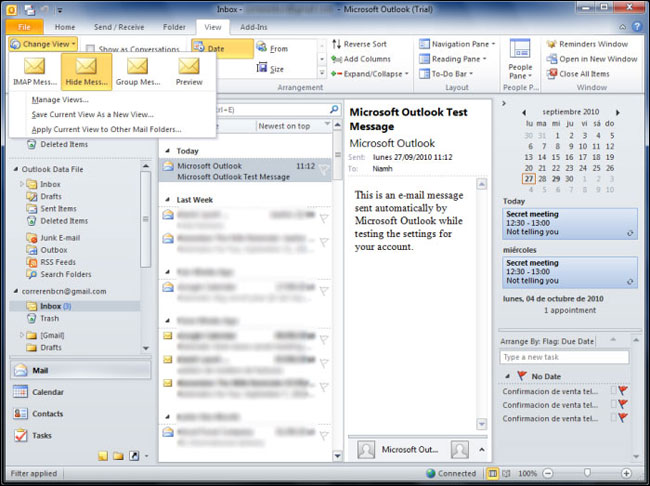
Microsoft Outlook 2010 can look very cluttered on the desktop
Contrast this with Apple’s approach to similar features in iOS.
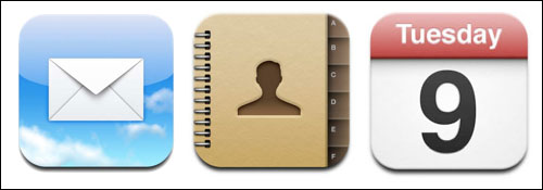
Mail, Calendar and Contact management are in separate apps. The user chooses up front which aspect of their life they want to manage or edit, and so the small screen device is able to present a UI entirely attuned to what the user is trying to do at that moment. Not a route to everything they might possibly want to do that the device or software is capable of.
Yet often publishers want apps that showcase the breadth and depth of everything that they do. At the Guardian it was sometimes possible to develop very simple apps. With the pressure of getting it ready in time for the launch of the original iPad, the Eyewitness app showed off beautiful photography beautifully. The original incarnation simply gave you one brilliant new photograph every day, with sponsorship as the business model.
It wasn’t always this focussed though. The beta version of a Guardian app built for Google TV devices ended up featuring lots of different content types, even though TV as a medium would typically have suggested video and photo galleries should be the priority. In fact valuable development and design time was spent on formatting text articles for the TV, when in reality, the chances seem slim that an early adopter of internet-enabled television would not also have a more convenient device to hand to read the news.
How do you apply this thinking to your products? Ruthlessly prioritise your use cases, and find ways to put users onto these simplified paths as soon as possible.
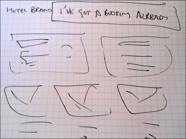
One of the exercises in my “Responsive IA” workshop typically looks at hotel websites. They need to support a complex array of use cases — researching a trip, booking a room, getting to a venue, selling the hotel as a venue for conferences and weddings etc. But it strikes me that there is one key pivot point amongst those multiple audiences, namely “Do you already have a booking with this hotel or not?” If I was designing a hotel website for small screen devices, the first thing I’d test would be whether having a big button that takes users with existing bookings off to a whole separate information architecture that supports their needs worked.
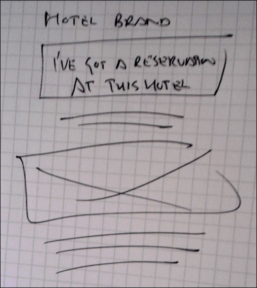
A sketch of trying to split the user journey at the earliest opportunity on a hotel website
And if making that journey easier works for the smallest screen, why wouldn’t you use the same approach on tablets and desktop machines too?
Should that design translate back to the big screen version?
The challenge of “responsive design”
The trend towards responsive design in digital services presents some big workflow challenges for both publishers and designers.
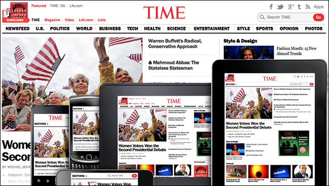
Time’s responsive redesign shown on several devices
AppendTo() did a lot of the build work for Time’s recent foray into responsive design. When publishing their corporate case study of the process, one of the key difficulties they highlighted was dealing with advertising.
“The ads had the most restrictions and required the highest level of functionality on the site redesign. The ads themselves would remain at fixed sizes, but the page would need to load the correct ad for the device type (mobile, tablet, desktop) as well as one that fitted in the available size. When orientation changes occur (users rotate their mobile devices or tablets) or the browser window width changed, some of the ads that fit previously would no longer fit on the page without breaking the layout.”
If I can get away with it, I’ve been tending to design the minimum number of screen possible. This isn’t just a case of being lazy. It strikes me that we didn’t used to make different design deliverables for people on tiny monitors or on large monitors, so you should only be making designs for the sizes where things actually need to vary. In that AppendTo() case study, they mention Time supplying them with over 200 Photoshop files of how the redesign was destined to look. That sounds like an absolute nightmare. They stressed that the only way they made the project work was because Time gave them permission to make local decisions every time they had to vary from the comps, without having to refer back to the Time design team.
We need to change the way we work though. If you make 200 photoshop illustrations, all you’ve done is draw some pictures. You haven’t written a single line of code that will get you to the end of a project any faster. Obviously you need to use the right tools for the job, and code isn’t the right medium to do all of your design work in, but rapid prototyping feels like it is going to be the only sustainable way to produce responsive designs on a grand scale.
The still below is from a video about the Boston Globe’s responsive redesign, and it shows their testing rig — lots and lots of devices with varying screen sizes, stuck to the wall in various orientations, all set up to show exactly the same page from the site at the same time. With this kind of test bench, and designing in code, you can immediately see the effect of changes across multiple devices and breakpoints in a way that would take hours to replicate in InDesign or Illustrator or Photoshop.
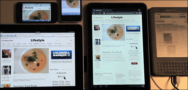
The Boston Globe’s testing rig for their responsive design
Don’t forget production staff
You shouldn’t forget your content production staff either. We talk about end users loving their touchscreen devices, phones and tablets, but so do the staff at publishing houses. At the Guardian I always used to argue that from a standing start I could beat any journalist in publishing to the web. Whilst I was using the Tumblr app on my iPhone, they’d be struggling with their laptop, VPN and authenticating through the remote version of the CMS. Now speed isn’t everything — accuracy is one of the ways that news organisations can distinguish themselves from the herd — but sometimes it is. In fact, for fashion shows, we ended up equipping the journalists with phones and Tumblr, and built a system to republish the Tumblr content on guardian.co.uk. If your staff are consistently getting a great, flexible, mobile user experience from the tools they use to publish in their spare time, a clunky desktop-bound enterprise CMS is going to look increasingly outdated to them.
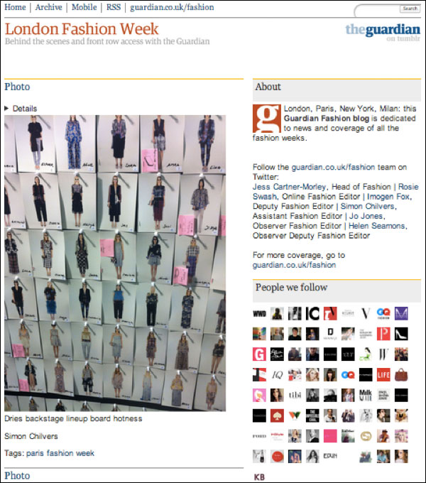
The Guardian’s Fashion Tumblr circumvents CMS limitations.
Know your devices
You really need to know your devices as well. Managers who are addicted to their BlackBerrys and designers who idolise Apple are not in the best position to judge whether something feels native on an Android device or Windows tablet. When working on projects for different platforms, I always tried to use one of the devices as my main phone for a few weeks, to really get a feel for how it operates. Little details like the placement of search icons or how social media sharing is integrated vary from platform to platform, and you want the audience to feel like your app or service has been built for them and for their device.
People talk about wanting to get a consistent user experience across a portfolio of apps and services. The user, in most cases, is likely to only use one or two of those platforms. The overlap between people owning iOS, Android and Windows Phones has got to be small. The much more important consistent user experience for the customer is that all the apps on their phone or tablet behave in the way they would expect them to on that device.
Look beyond your traditional competitors
In the news and media industry we still tend to compare ourselves to our narrow historical competitor set. Nowhere is this more apparent than in the UK’s ABCe figures which audit “newspaper” website figures. It provides a league table of websites owned by people who also own printing presses, not a league table of news sites. Major players in the online news market like the BBC and Sky News aren’t represented, not are destinations like MSN and Yahoo!. Despite being considered unsexy, and not particularly known for being news providers, their news services rack up millions and millions of page views.
Writing for TechPresident, David Eaves recently spoke about his frustration when government online services are compared to each other:
“The problem is, Singapore and Canada, or the United States, or the UK for that matter, are not competitors when delivering online experiences to their citizens. Canadians don't compare the (terrible) online experience they get with the government to that of Singapore, or Sweden. Rather they compare their experience to Facebook, to HipMunk, to Gmail and Flickr. All the Accenture report did was take a group of laggards who generally deliver a crappy online experience, lump them together and rank them. Rather than tell governments their online performance was in crisis, it reassured them that all was well.”
As an industry, this is what we do to ourselves when we declare “newspaper” websites to be something distinct and apart from the rest of the news sources on the web, or when we only judge the user experience of our tablet apps by comparing them to other magazines or publishers.
You probably don’t need a “mobile strategy” or “tablet strategy”
There is a recurring internet meme of Russian Reversal jokes. You know the kind, based on Yakov Smirnoff’s comedy routines from the 1980s: — “In America, you can always find a party. In Soviet Russia, Party always find you!” or “In America, you listen to man on radio. In Soviet Russia, man on radio listen to you!”
I think a kind of reversal is happening to our industry.
You might be sitting around debating whether your business needs to have a “mobile strategy” or a “tablet strategy”. You might be pondering whether you should declare that you are “digital first” or “mobile first”. You might be worrying about competitors who are pure digital plays without any of the legacy costs of owning a print operation
You can debate all these things for as long as you want, but your audience has already chosen for you.
They’ve already gone “mobile first”.
You probably need to start playing catch up.
The original slides for this presentation featured three photos of elementary students using iPads at school to do amazing projects, taken by Lexie Flickinger, and re-used via Flickr and a Creative Commons Licence. [1, 2, 3]
Please note, this essay incorporates elements of previous blog posts from currybetdotnet and articles for the Guardian, including “Responsive IA: IA in the touchscreen era”, “Designing products with mobile users at the core”, “New digital divides”, “Better contextual mobile testing, and barriers to adopting usability”, “The second screen experience: mobiles, tablets and TVs”, “Mobile powers Olympic content revolution” and “Digital news is heading for a mobile future”
This is one of a series of blog posts about the WAN-IFRA Tablet & App Summit at the World Publishing Expo in Frankfurt. You can download all of my notes from the day in a free ebook for iBooks, for Kindle or as a PDF.
“The UX of publishing for tablets and smartphones” - Martin Belam
“Taking Stern magazine to the iPad” - David Heimburger
“Condé Nast place value in digital reach over digital sales” - Jamie Jouning & Jamie Bell
“Behind the curve - the media and the new App economy” - Stijn Schuermans
“Brazil’s newspapers close ranks against Google and Apple” - Caio Túlio Costa
“Launching ePresse to challenge Apple and Amazon in France” - Philippe Jannet
“Optimising the FT using HTML5 and customer data” - Stephen Pinches
“Windows 8: Opportunities for publishers” - Frank Wolfram & Johan Mortelmans
“Toronto Star’s Ad Lab for digital advertising innovation” - Kate Collins