“Responsive IA: IA in the touchscreen era” - Martin Belam at EuroIA
This is a version of the talk I gave at EuroIA 2012 in Rome
I thought I’d start with Punch and Judy. It is appropriate to Rome, as Punch’s origins are in Italy.
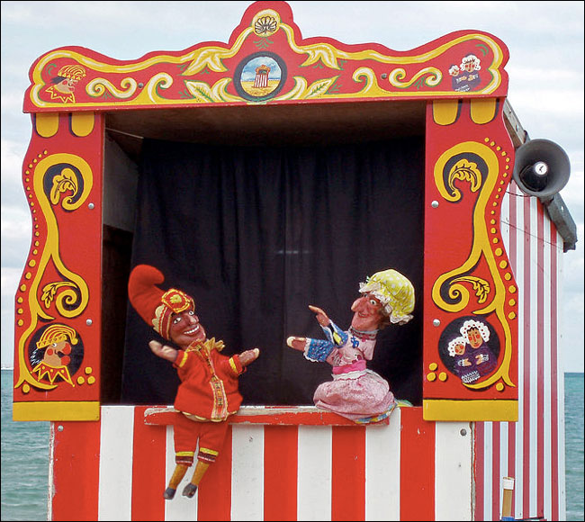
Punch & Judy on the British seaside.
Essentially a puppet show for children, in the UK Punch is a weird mixture of hero and anti-hero. He beats his wife, throws the baby down the stairs, gets arrested, escapes jail, then in an inexplicable plot twist he saves some sausages from a crocodile. Finally the devil comes to drag him to hell, and the audience are encouraged to be on Punch’s side. To me: a horrifying mix of domestic abuse and religious imagery. To my daughter: the best fun ever. She absolutely loved the first Punch and Judy show she saw, and pestered me for days “Daddy! Daddy! Do a muppet show! Do Punch and Judy!”
Being a geek, I naturally immediately wondered if there was an app for that. And of course there is a Punch and Judy app in the iTunes store, with listings of shows from a particular festival, image galleries and a history of Punch. Exactly what I wanted, so I downloaded it. The first thing it did was ask for my location. I didn’t know the app, or the makers, or what it wanted to do with the location, so I said no. I got to the app’s home screen, and tapped on the “History” navigation. Uh-oh, a dialogue box “You have to let this app know your location”. The same with anything else I tried to access. So, reluctantly, I thought “Oh well, I’ll give it permission”
I could not find a way to do so.
Tapping every single tappable thing in the app just bought up the dialogue box. I couldn’t believe they’d developed an app with no return path from initially saying no to location data, or that Apple had let that through the app store review process. So I tried the app listing in the general settings of the phone. I tapped everything that looked even remotely tappable. Eventually I gave up.
And I took it personally.
Why?
Because touchscreen devices are personal.
Because to be tactile is to be human.
Because I’d wanted to share it with my daughter, and rekindle the magical smile on her face when she was watching Punch and Judy for the first time.
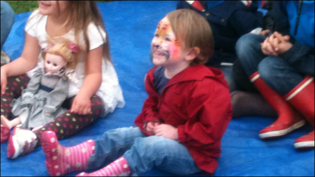
My daughter watching Punch and Judy for the very first time.
We are incredibly attached to our touchscreen devices. I read a survey once [which I can’t now find to cite the exact figure] that said something like 90% of Europeans are always within a metre of their mobile phone, i.e. they carry it with them all day, and then pop it on their bedside at night. And people use them all the time, to do all sorts of things. It isn’t all about running for the bus.
OK, sometimes it is about running for the bus.
It feels like for all of my adult life people have been promising that next year will be the breakthrough year for mobile. I got really excited the first time I heard this. Which was probably 2002. I even taught myself WML so I could start building my own mini-pages for the mini-web I could now get on my phone. I wrote a script that scraped BBC RSS feeds to deliver a personalised headline feed. Because I wanted to snack on the news whilst running for a bus - I was a walking mobile use case cliché.
Now we are just as likely to be using our phone at home, precisely because it is in our pocket all the time, rather then the desktop computer over across the room. Amy Buckner and Pamela Walshe gave a talk at UPA in Atlanta about how Wells Fargo got people to take pictures of where they used their mobile banking application - and discovered that a significant proportion of them were within reach of a computer where they could have opted to use a more fully featured desktop version.
People love their touchscreen and mobile devices, and the statistics from the London 2012 Olympics suggest we really have finally reached a place where mobile is “the next big thing” According to a fantastic set of slides published by the head of new media for the Games in London Alex Balfour, 60% of people who visited london2012.com during the Olympics did so from a mobile device. They can’t all have been running for buses.
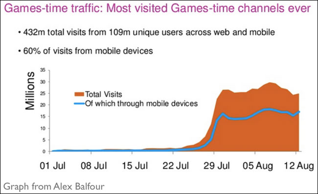
A graph from Alex Balfour’s presentation showing 60% of Olympic website visitors were on mobile devices.
And now we expect touch everywhere. My daughter expects to be able to pinch and zoom photos on any device, because she has seen it work on the iPhone. And I never looked more like a tourist in Rome for my EuroIA visit than when I was repeatedly jabbing my fat English fingers at the screen of the Metro ticket machine, oblivious to the ATM-style buttons set beside it.

I spent a long time looking like an idiot in front of one of these machines.
These devices worry publishers. They have introduced a whole new set of intermediaries in the market, not just in the form of telcos or app ecosystems like iTunes or Google Play, but in allowing organisations like the IOC or the British Olympic Team to reach consumers directly on a device that is always on, and always in their pocket. People fiddle with their phones whilst consuming other media, diminishing the already scare amount of attention they have available for traditional publishers and broadcasters. Most successful apps do one thing, and do it really well, but publishers often can’t resist the temptation to try and provide mobile, small screen and touchscreen services that showcase the breadth of what they do - leading to cluttered and difficult interfaces, and products that lack consumer appeal.
Responsive has changed the way I work.
Working on projects that require responsive design to target the small screen has changed some of the ways I’ve worked over the last couple of years, and I wanted to share some of that.
Prioritise your use cases.
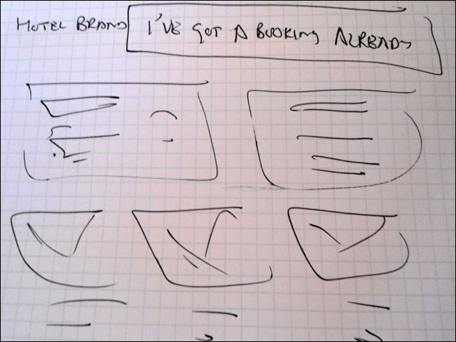
Firstly, I’ve learned to try and prioritise use cases ruthlessly. Take a typical hotel desktop website homepage, it probably has a form to allow you to make a booking, some links to help you if you have a booking, some glamourous photos in case you are thinking about making a booking, and some info if you are trying to hire it for a conference or a wedding. Plus a search box, some flags of different countries, loads of links put in by the lawyers, a city travel guide, and so on and so on.
Design it for mobile, and I’d probably be inclined to have one big fat button at the top that says “I’ve already made a booking”, to direct people off to a whole other IA serving those use cases, so that each page is able to really concentrate on one core task or one core audience.
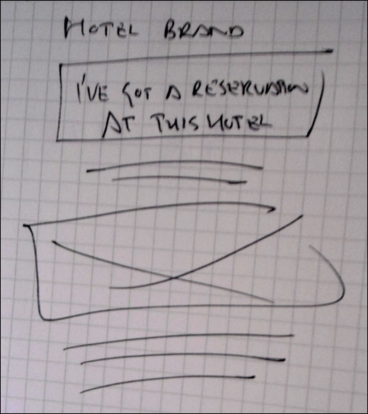
A sketch of trying to split the user journey at the earliest opportunity on a hotel website
The thing is, once you start to think responsively, you begin to wonder why you wouldn’t have that really easy visible path off to manage your booking on the desktop. Why bury those use cases behind registration and sign in? Once you’ve simplified for one platform, the temptation is to simplify for all platforms.
Should that design translate back to the big screen version?
Prototype. Prototype. Prototype.
Secondly, I’ve learned to love prototypes.
For a start, users can touch prototypes on devices, get that tactile feel for them, in a way that sketches and wireframes don’t allow for.
I swear by HTML prototypes now. Twitter Bootstrap is your friend. If you are a UXer or an IA and can’t code any HTML or CSS, then put this essay down and go and learn that instead of reading this. I always feel that designing web pages when you don’t know how to put them together is akin to designing cars when you can’t drive. Sure, you can do it, but you’ll never really appreciate what is easy and what is hard to build, what is elegant, and what feels good.
Twitter Bootstrap let’s you get started really quickly with a solid grid, and decent enough styling, and the responsive version comes for free.
OK, so a responsive version comes for free. The “simple marketing or informational website” demo gives you a couple of responsive versions from the same set of code. You’ll almost certainly want to tweak it, but using the responsive basis of Bootstrap gets you a lot of the way there much faster than producing mock-ups for lots of different screen sizes and orientations.
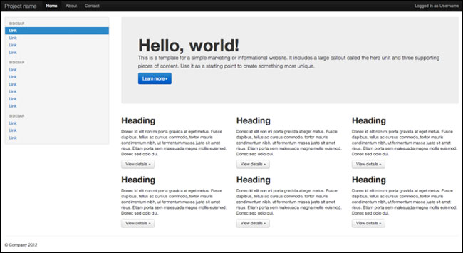
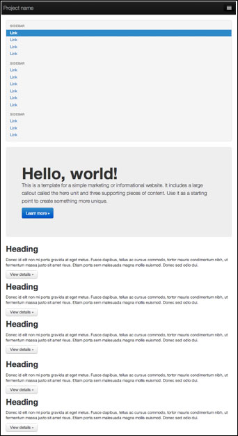
Two layouts of the fluid demo of Twitter Bootstrap.
The first time I really used it in earnest was when I was doing a two-day design and rebuild spike on the Guardian’s Facebook app with a couple of developers. Having wrestled the Bootstrap CSS into a shape that looked like the app, I produced something like 35 prototype pages of different bits of the app and different bits of functionality in a few hours. I think it was the most productive I’d been for years, and I swore I would never work any other way again.
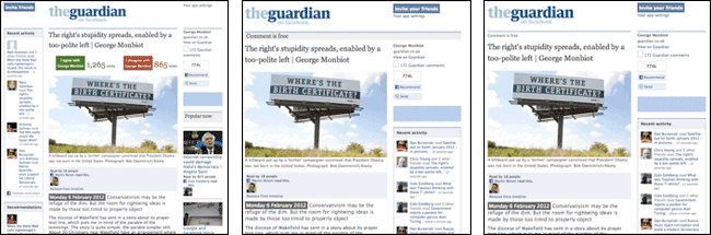
A series of HTML prototypes for the Guardian Facebook app.
How to wrestle the CSS to look like the app?
Well, Chrome’s Inspect Element is also your friend. We all know that developers are lazy in the good way, which means that they make shortcuts for everything. Look at a webpage in Google Chrome. Select some text from a bit of the page you like the look of. Get the right-click or context menu, and click “Inspect element”. Expand the panel in the bottom right corner that says “Computed style”. Et voila! The exact CSS you need to make something look like that, which you can easily add to the default Twitter Bootstrap CSS file.
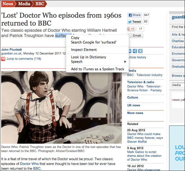
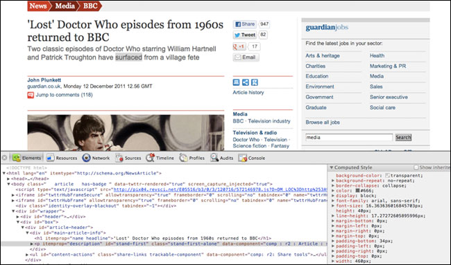
Uncovering the exact CSS to make the standfirst style on a Guardian page with Chrome’s Inspect Element.
Getting the fidelity of prototypes is important. I found that by building pages that looked enough like the final product at the Guardian I avoided both the trap of giving editorial staff things that looked full of placeholders that were difficult to grasp, and avoided it looking like I was trying to do final visual designs. A typical prototype, like these ideas for changes to Guardian Comment articles, looked enough like the site to be recognisable, but not so much like I had slaved over every pixel. With the basic CSS set up right, I could build these very quickly.
A prototype of new features for the Guardian’s Comment pages
But be pragmatic.
The intricacies of coding can be hard, especially for complex interactions. It is a waste of the IA’s time to be fiddling around trying to get some nested floating CSS with gnarly inheritance rules working, when you can draw the thing quicker.
Which brings me to the Omnigraffle stencil version of Twitter Bootstrap.
I’m still not convinced whether the person who built this had a stroke of genius, or a really weird idea. Because surely the time it took to carefully imitate all of the elements could have been spent becoming a ninja with actually using Bootstrap? But I’m grateful to them, and have actually used it on projects where I can tell the complex things I am trying to design are going to be beyond my coding fu.
So I still make sketches and wireframes and user flows.
I find designing for swipe can be quite a frustrating experience. On paper I always seem to add chevrons to the end of elements to indicate that they are swipeable. Which opens the question as to whether the design should have something to indicate swipeability? For touch I think not, but of course, if the design is also going to be on mouse-driven desktop displays, then some indication of scrollability is necessary.
This issue can get especially vexed if you do classical usability testing on a product. Mark Porter and Andy Brockie did a fantastic job of designing a truly beautiful reading experience for the Guardian iPad app. But one detail really annoys me. Because a few people in user testing didn’t discover the ability to swipe side-to-side between articles, the solution was deemed to be two tiny chevrons indicating the possibility of movement. It really does strike me as odd that just because a couple of people out of a small sample, introduced to a product for the first time, didn’t use one of the features, that every single user gets the chevrons on every single article they ever read for ever. Imagine if they’d user tested bound printed books as they replaced the scroll. We’d have ended up with little “Please turn me over” labels on every page.
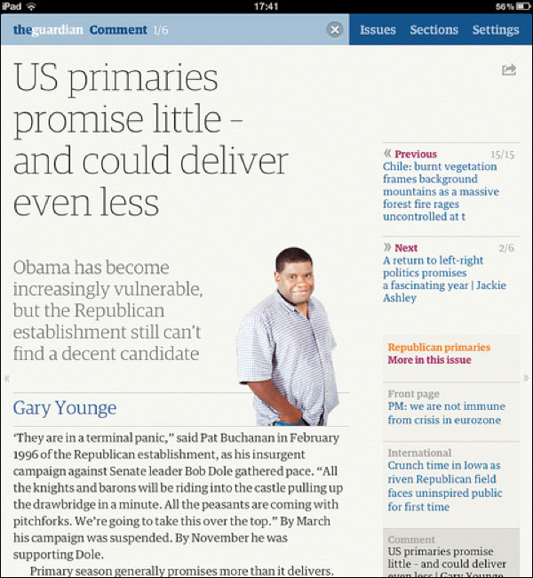
The Guardian iPad app. With annoying little chevrons.
Do as little as possible.
When I’m approaching a responsive project I try to design as few screens as possible. I’m aware this isn’t always possible, especially if you are out-sourcing development, but for me the conversations about the general principles of layout with designers and developers are more important than producing reams of documentation. I’ll usually start by setting out a navigation framework for different sizes and orientations, and then focus on design interactions for the small screen. For pages that will have a lot of content, I try to design the hierarchy of content divorced from screen-size or orientation, and let the visual design work flow from that.
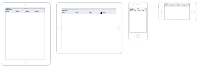
Setting out the navigation framework across sizes and orientations.
Oh, and don’t forget to specify design “Zing!” where it is needed. A little cluster of stars on a wireframe should be a standard part of any information architect’s toolkit.
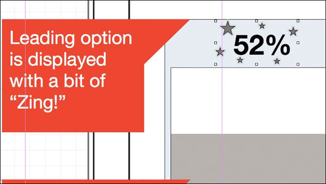
Zing!
Don’t forget content producers.
Don’t forget the content producers in all this. We talk about how much “people” love their phones and their touchscreen devices. Well, the people making the content do too.
When I was at the Guardian, we were aware that fashion bloggers could often publish their photos from the catwalk faster than our fashion editors, who had to go through a clunky VPN and publishing workflow. For the London Fashion Week they were issued with iPhones and the Tumblr app, and they published directly to the Guardian Fashion Tumblr. Dan Catt built widgets that pulled the Tumblr content into the main site, and so we used that path, and touchscreen publishing, to circumvent the limitations of the CMS.
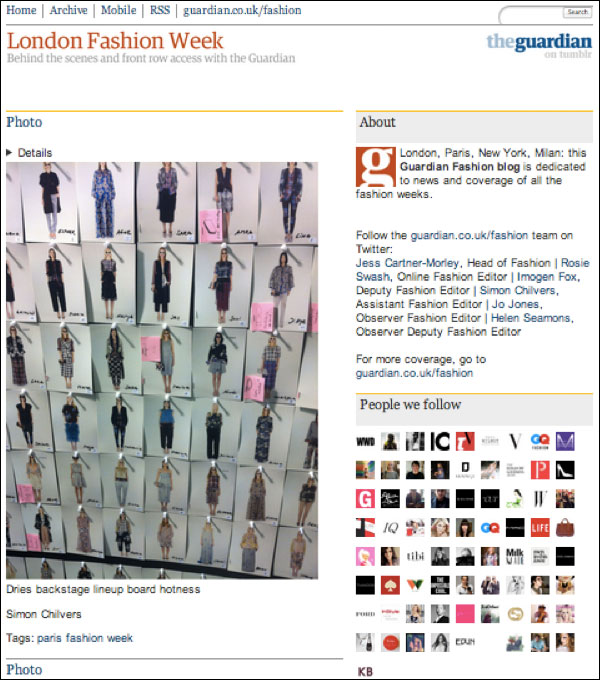
The Guardian’s Fashion Tumblr circumvents CMS limitations.
On a rebuild of the live blogging CMS, the developers built the journalist interface using Twitter Bootstrap. It meant having standards compliant code that worked cross-browser, and cross-device. Seeing the product manager Sharath Bulusu be able to pull the “one more thing” trick of “it already works on phones and iPads” about the new CMS was a joy to behold.
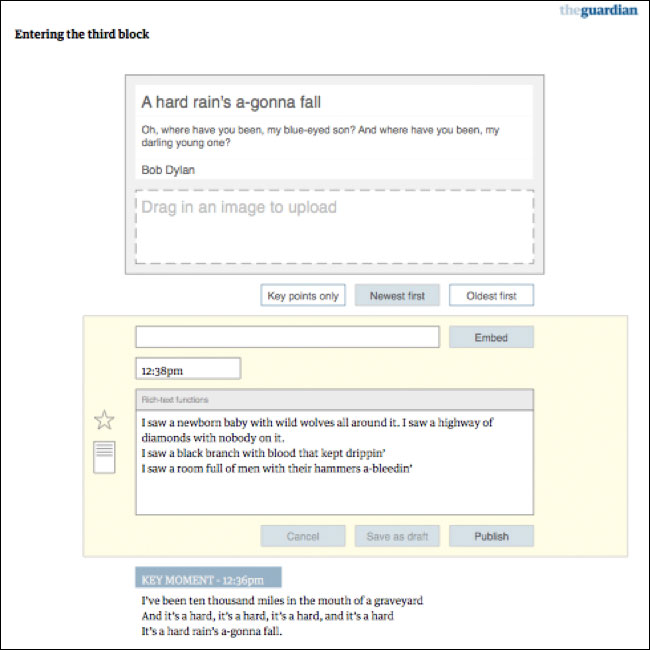
One of my wireframes from the rebuild of the Guardian’s live blogging CMS.
Know your devices
I really urge IAs to use as many different mobile and tablet devices as possible.
Let’s be honest - designers tend to love Apple. If you only use iOS, it isn’t unreasonable to position some kind of back function in the top left of the screen like a lot of apps. but that isn’t a natural place for it for Windows Phone and Android users.
When working on projects designing specifically for those platforms, I always tried to use one of the machines as my day-to-day phone for a while, to get a feel for what seems natural on the device. How else can you judge whether a design is well integrated or not?
The back button, search, and the way social services are integrated are three areas that differ greatly across these platforms. A HTML5 one-size-fits-all future needs to think a little bit harder about the hardware buttons on various devices, as well as getting excited about be able to share a common codebase across them.
Is Responsive design appropriate for everything?
On stage at EuroIA we had a swear jar for anyone trying to “define the damn thing”, or anyone saying “it depends”. I had to put money in at this point.
Is Responsive design appropriate for everything?
Well, it depends.
If you are building an enterprise tool that people are only going to use at their desks, then no. If your transaction is so complex that it simply can’t be achieved in a tiny amount of pixels, then no.
But ask me if responsive IA is appropriate for everything? Well then I’m all for it.
The discipline of imagining how every project could be configured for the small screen is in some ways incredibly liberating. It helps you focus on your core proposition. It allows you to concentrate on the key tasks the user needs to achieve quickly, rather than get distracted by supporting “tiny tasks” and edge use cases. It makes you consider how your pages and services will appear in the hands of someone with a touchscreen device. It helps you make good stuff.
This is the essay version of a talk given at EuroIA 2012 in Rome. It features elements from my previous essay “Designing products with mobile users at the core” and several other articles on a similar theme I’ve written for this blog and for the Guardian Media Network.
This is one of a series of blog posts about the talks I saw at EuroIA 2012 in Rome. You can download the whole lot in an ebook for iBooks, for Kindle or as a PDF
“The dirty magnet” - Gerry McGovern
“Helping businesses to tackle a ‘wicked problem’” - Peter J. Bogaards
“Process & People” - Birgit Geiberger & Peter Boersma
“An agronomist’s unexpected path to UX Design” - Raffaella Roviglioni
“Responsive IA: IA in the touchscreen era” - Martin Belam
“‘Stupid bloody system!’: Bad IA in the workplace” - Jonas Söderström
“On beauty” - Andrea Resmini & Eric Reiss
“RITE: Testing and a business driver” - Jim Kalbach & Carola Weller
Building a coupon app for iPhone - Hermann Hofstetter & Gregor Urech
“Micro IA and content that travels” - Sara Wachter-Boettcher
“What am I curious about?” - Stephen P. Anderson
You can also download all my notes from the previous EuroIA in Prague as one PDF or as an ePub document.
Your daughter asked you to do a puppet show and your first thought was "is there an app for that"!?!
Good article though.