60% of Editors Blog comments hate the BBC News redesign
"A silly waste of licence-payer's money and another example of the relentless advance towards turning the Web into a Fisher-Price wonderland for simpletons."
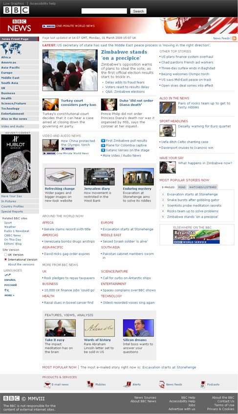
And with a quote like that, you know you must be on the BBC Editor's blog talking about the re-design of the BBC News site. At the time I checked it yesterday, Steve Herrmann's piece about the new look had generated 627 comments. At last count there were over 1,500.
From experience I have a checklist of what to expect in any public response to a new BBC design, and it all seemed present and correct. Accusation that the new design represented 'dumbing down'? Check. Suggestion that it was the work of students rather than someone who had put any thought into it? Check. Waste of the Licence Fee? See above. Insistence that people should be fired because of the changes? Check.
Someone called Fred enquired quite early on in the thread:
"What ever happened to the old saying if it isn't broken don't fix it?"
Well, Fred, I'm happy to confirm that the saying is alive and well, and mentioned no fewer than 22 times amongst the 627 comments that I saw. A count which doesn't even included variations like 'change for change sakes'.
Comparisons to the opening day jitters at Heathrow's Terminal 5 cropped up a fair few times as well:
"Not good, I'm afraid: the triumph of form over function. (Why does Heathrow Terminal 5 come to mind ..?)"
"Looks like it was tested as much as BA's T5 project.."
Although it was not always in a negative context:
"Looks great and very clear and clean on the AppleMac. Can you have a go at redesigning Heathrow T5 :-)"
There were a couple of mentions of Fisher-Price, and the suggestion that the site had lost some impact and seriousness.
"The new pastel colours are a bit lightweight. Too BBC Breakfast, and not enough Ten O'Clock News. Overall the looks is a bit Fisher-Price 'My first website' - something that you make with a wizard in Front Page or something."
"Please lets have the old one back nice and smart. This is along the lines of tellytubbies."
"In terms of style, if the old look was the Times, it now looks like the Beano. I thought the old style had more gravitas."
Amusingly there were a couple of requests for the analogue-style clock from the new BBC homepage to be added - which, considering it was such a divisive feature in that redesign, would have opened up a whole new can of worms.
"Could you put the clock thats on the BBC homepage in the top right corner of the news website? It'll be a nice addition and fill the empty space up there."

And, of course, scratch the surface of any public response about the BBC, and you'll find a grammar pedant:
"What's more important is the style of writing, when did full stops become replaceable by commas (see first sentence) - and when did it become acceptable to use a hyphen in the place of virtually anything??"
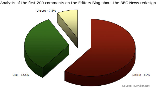
I did a quick rough'n'ready analysis of the first 200 comments on the page, crudely dividing them up into 'approved of the new design', 'disapproved of the new design' and 'uncertain' where they didn't seem to express an opinion either way.
The result was that 120 comments, or 60%, disapproved of the design, whilst 65 comments, or 32.5%, approved. There were 15 non-committal comments in the first 200.
I should imagine that the BBC will actually be quite pleased with those figures. There is always a tendency when making a big change to evoke strong negative responses on blogs and via email. Just yesterday, Matthew Ingram described this as the 'phone-in show' effect of blogs.
"Violent agreement is an unusual thing to see, in most cases. But disagreement is almost always emotional — even if it’s couched in logic. And it’s a strong emotion. People who disagree with something are motivated to pick up the phone and call into a show, or click the mouse and comment. People who agree are much more likely to just nod their head in agreement and get on with their day."
As I went through the first 200 comments, I also made a note of recurring topics. Two of the most popular complaints were a lack of weather (49 comments) and a lack of postcode-driven local news on the UK edition of the site (31 comments). It appears that both of these elements were missing from the launch of the UK version of the page due to a glitch, so the BBC has already addressed those concerns.
The other major issues that cropped up were that there was 'too much whitespace' (37 comments), the page was too wide (34 comments), the font used was hard to read due to the colour (22 comments) and that the double banner was too large (20 comments).
Last year I did some consultancy work at the BBC and at BBC Worldwide looking at how that 'toolbar' space across BBC web properties might be used. So far they seem to have put in the very bare minimum for the area - a logo, a search box and two links. I'll be interested to see how that space develops.

I noted 11 comments amongst the first 200 lamenting the loss of either the 'tabbed' toolbar or the UK version with its links to 'Where I Live' and so on. Received wisdom within the BBC, and the statistical evidence of click-throughs, is that as a navigation device this toolbar is used by very few people. Possibly all 11 regular users complained!

In amongst the 'I love it' and the 'Horrible, horrible horrible' quotes were a few interesting technical points about the new page. One was the fact that it doesn't validate, and in fact, is strewn with validation errors.
" I quite like the new look, but is there any chance of the underlying HTML to get at least vaguely closer to the XHTML 1.0 Transitional it's claiming to be?
The W3C's HTML validator reports 378 errors for the front page alone - many of which would be incredibly easy to fix.
Even just changing the doctype to the older HTML 4.01 Transitional would take the number of errors down to 75. Currently, it's claiming to be in one dialect, when it's actually far closer to another."
A lot of people pointed out that it was a mistake to make the page 'fixed width' rather than fluid.
"The simple solution is to just have the page fit the space available. If needs be you can set a maximum width so it does not stretch beyond legibility on large screens. This is something anyone with a knowledge of CSS would be able to accomplish in an afternoon. It's not hard."
There was also mention that the design still relies on HTML tables to lay out the page, rather than using CSS for layout.
"I like this redesign (more of a realign really), with better use of the available browser width and larger photos: but how can you guys justify using tables to lay out non-tabular content in 2008? What a shame. I wonder if the content management system is dictating the design, rather than the design directing the way the CMS should work?"
Knowing some of the client-side team at BBC News, my guess is that they would have loved to render the pages in table-less pure CSS driven XHTML, but that 10 years worth of legacy kludge from the News CPS will have hindered them. I think I can anticipate what the outcome of any short-term cost/benefit analysis of rebuilding the front-end in old skool HTML versus re-building the entire CPS would be.
One comment on the blog suggested the BBC should just rip it all up and go back to 90's style HTML anyway:
"Can we go back to the 1998 design? It was no-nonsense, distinctive and very British." [1] [See comments for more on this quote]
A handful of iPhone users commented that it didn't work very well on their browser. I'm sure it won't look great on my Nokia N95 browsing with the images off, but I don't really expect the BBC News design to worry too much about edge-cases like that. I guess though, if you've invested in the most expensive exclusive UK contract phone that money can buy, you'll lash out and blame anyone for a poor internet experience rather than Apple ;-)
I was going to leave the final quote to Jel Mist, who almost certainly calls it like it is:
"I would bet anything that when the old look was first rolled out (when was that? 2002? 2003?) there was the usual string of complaints, just as we are seeing now. We have had several years to get used to the compact format that's now being retired.
My guess is that most of the complaints are less down to objective comparisons of old vs. new, and more to do with the discord that inevitably accompanies the new and unfamiliar. People are comparing the new look against what they are used to, and anything not in its accustomed place will be marked down.
Give it a few weeks for the new look to bed in and for us to get used to it, and for the site designers to tweak it in response to valid criticism and suggestions, and we will wonder just what all the fuss was about."
But I thought it was more fun to give the last word to Ed, who didn't just dislike the new design, but found it:
"Very insulting!"
[1] Although I did wonder it that was left by Matt Jones under a pseudonym ;-) [Return to article]
Blaming Safari for not rendering the site properly on the iPhone is daft -- didn't anyone do basic cross-platform testing? And you can hardly call the iPhone and N95 "edge cases", unless you're happy to ignore the entire emerging mobile web market.
BTW I searched for reactions to the 2003 redesign -- they were, in the majority, positive. The 2003 design, just like the 2002 homepage design, was very good.
After 1,500+ complaints -- and they are complaints, check lower down the comments now and you won't see any in praise at all -- you think people might just recognise that a mistake has been made.
Now, why did I think that the iPhone comment was most likely to elicit a response ;-)
Seriously though, I've just spent half hour fiddling about trying to get CSS background images to render as I expected in Safari on my MacBook, so maybe I'm just angry at Safari today...
And I thought I'd covered my tracks sufficiently! Busted! ;-)
Incidentally, Dan G who left the first comment on here has a couple of excellent posts on his blog about the redesign, about what is wrong with the new site technically, and how Opera and Firefox users can 'fix' some if it.
Normally I think you're quite on the money Martin, but I'm afraid quite a bit of the above is rubbish.
While I'm sure the CPS would make launching a site with dynamic width trickier, that doesn't mean it was a good idea to widen the site without it, or that dramatically increasing the amount of downwards scrolling to access the same information was a good idea either. At the current width the entire page isn't visable horizontally on the BBC desktop itself if you have the favorites bar open!
And the bit about the iPhone browser is just stupid. It's a mainstream browser now, and one the BBC itself has spent an awful lot of money developing for (the old news page had a webapp icon developed specially, and the pagewidth fixed to zoom to an appropriate level specifically for iPhones. And the iPlayer enencodes all the content, at not incondsiderable third party rights risk and server time expense for the iPhone/iPod Touch browser). The page doesn't work, not becuase of any fault of the iPhone, but because of the validation problems with the site itself such as the ludicrous decision to decide font sizes in pixels that nobody else does for a *reason*.
It also doesn't function properly in Safari desktop or Opera. It's very, very broken, and should not have gone live in it's current state. I'm just staggered it hasn't seemed to go through any testing whatsoever.
I'll own up to teh l4m3: mine was one of the umpty "if it ain't broke" comments.
My primary resentment at the new design is that it forces me to do so much more work for the same content; I feel like I'm scrolling endlessly across the Karakoram. No fun, my babe, no fun.
Well, I'll take the first bit as a compliment and gently disagree with the second bit. I don't think the site should be fixed width. I did write that it was a mistake above, although given the number of fixed width components in the page, and the number of other content management systems across the BBC that inject content into the news site, I understand why it is a fixed width. Suggesting why someone has done something that is a bit of a kludge is not the same as saying it was a good idea.
And it has a wink-eye smiley after it as well...
You know that I just like winding up Mac fanboys - even as a Mac owner myself.
Stuff the news design. What about the frankly awful changes that have occurred to currybet.net whilst I had my back turned? Urgh! It's just change for changes sake, and hey, if it ain't broke, don't fix it!
Bet it doesn't work on my iPhone either!
Yada yada etc etc ;)
Interesting to read that the CPS is the root cause of the poor markup.
I would have thought a top-to-bottom overhaul, investing in a new CMS, would have been the way forward. Would take months, maybe years, of work I imagine, but what's the rush :-). Best get it right.
I believe there are several competing CMSs within the BBC so replacing them with one single new system might be a good idea from a number of perspectives -- training, support, performance etc.
Of course, there's all the problems of no php allowed on the BBC servers etc. And even I, an ardent Wordpress fan, would suggest that bbc.co.uk could be powered by a Wordpress or Drupal install!
Here's an example of reaction to the 2003 redesign -- quite positive really, though somebody does note the markup errors -- all 17 of them! Them were the days...
Wondering idly whether there'd be any better CMS options if Siemens hadn't nailed them by the knackers to a wall marked "Perl circa 1998".
I don't, obviously, think it's insulting or dumbed-down. I don't think it's a waste of licence-payers' money (not that I care much about that anymore) - I'm sure they'll cut the validation errors, and the sure-as-night-follows-day rendering errors that do with them, to a number lightly smaller than **347** in due course.
My problem with it is that it's fscking hideous. Tedious default-Wordpress-template yawnfest devoid of any presence or authority.
Unlike Currybet.net, where the addition of some grid action up at the top of the posts the other week brings, I feel, a "Slapping Foreign Officials Aside With A Stiff Blue British Passport" air to the proceedings.
Well, I'm sorry if that isn't what was intended Martin, but the article really doesn't give the impression. You haven't actually said that you though the lack of fluid width was a mistake anywhere in the article. You've quoted *other people* saying as such, but that doesn't really mean anything given the thrust of the piece is (quite correctly) "just because someone's written something in a comments section doesn't mean they should be listened to as their comment isn't neccessary statistically valid."
It also doesn't address the more important fundamental, which is if fluid width wasn't possible the extra width shouldn't have been implemented until it was, and doing otherwise was a fantastically bad idea.
Well, it doesn't actually. The section about complaining to Apple has one, but the sentence before appears entirely separate and serious, when it's quite badly incorrect as a point as mentioned above.
Somewhat ironically, the comments section here also doesn't work on the BBC desktop… the first few letters of any sentence appear off screen and have involved selecting all and pasting into Word just to read them...
this seems like a lot of work and I'm not sure what your point is.
i could see usability issues and from their blog comments that it was design-led. from my experience, process ends up being compromised for users by the sorts of factors their blog posters has - and not always between the lines.
i understand the problems of being a poor slob doing this - was this your point? but without looking at the power factors which screw up user-led redesigns from your experience you're not adding much. give us some real insight, martin.
Obviously in my comment above I meant I *wouldn't* suggest BBC News could run off Wordpress... though maybe it could run off Wordpress MU with Supercache, memcache to accelerate the PHP and a bit of Squid goodness to serve the Supercache static files...? No chance with Siemens around, of course.
Well, to judge from the feedback, it looks like with hindsight I should have done one post of "Gosh, don't people say the darnedest things over the intertubes", and then a rather more serious post about the technical shortcomings pointed out in the comments on the Editors Blog. I drew attention to those because I thought, unlike the XHTML on the BBC News homepage, they were valid.
And maybe I should have left the iPhone baiting out altogether? Although my long-standing belief that iPhone users are a prickly bunch over any criticism of the product appears to be a bit QED by the response here. See iPhone and the blindness of the Apple fans for prior art.
That is interesting to know - is it still Internet Explorer 6 on XP SP2? I tested the new templates here on IE7 and Firefox 2 on Windows XP, and on Firefox and Safari on the Mac. That covers about 75% of the visitors to the site, but I haven't had access to a copy of IE6 to look at how it all renders, or indeed apparently doesn't.
I've no idea what this site looks like on the iPhone btw. I do get a handful of visits a month from the iPhone and the iPod Touch (James, is that you?). I also get some visits from people claiming to be on the PSP, PS3 and Wii platforms, but I always assume these are just young'uns who got to the site after searching for dirty words on Google and who will be a bit let down by what they find.
Man, I'm late to the party commenting here.
I have to say that I generally like the new design (though I was mightily confused by browsing the site when it has just been switched, and half the site was still in the old style).
As an iPod Touch owner, I'd certainly appreciated if more time was spent customising the design for that platform. However, having just tested it, it's not all THAT broken as it is (although the ticker behaves a bit oddly).
The best thing they could do for iPod Touch/iPhone users would be to encode all the videos in H.264, as they have for iPlayer, so that they actually work.
Agree that fluid width would be good, but a bit wider seems better than sticking with the old width to me...
Re: the fixed width issue, I'm not so sure it's a content related decision. While trying to find someone to send an angry email to last night I found the the BBC UX+D Visual Language Guide 1.0, dated the 11th of December, which is the set of guidelines for the recent BBC website changes.
Page 5 is interesting.
"You MUST design your page to be fixed width (NOT stretchy) and centred within the browser."
Is the best bit. Looking at the layout on page 15 I think it's safe to say that the news page has been in development for a fair while. It still doesn't excuse it being rubbish though.
Just for the record, I don't own a iPhone. In fact my mobile is a "black & white" Nokia something from 2002! It's indestructable and has a built-in torch that I use a lot, so am quite attached to it. I do recognise that more and more people are getting "mobile" devices. I'm planning on getting an iPod Touch -- having played with Safari on an iPhone I think it's fantastic, but the GPRS service is not. Would rather use WiFi on a much cheaper device.
Martin, Microsoft supplies a free virtual machine that contains only XP SP2 and a copy of IE6. That's how I test development work on IE6. Only works on XP Pro and Vista though -- not Home.
Around 20% of my users are still on IE6 so I have to support them. Surveying them suggested they were office workers who had no choice in what they used (often using IE7 or Firefox at home!).
Watching BBC News last night there was a close-up of a browser while someone typed the URL of First Direct in (regarding the cutting of mortgage offers) -- I was surprised to see the browser was IE6!
"Can we go back to the 1998 design? It was no-nonsense, distinctive and very British."
Martin:
I am the person who made the above comment which you are now quoting in your article.
Anyone can see for themselves by reading my post here:
http://www.bbc.co.uk/blogs/theeditors/2008/03/refreshing_changes.html#commentsanchor
that I did not mention HTML, XHTML, or any other internet markup language.
There was no suggestion from me that the BBC "rip it all up and go back to 90s style HTML".
People can confirm the truth of that by reading the post for themselves.
Why my post is being deliberately distorted and the false impression given that I was suggesting a return to "90s style HTML" is anybody's guess, and one can only assume it is to serve some petty self-serving agenda of your own.
At the least I think I deserve an apology from you for that.
You also wonder if Matt Jones wrote my post under a pseudonym.
Matt Jones did not write it, I did,
I notice Matt Jones humourously writes above that he has "not covered his tracks properly" and has been "busted", giving the false impression that he did write my post.
Possibly Matt Jones wishes he had the flair to write what I wrote?
Lastly, I stand by what I did say in my post: the look of the 1998 design was cleaner, simpler, more "British" and more "BBC".
A shame also that my comments on the BBC's lack of journalistic professionalism have been completely ignored.
An attraction (possibly *the* attraction) of the BBC News site was that the previous compact design efficiently presented a large volume of news such that it could be visually scanned, and absorbed, very rapidly and with minimum scrolling. i.e. it was functionally excellent.
It seems to me that the BBC haven't realised why many people previously found it such a useful site, i.e. that efficiency of presentation.
The redesign has thrown out this compact, efficient presentation, in favour of a more superficially visually pleasing design. As a result, it's usefulness has plummeted.
I think that's why so many people are so angry. A class-leading tool they have come to rely upon has been exchanged for a mediocre-at-best, poor-at-worst tool, for no apparent good reason.
You state you were involved in consulting with the BBC about their toolbar area; how have they ended up with these mastheads taking up 1/5 of the most valuable screen space, forcing people to scroll each time to capture information previously available to them at a glance? It's a usability disaster.
Well, your response to the negative reception of the new website design is comfortably confident. You are impressively sure that in time the public will come to learn what's good for them. Perhaps indeed we should feel fortunate that the website's in such expert hands that, in this matter anyway, any expression of view by your readers may safely remain unheeded.
It's nice to read a balanced perspective from someone who's actually worked at the Beeb and understands the internal constraints and issues that often surround a project like this.
Thanks for that Dan, that is useful to know. The good news is I have Windows XP Pro on my desktop machine. The bad news is that I have a 32Kbps internet connection, so downloading it may be a bit of a pain! I think I'll have access to IE6 next week, so I'll take a look at it then.
I did some work last year which was about presenting a set of different ideas of what could go in the space to replace the existing toolbar to various departments around the BBC. The users of the BBC News site in the UK for example, tend to follow different navigational paths to users of the BBC Mundo site or the international news audience.
The version you can see on the site at the moment isn't the finished version. Julia Whitney explained on the BBC Internet blog:
Her post has a picture of what will be coming. Users will be able to open an overlay that has links to the most used BBC content, with also, it seems, some topical or event driven links. I think that will mean that, for example, during the 6 Nations Rugby, instead of having to go BBC Home >> Sport >> Rugby Union >> Six Nations, from any page on the site you'll be able to go Explore the BBC >> Six Nations, however I haven't seen the final version in action either.
The new design clearly takes away from BBC tradition. However, on an aesthetic approach, the site is well organized and visually pleasing. Just not BBC style though.
Well I totaly agree, the new design isnt usefull for that company.
RAF Station Commanders change about every 2 years. All of them seek to impose their own stamp on their new empire. They will move people around, give folk new or less or greater responsibilities, change policy etc. It has been noticed that after a few Station Commanders have been and gone the situation has usually reverted back to where it was at the start of the cycle. This is the concept of break it even when it doesn't need fixing.
I get very irritated when a Newsreader gives brief details of a story that will be given in detail at a later time. An example this morning was the child diagnosed with a problem after a photo was sent to a friend by e.mail. This story had more merit than weirdos at the Cannes Film Festival. Some of us have to go to work and half a story is no story.
May be the new design not looking good..but what they fell,who knows..better do they change it..
I came home to find a TV licensing legal notice in my door yet they know I don't have a TV, the letter was extremely threatening, claiming "if you'd been found using a TV without an appropriate license today, you'd have been cautioned and interviewed in line with the Police and Criminal Evidence Act 1984." Which also stated in bold red text "Get a License before you get another knock at your door."
Now I know there are a lot of morons out there who will sweep what I say next under the carpet because I'm reffering to things that don't have physical moving parts, but to those morons that say "just get a license and stfu." I'd like to say two things:
1) I don't use my TV.
2) It's because of conformist un-educated fu#ktards like yourself that we are being run by a bunch of NAZIs that are poisoning our children to dearth, don't complain to anyone if you now get cancer and die, it was YOUR fault for not using your brain EVER, now go have another banana.
Digital Television broadcasts using electromagnetic radiation, this is exactly the same type of radiation used inside microwave ovens, this form of radiation, regardless of wavelength, causes DNA fragmentation, the frequencies currently in use exceed safety exposure limits.
DNA fragmentation puts anything with DNA at risk of a wide variety of deadly and sadistic terminal illnesses, not only this but the fragmentation is passed on genetically to children.
Electromagnetic radiation can amplify or refract depending upon the terrain it is being broadcast across, this means that levels being broadcast within the safety exposure limits can easily refract in such a way that they can greatly exceed safty exposure limits, this is why electromagnetic surveys should (but don't) be forfilled in order for a microwave tower to be deemed as legal and safe for use.
Corners can amplify electromagnetic radiation, trees and forests can also amplify the effects of electromagnetic radiation, why is it then that most microwave towers are found high up in woodland ? (counter blue radiation).
(if we live in a democracy then who asked me if I mind someone microwaving me and my unborn children ?, or is it that money has something to do with this ?, there are not words for the how insulting this disgrace is, because you can't physically see this makes people accept it ?, shouln't we be the ones knocking on there door leaving them legal noitices and smashing down there towers ?)
In the past three years deaths related to cancers are at an all time high, within six years of exposure to this form of electromagnetic radiation is enough to cause cancerous forming tears in Human DNA while permanently damaging the DNA, again this damage is passed on to your unborn children.
It took millions of years for us to evolve, I cannot comprehend how microwave towers are allowed anywhere in this word given the facts regarding the permanent damage they are causing to our race, this is the kind of thing you would expect in a science fiction movie, this is the kind of thing you would see in a B-Movie fifty years ago, being done by hostile aliens.
Just because you can't see it, you think its ok ?, now ask yourself, how many people do you know who have died recently ?.
Sodium Fluoride in our water supply amplifies the effect of electromagnetic radiation, this listed deadly poison also calcifies within our body and unbalances our hormones which are central to functioning in a comprehensive manner.
Sodium Fluorine is regarded as being good for your teeth because it is an abrasive, Sodium Fluorine actually weakens the bone structure and builds up inside your body, it was first used in Russian POW and death camps.
100mg of Sodium Fluorine is enough to stop your heart, now imagine going for a casual walk in the woods to close to a microwave tower that loosens several grams of calcified sodium fluorine ?, what if someone changed the broadcasting frequency ?.
The fact is, these people, strangers are knocking at my door and treating me like a criminal with threataning letters unless I'm proven inncocent because they want me to pay them to microwave me with lethal radiation that has caused record levels of death and permanent damage to the Human race.
Who the fu#k do they think they are.