Using measuring and using humour in UX - UPA Redux #2
Last week I was in Atlanta for the UPA conference. Here is part two of my notes from the week:
“Testing and measuring at PayPal” - Kuldeep Kelkar
“A dashboard is just a dashboard. A number is just a number. Use other research methods to find out why” - Kuldeep Kelkar at #UPA2011
Kuldeep Kelkar argued that you can pretty much run A/B testing practically for free, provided you have a good enough engineering structure and can implement the new generation of free tools on your site. PayPal naturally test a lot, and one of the reasons they do this is that every time they want to make a change, they need to bring many, many merchants along with them. In order to get merchants to take the time and effort to implement changes, they need significant data that will prove that it will be worthwhile. A/B testing gives them that data.
They had also tested variant designs to try and prove or disprove the usefulness of making small design changes. Kuldeep showed a case study where some incremental design changes were only expected to deliver a fraction of uplift in transaction completions, and were going to cost just as much as a ground-up rebuild of the service which would deliver much more significant results. Given data like that, the best option for a product manager to take is often obvious.
Another interesting point that came out was that PayPal had given up offering small financial incentives when trying to recruit people for testing by email. People assumed that it was a scam or that there would be a catch.
I had mixed feelings about this session though.
The second half of it talked about how they constantly tracked user satisfaction with around 40 experiences on the PayPal site. This could then be plotted on a graph, and where they saw dips or rises in the level of satisfaction, they could go back to the product teams and correlate this with what had happened. Was it a design change, or a technical issue, for example?
The question I kept asking myself though, was, what possible decisions could you make based on this data? It was like measuring the wake of a ship. Surely any severe dip in UX satisfaction was also likely to manifest itself in revenue? With Kuldeep saying that PayPal process $3,510 every second, I couldn’t see how that wouldn’t be a much faster indicator that something was amiss.
“Of cannibals and swings...” - Rolf Molich
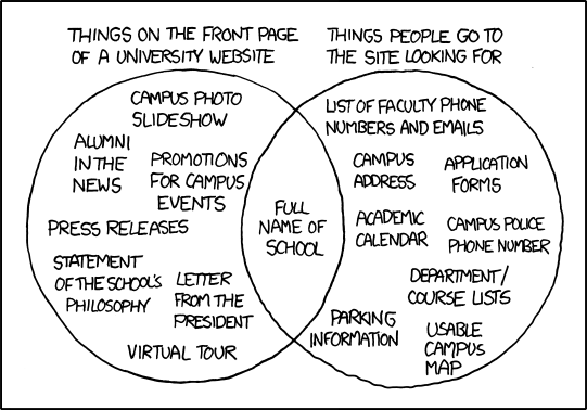
Rolf Molich gave a brilliant Ignite talk, looking at using humour in UX. His slides were a run-through of some of the best cartoons about usability from the web, including the infamous tire/swing and a contribution from Dilbert. I was pleased to be reminded of this XKCD cartoon that sums up so much about how institutions orientate their websites around themselves, rather than around their users’ needs.

“University Website” on XKCD
“Having fun with error messages” - Danielle Cooley
Danielle Cooley presented an Ignite talk on error messages, arguing that as well as being functional, error messages should strive to delight users. Well, as long as the context was right. She stressed that you wouldn’t want a banking application suddenly saying “Whoops! Who knows where your money just ended up?”, but argued for error pages that have a bit of character and fun about them.
At the Guardian we wouldn’t want to deliver non-serious error messages in a serious context, and our 404 error page is designed to be brutally functional. Our error otters, and the cat on the music artist pages, however, are another matter all together...

An error cat on the Guardian’s new music artist pages
Next...
The next set of notes will feature a talk on how to improve contextual mobile research, why companies fail to adopt usability recommendations, and a helping of technology fail courtesy of FedEx.