Changing the Guardian through guerilla usability testing
I work as Lead User Experience & Information Architect at Guardian News & Media, which publishes The Guardian newspaper six days a week, and The Observer on a Sunday. Our website guardian.co.uk reaches over 50 million unique users a month, a third of whom live in the USA.
Whilst our software process is agile, and we attempt to do many things in a user-centred way, culturally as a business we are used to being secretive about product launches, and, as a news organisation, be very wary of giving away an “exclusive”. In the UK, it isn’t unknown for newspapers to give late night TV news programmes dummy front pages to disguise a real scoop they will be leading with in the morning, to avoid rivals running with it. And in the days before public Twitter lists, journalists lived and died by the value of the contacts in their notebooks. Between The Guardian and The Observer, there is something like 400 years history of cultural secrecy about “exclusives” in print.

“Contact book culture” epitomises the secrecy that traditionally surrounds journalism. Photo: Lisa Yarost
We have a fantastic Research & Customer Insight department at the company who provide great market research and help facilitate formal types of testing, but that culture of newspaper secrecy can sometimes make it difficult to get user testing done early in a development project. And the budget for testing is always tight. To counter-act that, I have developed a series of techniques for carrying out “guerilla” usability testing, by approaching people in public spaces, and recording them using and talking about our products.
This isn’t, it must be said, pure maths or science.

“Guerilla” usability testing will not give you lots of numbers to crunch on your computer. Photo: Naotakem
There are plenty of drawbacks with the method. However, all types of usability testing are subject to some inherent bias, and I believe that providing you work within the limitations, “guerilla” usability testing is a valuable tool to have at your disposal. In today’s presentation I want to talk through 3 case studies of different types of “guerilla” testing that I’ve carried out, and give you ten practical tips for doing this kind of lo-fidelity testing yourself.
Guardian Jobs recruitment site testing
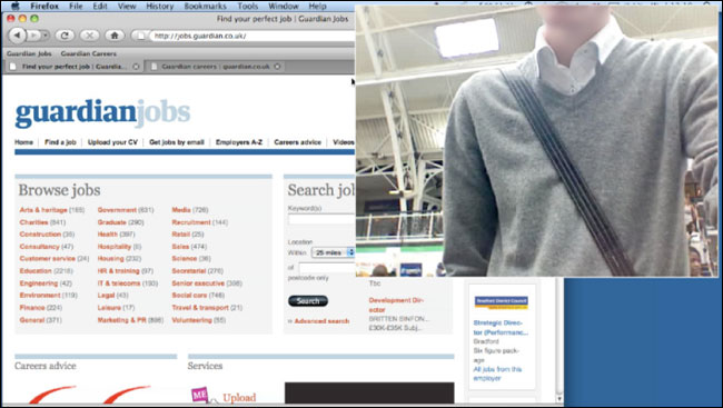
One of the first projects that I carried out website “guerilla” usability testing for was the redesign of our standalone recruitment site - Guardian Jobs. We were sponsoring a graduate recruitment fair in London, and we had a very central stand in the exhibition space. The stand featured several laptops where people could browse the existing jobs site, and also our sister careers site, where we publish information and content to help people through their working lives.
To carry out the testing we replaced one of those PCs with my own MacBook. I use the Silverback App software which simultaneously records the user’s on-screen actions, whilst also recording their video and audio via the webcam. The footage turned out to be really useful, if not elegantly shot. In fact several people did not quite appear in shot at all, and I got some excellent footage of the tops of people’s heads or torsos. This wasn’t a huge problem though, as I had still captured their voice and their on-screen actions.
I didn’t have any kind of formal “script” for the tests. Instead I asked people questions around whether they had ever used the site before, and what other jobs sites they had used. Then I would show them the site, and get their opening reactions.
The first couple of students I approached recoiled with horror at the idea of being video-recorded whilst using the web. I learnt that the easiest way to get co-operation was to say something slightly more ambiguous like “the laptop will record what you do” rather than “you will be videoed”. It wasn’t strictly an untruth, but it was being a little bit disingenuous. I also didn’t try to get the subjects to sign any kind of consent or rights release form.
It is very important to understand that although I had obtained consent to conduct the session, I had not obtained any consent to re-distribute the footage outside of the business.
For that reason, I’ve never shown the footage to people outside of the office. Whilst it was a pragmatic approach, to increase the number of people willing to take part in the testing, it is a shame, as I think we got lots of lessons worth sharing in it.
I put together a five minute clip-reel to show within the business, and, to give it some context, I filmed myself giving a little 30 second introduction to the concept of guerrilla testing, and setting the scene. Rather than show each user sequentially, I arranged the clips thematically around the questions that had been asked of them. I used caption slides to display the question and then followed that with quick cuts of various responses, making sure that I covered the spectrum of views that had been expressed.
This wasn't formal testing, so I didn’t come out of the session with any specific user interface recommendations. However, we had established that graduate jobseekers seemed less likely to be on services like LinkedIn for job-seeking, were very unlikely to find Twitter based services useful, and wanted “jobs by email” alerts to be very specific. I also got clips that demonstrated students looking for their first job both by browsing an industry sector like “engineering”, or by selecting entry-level criteria, like “graduate jobs”.
See also: The story behind the redesign of Guardian Jobs
iPhone application testing
A different type of testing was undertaken when we decided to launch our iPhone application. Recruitment for subjects was carried out via a pop-up survey on a specific section of our website. We wanted to attract people who already had an affinity to the brand, and who were early adopters, and so we chose the ‘Technology’ news section. The people selected came to visit our office, and carried out a 45 minute session using an early build of the application.
The testing was carried out by the product manager and myself, acting as the information architect on the project. Of course, this breaks many rules of how you would carry out classic lab usability testing. Subjects knew the brand they were testing for, and the people doing the testing were working closely on the project. Nevertheless, it was a very valuable exercise.
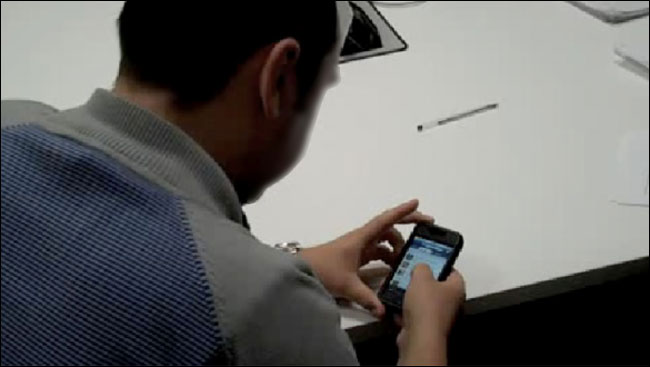
The sessions were again recorded by using Silverback, which utilised the webcam on my laptop to capture a Q&A part of the session, and the faces of the subjects whilst they interacted with the device. Additionally, during the hands-on part of the session, a small Flip camcorder was used over the subject’s shoulder in order to capture their interaction with the phone. Both sets of resulting video footage were lo-fidelity. It was difficult, for example, to capture the precise detail of the user’s interaction with the touchscreen. However, the quality was sufficient for our purposes.
Although we only had a small number of testers, we uncovered several key issues that informed how we completed the building of the app. For one feature, photo galleries, we had employed a non-standard piece of iPhone application UI. Users were able to scroll through the galleries from left to right in a panel embedded within a page that otherwise scrolled vertically. As expected, users were surprised at this, but because the content they discovered was compelling, we found them to be pleasantly surprised.
A second issue was with the way we had facilitated “related subject” navigation in the app. All the content on our website is tagged with a selection of keywords which describe the topic of the news item. In the design process we had felt that drilling down through a topic and subject hierarchy was quite a tiresome interaction on a mobile device, and had looked for an alternative way to do it. The solution we had arrived at was a small tag icon underneath each headline, with a list of some of the more important keywords next to it. Tapping on this icon opened an overlay, which listed all the keywords on an item. Via the overlay, users could navigate straight to the tag page for a particular topic.
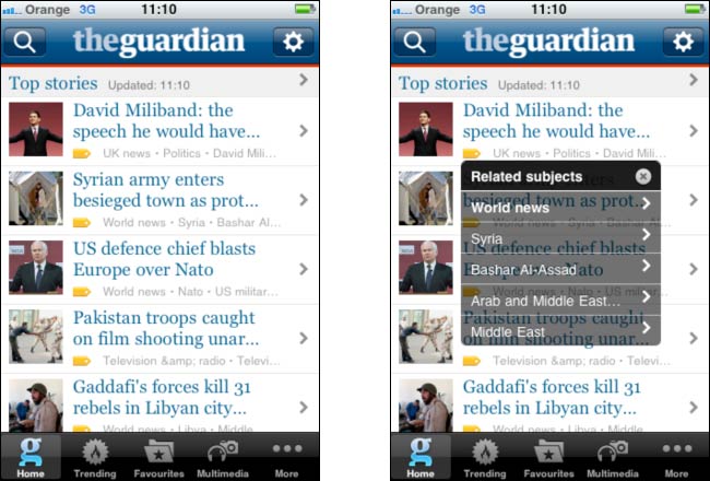
“Tag overlay” navigation on the Guardian iPhone app
During the course of the testing we found that users appeared to appreciate this alternative way of navigating, but we also uncovered a problem. In our beta build, the area that had to be tapped to open the overlay was far too small, and users struggled to activate it. As a direct result of the testing sessions we increased the area that was tappable, and improved the functionality.
One of the key outputs of the session was not the test results themselves, but again a video clip reel. I edited together a six minute video which showed some highlights of people reacting positively to the application’s design, discussing how much – if anything – they would be prepared to pay for the app, and struggling to discover and use some of the features that needed improvements. I placed the video on our intranet, and it was shown at some high-level meetings within the company discussing the project.
See also: Notes on designing the Guardian iPhone app by John-Henry Barac
Tags are magic! by Martin Belam and Peter Martin
Testing “culture” consumption and attitudes
A third type of “testing” that I have carried out is rather more ambient, and not very task focused at all. One recent major initiative within the Guardian has been to reinvigorate our arts and culture coverage online, with an aim to incorporate more contributions from users, and to allow users much more say in what is covered. I wanted to get a feel for how our core audience would react to this.
The relaunched guardian.co.uk/books site
In order to do so I spent a day with the product manager and the design manager visiting arts venues and centres in London. We visited Barbican, the Southbank Centre and the BFI. We thought these seemed like good locations to find users who were interested in the London arts scene. In effect, we used the venue as a “screener question”. In all we spoke to around 35 people, and more than 30 of them were Guardian readers or website users - I had got my choice of locations spot on.

London’s South Bank Centre turned out to be a great place to meet guardian.co.uk users. Photo: Ewan-M
We approached people sitting on their own, and people who were in small groups of two or three. We either used my trusty laptop and Silverback to film their reactions to our existing site, or used the Flip camcorder to record “vox pops”.
Again I edited this down into a thematically arranged clip reel which was placed on the intranet, and then used in a major presentation given to key stakeholders and board members. Whilst the recruitment of subjects was obviously skewed to those who just happened to be there at the time, and the findings were exclusively anecdotal, they were nevertheless very valuable.
We got a very strong sense that it was our authorial voice at the Guardian & Observer that was valued in our culture coverage, and also that whilst people were interested in the comments of other readers, it was not their main interest in coming to our site. We also found some reluctance to making contributions.
This was important for the project, as, prior to that point, a lot of the discussions around building new features had been very much based on the idea that “super users” would be contributing significant amounts of content. The anecdotal clips allowed us to reset the expectation internally on how willing the majority of our audience would be to commit themselves to writing reviews of the arts events they had visited.
And what about when it all goes wrong?

You need to know when this type of testing isn’t working. Photo: DaveOnFlickr
You are relying on people who have been recruited in sometimes a very ad hoc way, and sometimes without heavily pre-screening them. It is important to understand the limitations of this type of testing. Even as I am presenting this talk in Atlanta, back in London we are carrying out some formal usability testing on one of our upcoming digital products. We’d tested it in the ad hoc way a couple of times during the development process to date, and my recommendation after the last round was that we needed to do a more formal test with a more carefully recruited panel of users. I’m certainly not an advocate of only doing this type of test - but I think it can add valuable insight during a product build.
Ten tips for carrying out guerilla user testing
So, if you think those cases studies suggest there might be room for more ad hoc testing in your organisation, here are my ten tips for carrying it out:
1: Get the right software - I use Silverback on my Mac and a Flip camcorder for “vox-pops”.
2: Clear computer clutter - Use a blank desktop and switch off any software likely to generate “alerts”. It will be a distraction for your user.
3: Use a new browser profile - You don’t want cookies or automatic URL or search completion affecting the test.
4: Take someone else with you - You’ll have lots to carry, and a mix of genders may make it easier to approach people.
5: Prepare your opening lines - You have to repeatedly approach strangers. Be sure of what you’ll say.
6: Be ready to improvise - If you stumble across someone who says they are a user of any of your services, be prepared to test that too.
7: Make clip reels, not epics - I try to make a “maximal” cut of everything useful, then edit it into themed clip reels.
8: Know your limits of consent - There is a reason I haven’t shown any clips in this presentation. I had consent to carry out the session, but I didn’t obtain consent to re-distribute the footage.
9: This is not science - This is quick, dirty and cheap. Make sure that the rest of the business knows that.
10: Be polite to everyone - Not just to users, but if you are hanging around a café for example, ask first and buy plenty of coffee.
These are based on two blog posts that I wrote last year: “10 tips for ‘ambush guerilla user testing’” and “8 tips for making ambush ‘guerilla user testing’ clip reel videos”.
Conclusion
Guerilla usability testing is not a replacement for lab testing, and it has flaws and in-built biases. However, every type of testing has flaws and in-built biases. The lab environment is disconcerting for users, remote testers are self-selecting, mobile research struggles to replicate the context of use, and it is all too easy for respondents to be forgetful when filling in diary studies. But as long as you are aware of the weaknesses in the methodology you employ, you can get valuable insight and improve your products.
At the Guardian, introducing guerilla testing has provided a new way for us to improve our products, and particularly with our mobile apps, has become an accepted part of the product development process. People now ask me when we are going to test what they are developing, not whether we are going to test it.
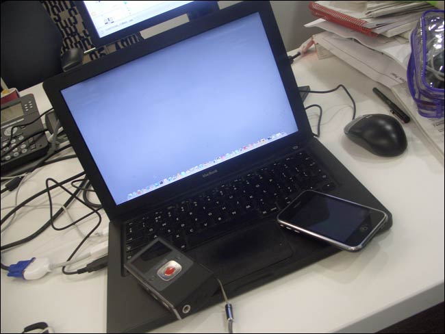
My mobile testing kit of a MacBook running Silverback, an iPhone and a Flip camcorder
Acknowledgements
Over the last couple of years many colleagues at the Guardian have helped me carry out these tests, and I would not have been able to put together this presentation without the help of Karen Loasby, Jonathan Moore, Katie Le Reuz, Piers Jones, Tara Herman, Martin Reddington, Andy Brockie, Lianne Katz, Barry Ainslie, John-Henry Barac, Jim Mann, Olivia Horsfield, Dan Botten and Pearlyn Quan. Thank you.
I only read down as far as the Guardian Jobs testing section, which reminded me of something - some time in the last few months you changed the way that these are sent out. It used to be that you would get an email daily from an alert with all the matching jobs - so at the weekend you could open your 5 emails look down the list, and click the job titles that looked interesting.
But now you just sent out the first 5 matching jobs, meaning that you have to open the search page, work out on which page the jobs you've already seen appear, and read through all the newer pages.
Terrible for the User Experience I think - and the day the change happened I emailed straight in mentioning this... only just realised that since I read your blog I might as well mention it to you directly!
Thanks for your comment David, I've passed it on to the Product Manager for the Jobs site