Not quite the future of publishing yet - Pitchfork, Bat For Lashes, and mobile phones
You might have seen lots of people on Twitter lavishing praise on the web display of Pitchfork’s Bat For Lashes feature today.
But not me.
I tweeted:
“On judgement day we will be divided into inkies or techies based on if we noticed the download size of Pitchfork’s Bat For Lashes feature”
For an article that consists of a couple of thousand words, it is a hefty old download.
If it works at all.
I first tried to view it from a link on Twitter, on my phone, over 3G. Even trying to recreate the experience later on my fat home broadband I got about thirty seconds of it rendering nothing whilst it loaded, followed by a fraction of an image. Every time I tried to scroll, pinch and zoom, or explore the article, it snapped back to the same picture of Natasha, too fast for me to even get a screengrab of how poorly it rendered.
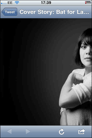
Pitchfork’s “amazing” design on my phone today
As my friend Mary Hamilton put it:
“Lauding web design that doesn’t work at all on mobile as brilliant is like praising a static PDF of a gorgeously designed print page posted to the web.”
Now, the thing is, I’m not really moaning that this is broken. If you’ve seen some of the stuff that used to go out under the Guardian Beta banner you’ll know I’m not averse to launching with rough edges in order to collect real data. And Pitchfork will definitely have more data tonight about this type of content presentation. They will be able to judge the level of engagement they got with this compared to a comparable length article by a comparable level artist, and they’ll know exactly how many people are motivated to complain directly if they get a broken phone experience.
But it is an example of why I think what I’ve been dubbing “Responsive IA” is so important, even if you aren’t making a fully responsive design.
How often, when you are thinking about how your site is received by the user, do you consider the use case of the content being viewed within the confines of Twitter or Facebook on phones and tablet devices? Do you always work on the premise that you have the full screen minus a little bit of browser chrome to play with, or do you factor in that your link may appear as an in-app browser view where someone else controls the size of the screen? When you map user journeys and flows into content, do you think about both mobile and desktop users coming in through the side door, rather than simply expecting desktop users to come in via the homepage?
I don’t know the level of mobile traffic that Pitchfork see, but some of the clients I’ve been working with see half of their traffic coming on phones and tablets. In this case, even without doing a fully responsive mobile optimised version of the feature, Pitchfork might have thought that if they detect a viewport below the width at which the article was legible, they should have at least popped a “Get me over to m.pitchfork” link on top of it.
And then maybe I’d have been joining in the chorus of praise for what is indeed an innovative way to render magazine content on the desktop.
Clever idea - it didn't load for me the first time on my lap-top so I refreshed and got the effects the second time. Unworkable due to the filesize I'm sure but were it not for that then I'd say it was a page that would be memorable; I've no idea why this couldn't be done with something a bit 'slimmer' though, file wise.
This is why Pitchfork offers the article in their traditional format as well, which works just fine on mobile devices. Just a really nice bonus if you're at your desktop, using Chrome and have a decent internet connection.
I don't believe it works on desktop either. I certainly didn't read any of the words, I was too busy watching the imagery change. It would be great for a photo gallery but not an article you want to spend time reading.