Optimising blog design for the reading experience
In a blog post last week about Brendan Dawes' presentation at dConstruct called "Boil, Simmer, Reduce", Adam Tinworth cited currybetdotnet as an example of a trend towards stripped down blog design. It was a funny coincidence, because the current design is due to something that happened whilst I was watching Brendan earlier in the year.
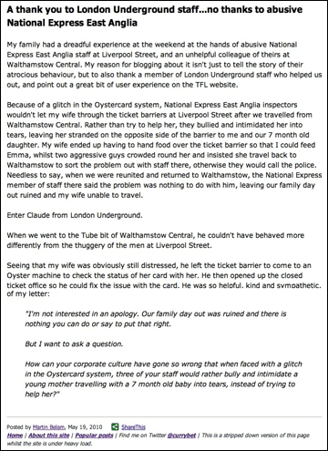
It was the day that I was at Future Of Web Design in May that my blog post about train staff bullying my wife exploded across Twitter. With my server being hammered, my technical support network of a bunch of brilliant software developers I've worked with over the years gave me some tips to keep it up and running. One of those was to serve a plain text version of the specific article, to reduce the number of requests and bandwidth required to serve that page. I did that, but it looked a bit rubbish - like a USENET post or mailing list digest.
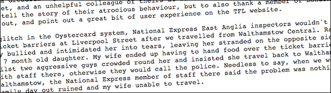
So I added a few lines of CSS, and a Share button, and a little bit of navigation at the foot of the page, and ended up with this.
And that is when I had 'the revelation'.
On any given day, the vast majority of traffic on this site heads to one or two posts. It happens because the links are being shared on social networks, the post is at the top of the RSS feed, or because it is ranking well as a recent post on a topical query. And all those people want to do is read the one article that they've been directed to.
So why not just optimise the experience for reading the one article, and remove all of the blog furniture and clutter? The previous design was pretty minimal, but I thought I could take it further.
I've stopped carrying adverts, so I'm not desperate to drive people to a second click. I'm not actively looking for freelance work, so I don't need to push people towards my About page or CV. As Brendan Dawes was urging at dConstruct, I can 'boil down' the functionality and visual design to a very basic: "Here is the article you wanted to read".
The new page layout isn't without flaws. For example, I miss the ability to promote recent high-performing articles across the site, which I used to do in the right-hand column, but on the whole I am very happy with it.
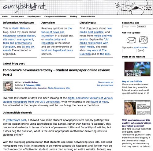
I owe a debt to Jim Ramsey, whose 'Pico' microblogging theme ships as one of options with the latest version of Movable Type. With just a few tweaks to the CSS, mostly to up the font size of the body of an article, I've ended up with a blog that looks closer to viewing articles on Instapaper or on an eReader, than one with a busy and fashionable Wordpress theme.
I've been very taken with the recent focus on the 'reading experience' of things like Instapaper or Readability or Today's Paper or Safari reader mode, and I think as HTML5 mark-up becomes more prevalent on news websites, we'll see more of these kind of views of articles in the future.
To be honest I think you've went too far in this direction and your pages look very dull now. I find myself more eager to skip your blog posts because the website is so uninviting.
Have you designed the site specifically for ease of mobile use, as the last commenter said it is slightly sparse. Web site good for mobile but needs a block of colour or gradient to make it slightly more appealing to the end PC user.
Difficult for any page to be too spartan for me unless everything is displayed within <pre> tags.
But I'm very good at mentally stripping out the extraneous stuff anyway.
Leave as is. Trust me if you enjoy reading your writing (which largely I do) then there is absolutely nothing wrong with the visual design.
But you knew that anyway.
Graphic design on blog sites that are fundamentally about content is overrated. As Mr Brody once said "Style is a disease..."
DJ
I disagree with the points above; the purpose of a blog is to deliver written content. Anything that detracts from this aim is simply design glitter and unnecessary. The choice of font size, weight, line-height and margin size on this website all aid the user in their aim - to digest an article as easily as possible. A blog is not a magazine where creative direction is part of the delivery (in some cases), and this is one of the most readable blogs I've seen in a while.
Do you look at the cover of a novel when reading it? Please leave this design alone, it's great as it is.
Hi Martin,
I agree with you about the need for a better reading experience overall when it comes to blog articles: especially given the increasingly short attention span of many Internet users. I use a theme from plaintxt.org by Scott Allan Wallick, which is in his own words a "personal experiment in combining minimalism with blog design." A clutter-free design is also more likely to get people reading your blog on mobile devices, which is the way things are heading right now.
Yep it's all too sparse. And looks like every other blog I read.
Oh hang on, that's cos I'm reading it in Google Reader...
yeah good content but quite messy and unorganized..but i still commend your style..
I like this layout. Some of the best blogs I read have a very stripped-down design that makes for an engaging user experience - take Andy Rutledge or Mark Boulton for example.
My own web design blog uses a much busier design, but I feel it's still rendered readable by good typography.
In my opinion it's a little bit too sparse.
I know that the content is much more important but i like complex graphics
Have you got any before and after figures on bounce rates, SEO traffic, number of pages viewed per visit etc etc? If they haven't gone down, I might do this to my blog!
In my opinion it really depends on what type of information you got on your site. Generally very basic designs is suitable for sites with longer texts/posts.
I like the minimal look TBH. Too many blogs and sites use images/add ons to hide the poor content of their blog. Furthermore, The web will inevitably have trends just like fashion it's cyclical! The net started off like this and I prefer it.
I'm glad you went this route with the design. To many blogs are cluttered with adverts and a bunch of other things that get in the readers way. I myself like to focus on the article rather than a bunch of fancy graphics. But I do think that you should keep the high-performing articles visible to the readers, if not on the side then right at the end of each article. No need to cheat yourself out of getting those articles more traffic.
In my opinion it's a little bit too sparse.
content is the king
It has to be a mix of graphics and text. People have their eye drawn to really good pics - especially guys.