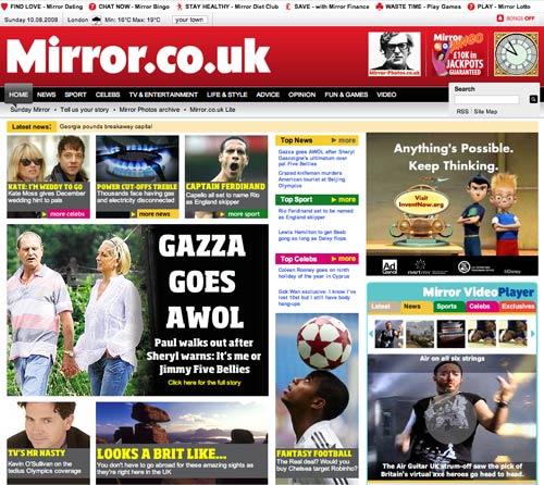
The Mirror re-design review: Part 3
Over the last couple of days I've been reviewing The Mirror's recent re-design. I've looked at some of the good and bad in the navigation, and examined their use of tags. Today I'm looking at some of the aspects of the site search design.
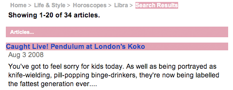
Lack of detail
I noted a distinct lack of detail in the way that The Mirror presents search results. In Amsterdam in September I'll be giving a Euro IA presentation about the ways that you can differentiate your site search from the ubiquitous Google interface. The Mirror has employed virtually none of the ideas that I'll be suggesting.
Their CMS gives them the ability to display a lot of information about each article - when it was published, who wrote it, what section of the paper it was in, the image that accompanied it, what tags were added to the story and so forth. However, the only metadata they display with each story is the date it was published.
Colour-coded search scopes
In the first part of this series I mentioned my concern over the way that The Mirror has colour-coded the whole masthead and page based on which section you are in. I find this to be problematic when using search.
The results are colour-coded not by the section the results belong to, but by the section that you have searched from. This is counter-intuitive. Coupled with a crumb-trail that simply plonks '> Search' on the end of wherever you were in the site, it gives the impression that you are searching over limited scope of content, when in fact the results come from all over the site.
Recommended Searches
For some time the list of popular searches on the Daily Express site has been a source of amusement to me (Madeleine McCann has been top for over 180 days so far this year), but I found The Mirror's set of 'recommended searches' to be more mercenary. The box is in the right-hand column of most pages on the site.
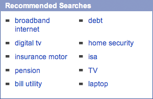
The keywords seem chosen not to help the user find useful 'search results' or hot topics, but purely to trigger the appearance of related sponsored links at the top of the ensuing results set. It looks so transparent to me that I'd be unlikely to click on them, but I guess subtlety in advertising gets you nowhere.
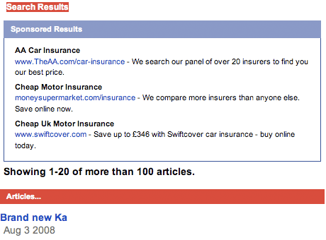
To be honest, it is barely one step away from simply selling text links on the page.
Next...
Tomorrow, in the last part of this series, I'll be looking at some curious horoscope predictions, odd ratings, and how The Mirror handles links to social bookmarking sites.
Scrutinizing the Mirror eh? Good work! It's interesting stuff and something which readers don't really know about.. they do, however know how to complain about websites..