The Mirror re-design review: Part 1
Earlier this year The Daily Mirror re-vamped their website, giving it much more of a visual-led magazine feel. At the time I didn't get the chance to do a review, but as I recently reviewed the re-design of The Telegraph, I thought I would have a look at how the new Mirror design has settled in.
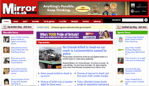
Old Mirror design
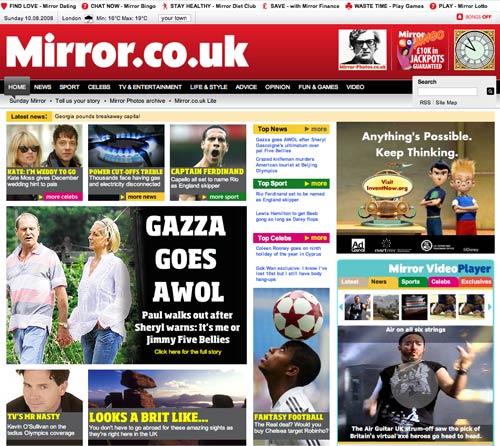
New Mirror design
Global navigation and mouse-over
As seems to be the fashion at the moment, The Mirror has gone for a horizontal global navigation under the masthead. This consists of two tiers, and the second sub-menu changes to reflect the option chosen in the top tier.

Interestingly, they opt for 'Life & Style' as a category, rather than the more common 'Lifestyle'. This has always been one of those labels that frustrates me, as I find it to be totally vague and meaningless, yet user-testing session after user-testing session has shown that audiences understand perfectly well what it means. Although whether they generally think that includes 'Science' is another question...
One thing that I always feel needs to be more of a consideration with these type of 'hover' menu features is accessibility. Because the sub-menu changes when a mouse-over event occurs, it will be difficult for those with less than precise motor control to select some items.
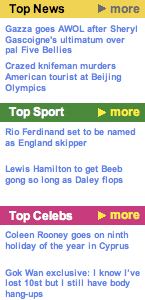
Probably the worst example on the new Mirror design is trying to select the Fantasy Football link. The most natural mouse action is to select the 'Sport' heading, and then drive the mouse directly to the 'Fantasy Football' link - the path marked on this diagram. However, this goes right across the mouse-over trigger for the 'Celebs', 'TV & Entertainment' and 'Life & Style' sections, bounded by the box in the diagram, which will cause the 'Fantasy Football' link to disappear and be replaced.
Site map in the footer
I recently criticised The Telegraph for seeming to have thrown a bunch of links into a "bucket" at the foot of their page. The Mirror handles this area of navigation better.
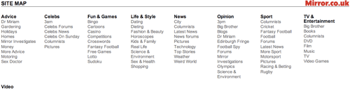
The links are displayed in a consistent way, featuring the same main sections in the primary navigation, organised alphabetically. The sub-sections are then also organised alphabetically. In contrast, The Telegraph seemed to have quite a random bunch of links that mixed content types with genre and functional links, and which was in pseudo-alphabetical order.

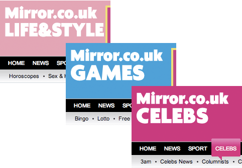
Section colour-coding - does it over-power the brand?
The various sections of The Mirror site are colour-coded - yellow for news, green for sport and so on. This is also reflected in the colour of the highlight applied to the main masthead section link.
,
The colour-coding is reinforced in the heading links to the content itself.
More unusually, the colour-coding is also reflected in the masthead area when the user is within a section. Whilst I appreciate that it helps familiarise the user with the organisation by topic by colour, I can't help thinking it detracts from the Mirror's red masthead brand - and stops the site 'looking' like Mirror.co.uk.
The sport section is sponsored by Setanta, and here I can see that the green works well with the concept of the content 'sport', and the mixed Mirror and Setanta branding.

I'm not so convinced by the pinks and light colours used elsewhere on the site though.
The gambling strip
There is one other aspect of the visual design that I don't think does the brand any favours. The strip of links at the top of every page goes through to the type of commercial propositions like dating and bingo sites which help finance the 'free' news content. Whilst understanding why they are there, I just find that the use of iconography of card suits and bingo balls makes the site look a bit like a tacky gambling site.
Since these are the first thing on the page to render during loading, it makes a bad first impression of Mirror.co.uk.
Next...
In the next part of this series I want to look at some things that the Mirror.co.uk site has done really well around tagging.