“Putting user experience at the heart of your tablet strategy” - Martin Belam at ‘Les Victoires de la Presse’
Yesterday I gave a talk in Lyon at WAN-IFRA’s ‘Les Victoires de la Presse’ event. Here is the essay version of a talk which looked at how user research and a focus on simplicity can help the news industry build better products for the tablet market.
I wanted to start with two things. Firstly, an apology. You know the English. Always lazy. And we never learn any other languages. I thought briefly about doing the talk in French, but then I realised that you would soon tire of me stumbling over the simplest sentences, and saying everything in the wrong tense.
Secondly, and more importantly, I want to say what an honour it is to have been invited to such a prestigious event, and to talk to such an audience. I hope that you will find what I say sometimes interesting, sometimes useful, and sometimes perhaps a little provocative.
And who am I?
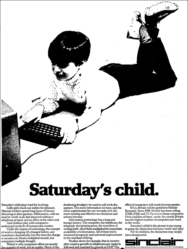
This is a picture of a young boy playing with the first computer I had in the 1980s. This advert claimed that where the steam of the industrial revolution multiplied muscle, the product of the computer revolution was going to be the multiplication of thought. The ZX Spectrum had 48k of memory, little rubber keys, and you loaded software onto it by playing programs in from a cassette recorder. It feels a world away from the touch-screen connected devices that we now take for granted, but that early introduction to computing has formed the background for a long career in digital.
In the early 2000s I worked at the BBC in London. My first job was to promote BBC content to search engines. In the days before Google came to dominate English-language search, this sometimes meant literally registering newly published web pages by filling in forms on services like Excite, Lycos or AltaVista. I worked with search engines a lot, and I soon came to realise that by reading the things that users were typing into the search engine, you could begin to understand the type of content they were looking for, and the things that they couldn’t find. It helped with ideas for commissioning content, and for spotting problems with site navigation. Over the years I gradually became an “information architect” - practising the art and science of organising large scale websites.
After the BBC, I lived in Greece for a while, and I worked for Sony in Salzburg. True to my British language skills I didn’t learn Greek or Austrian either. At Sony I worked on the design of front-end and back-end systems to support digital music services, one of which was built for Vodafone. It gave me early experience of designing for broadband mobile services.
Towards the end of the 2000s I joined the Guardian newspaper in London, taking up a “user experience” role in the technology team. I stayed there for three-and-a-half years, and worked across many projects including the newspaper’s iPhone, iPad, Android and Windows Phone apps, and their award-winning — but not universally popular — Facebook integration.
And now I run Emblem — a small digital agency whose clients include Libération in Paris, and a range of other media and publishing companies, arts bodies and museums.
Through all those roles I’ve had a real focus on developing products and services that are based on what the user needs to do, rather than what the company wants them to do. It is a role that can often lead to conflict with editorial and commercial areas of a business, and a role where you constantly want to redesign, iterate and improve on your work, based on real user research, not just on a hunch or a whim.
It’s a mobile world
And everything about user research at the moment tells us that our audience is going mobile.
At the London Olympics, according to this brilliant set of data from Head of New Media Alex Balfour, 60% of traffic to the London 2012 website during the course of the Games came from a mobile or tablet device.
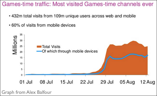
A graph from Alex Balfour’s presentation
The Financial Times, tracking usage across the day, sees distinctive patterns of when people are much more likely to be using phones or tablets rather than being chained to their office desktop machine.
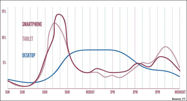
Patterns of usage of the FT.com
At some times of the day, traffic to the Guardian website from mobile devices exceeds that coming from the desktop, and some of my ex-colleagues recently published a breakdown of the sources of mobile traffic to the Guardian.
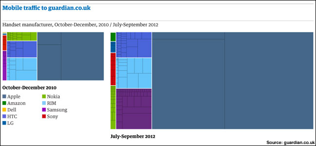
The make-up of mobile traffic to guardian.co.uk
Developing for so many devices is tricky, as the article explains:
“The challenge that faced our mobile team — designing a web page that caters to all these different device types — becomes clearer when you consider just how many individual handsets you're dealing with…Samsung and HTC alone now account for well over 100 devices. Add in Nokia and you're at more than 150. Add in RIM, Sony and LG and you've broken 200.”
What isn’t a surprise in the figures is the dominance of Apple’s platforms. What is perhaps a surprise is the spectacular overall growth of mobile traffic.
“These breakdowns mask perhaps the most important trend of all, which is the sheer rise in overall traffic to our site on mobile devices. Two years ago, mobile traffic was less than a quarter of what it is today. We now serve roughly 3.3 million pages on mobile devices each day, not including views of our iPad app.”
Many businesses are still trying to make a decision about whether they have a mobile or tablet strategy. It seems clear to me that the audience already has one, and that is to go mobile first.
Mobile doesn’t mean moving
Well, at least to go mobile device first. One persistent myth when designing for small screen devices is that people are using them on the move, with limited bandwidth or access to the internet. Whilst some people certainly do use their phones or tablets whilst running for the bus or the train, if you think about your own usage, you’ll realise that the last few times you used yours was probably when you had a brief moment of boredom or time to kill, and you were probably in an indoors location.
At Google, Hendrik Müller, Jennifer Gove and John Webb recently published a research paper describing a study into tablet usage in the US. Their study had 33 participants, who kept a diary of their usage, as well as being interviewed and observed in action.
Their report verified what I’m sure we all already suspected, that tablet devices are overwhelmingly used in the house, with the couch and the bed being the two most popular locations. The most popular activities by far are checking email, playing games, checking social networks and looking for information.
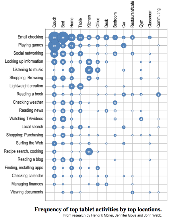
A diagram from the research by Müller, Gove and Webb, showing the activity and location of use recorded by participants in the study.
“Reading the news” was done on the tablet by around 45% of users:
“Participants primarily used native apps (e.g., Slate, Wall Street Journal, Fox News) and aggregators (e.g., Flipboard, Pulse) to access news content, though several reported using the browser to surf across favorite news sites (e.g., CNN, NYTimes, and local news providers).”
That figure may seem on the low side. I guess the good news is that it still means there is a proportion of the market to play for.
Patterns of tablet usage change during the week:
“Weekdays showed more frequent email checking, managing of calendars, and checking the weather, but also included longer activities such as listening to music or social networking; however, activities such as watching videos, playing games, reading, and shopping were more frequently done on weekends.”
That may give you cause to think about the rhythm and scheduling of the material you are publishing for the tablet market.
Users are also frequently doing something else at the same time as using their tablet device:
“41% [of uses of tablets reported in the study] showed partial engagement. Note that this number is to be considered as a lower bound as it is possible that participants under-reported or forgot to explain those activities they were engaged in outside their tablet use. The most frequently reported non-tablet activities that participants were doing at the same time they were using their tablet were: Watching TV, eating or drinking, cooking, waiting somewhere, getting dressed, talking with others, and exercising, among others.”
User research
Putting the user at the heart of your tablet strategy means putting user research at the heart of your product development. I’m passionate about getting users involved in development as soon as possible.
At the Guardian I would use “guerilla usability testing” to get quick reactions to designs. I would take my laptop down to local coffee shops or libraries, and approach people sitting on their own looking bored, and ask them if they would help me with some research. With a phone and a small camcorder, it is cheap and easy to record the sessions.
We also invited people into the Guardian offices. We’d put a pop-up on the technology section of the website, and ask people to come and look at products like the iPhone and iPad apps whilst they were in development.
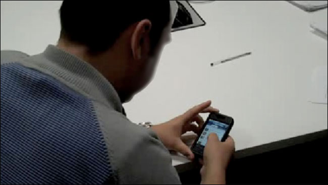
A user testing session of the Guardian iPhone app
Testing this was isn’t a rigorously scientific process. You have to realise that the people likely to respond to that type of approach will be inclined to be favourable to the brand, so the research has to be about the bare bones of “can they use the application”.
If there is budget — and to be honest it is always cheaper to fix a bad product idea before you’ve written all the code — you might use a lab for this research. In a lab situation, the user and a facilitator sit in a room and use and discuss the product. The session is filmed, and can be observed by other people through a one-way mirror. It is a little like the interrogation scenes in US cop dramas.
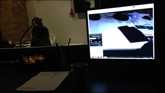
A lab-based user testing session
When building a new product a typical session might involve some time exploring how the person uses their device, and getting them to show any favourite apps or websites. Then you might get them to explore the websites or apps of rivals, or services you particularly admire, to gauge reaction to their features and design. Finally you might then explore a prototype or fledgling version of a new service, to get reaction and confirmation that users understand how to use what you are building. And that they are interested in what you are building.
Put reading at the heart of the experience
It sounds obvious, but I think we need to put reading at the heart of the tablet user experience for news.
It sounds obvious, but often it isn’t. The reason that browsers like Safari have ended up including “Reader” modes that strip websites back to pure text, and that services like Readability exist, is because we’ve often done such a good job of filling our websites with adverts, noise and clutter.
When you load an article on the website of my local newspaper in London for example, the actual text of the article usually only occupies about 9% of the screen. On a tablet the font size requires pinching and zooming to get it in focus on the screen. What does that say to your reader about how much you care about their experience?
I want to look at three services that in different ways have put reading at the heart of their experience.
Matter
Matter is an experiment in supporting long-form investigative journalism about science and technology. Recently at news:rewired in London publisher Bobbie Johnson explained how they were breaking “all the rules” of online publishing. They only publish really long pieces. They publish infrequently — their current aim is one a month. And they expect people to pay for journalism — their first story was $0.99.
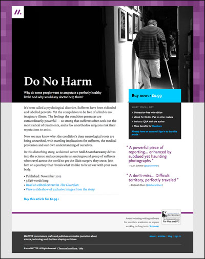
The first “edition” of Matter
Bobbie explains that the reason for not publishing that frequently is out of respect for the reader. Matter’s articles are around 5,000 words long, and how many of those can you realistically expect someone to read in a week?
Bobbie also talked at news:rewired about rethinking the design of “long-form” for digital services. Most design flourishes are still based on the heritage and typography of print. He cited the pullquote as a classic example. People use pullquotes in magazine to catch the reader’s eye as the flick through the pages. When you are 4,500 word through a 5,000 word piece, you don’t suddenly need to be distracted by a large glob of text repeating something you may have already read. It isn’t a design element that performs a digital function. Matter is fully cross-platform, and the team have worked hard on making that purchase and reading experience as seamless as possible.
Medium
Medium is a new blogging service from Evan Williams and Biz Stone. The presentation style is brutally simple. The reader arrives at a page to read an article, and all they have available to do is read. The simplicity of Medium isn’t just about the presentation of the content, it is also about the simple creation of content. It is a simple tool to write with.
New blogging platform Medium
The writing process is incredibly important, and I’d also draw your attention to IA Writer, a writing app for iPad and the Mac. The whole focus of the app is on writing, leaving distractions like editing, formatting and styles to other word processing software. Think about how complex your CMS is to use by comparison. All the buttons and switches it has for features that you barely use.
When I was designing the interface for a new live blogging tool at the Guardian, I worked hard to minimise the number of things in the interface for the journalist. So that they could concentrate on content creation, rather than content management.
Wireframe from the Guardian live blogging CMS re-build
Atavist
Atavist is an app and platform that I really like. Another attempt to provide a revenue stream for journalism, through their own app they sell stories that include embedded video and audio. Once downloaded, the user doesn’t have to be online to access the multimedia. The team have made their tool available to partners, and news outlets like the Washington Post have used it to build story-driven interactives that require journalism but not programming skills.
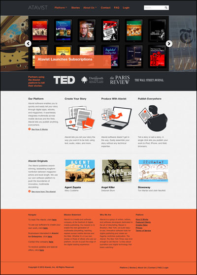
The Atavist homepage
Having a simple focus
Users approach using their phone or tablet in a different way to using the desktop. Think about the kind of sites that news publishers design. So often we worry that the user needs to be able to reach every single recently published story and every single section and every single type of content directly from the front page. This produces a really busy interface that overloads the consumer.
I’d bet that most of the apps that you use on your phone do one thing, and do it really well. Compare that to Microsoft Outlook. On the desktop, Outlook is your email client. It also manages all of your contact information. And your calendar and appointments. And it has a task list functionality. All of these very different functions compete for space on the screen.
Then look at iOS. Mail, Contacts and Calendar are three separate apps. The user makes a choice up front about which task they are trying to perform, and then the phone or tablet can provide an interface that is completely focussed on that task.
Polar is a new app that does one simple thing and one simple thing very very well. It is set up so that users can quickly make votes and share them with their friends. They get to outline two options and pick two images to go with them. Almost every news publisher in the world has some form of interactive voting on their website. Not one news publisher thought to spin that element of their site off into a little app.
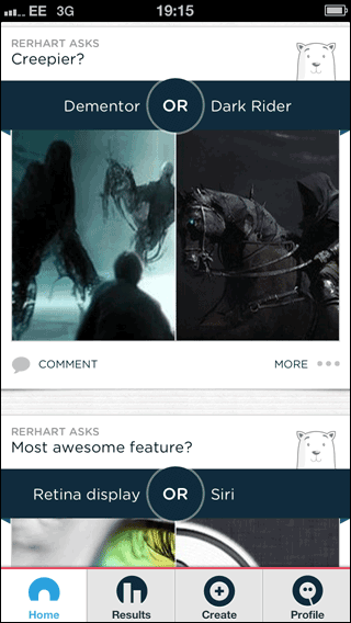
The polar voting app
Luke Wroblewski, who worked on Polar, described how they relentlessly tested it to bring down the amount of time it took for a user to set up a vote using one thumb. Remember, 41% of users are doing something else at the same time as using their tablet — Polar optimised for the distracted user. I doubt there are many, if any, news organisations who have relentlessly tested their apps or web services to minimise the time it takes to do a couple of key primary tasks.
One of the reasons why technologists and software developers have become so important to the news and publishing industry is because you can’t afford to treat the way your content is digitally packaged as an after-thought. The software has become your brand.
When doing his brilliant design work on the Guardian’s iPad app, my friend Andy Brockie made lots of sketches and animations of how the transitions should work. But it was only when Martyn Reddington coded it that we could see whether the app felt responsive to the user’s touch, or whether it felt slow or unnatural.
Responsive web design
Making services for tablets isn’t just about native apps. Several news organisations have used “responsive web design” to provide an experience tailored to the screen the site is being used on. “Responsive web design” involves building web pages that can detect what size screen they are on, and what orientation the user is holding it in, and then adjust the content they display according. The Boston Globe, Time Magazine, BBC and Guardian are just a few of the news organisations taking this approach.
The approach has several advantages to the business.
Firstly, you are only building one thing. You don’t have to build an iOS app AND an Android app AND a Blackberry app AND a Windows Phone app. One codebase adapts to the size and shape of the screen. This should make maintenance easier, and as new devices arrive on the market your site may only need slight tweaks, or no tweaks at all. Sure, some IT departments will tell you that this is going to be another expensive re-build of your infrastructure. But getting your output into clean and semantic HTML5 is only going to provide an excellent base for whatever technology is in the consumer’s hands in three, five, ten years time.
Secondly, building a “responsive” site helps you with the focus on simplicity and user need. If you start by designing for the smallest screen and then scaling up, you find yourself questioning every additional piece of functionality, navigation and content. You find yourself asking: “Is this element really necessary?” all the time.
There are some drawbacks. The technology to optimise images and the size of file that you deliver to the smallest devices is still in its infancy. A badly designed and configured responsive site can be worse for some phones rather than keeping a separate mobile site.
Thinking “responsive web design” changes the way we work. You have to get coding earlier. The still below is from a video about the Boston Globe’s responsive redesign, and it shows their testing rig — lots and lots of devices with varying screen sizes, stuck to the wall in various orientations, all set up to show exactly the same page from the site at the same time. With this kind of test bench, and designing in code, you can immediately see the effect of changes across multiple devices and breakpoints in a way that would take hours to replicate in InDesign or Illustrator or Photoshop.
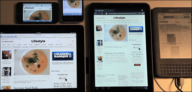
The Boston Globe’s testing rig for their responsive design
“Responsive” also means changing the way we think about access. The BBC News responsive site attempts to detect how fast your connection is, as well as your screen size. If you are on a slow connection, it doens’t showcase the video the BBC has. If you are on a fast connection, however, just because you have a small screen isn’t any reason to hide multimedia from the user.
Further reading
If you want to understand more about all of this, I recommend a trio of books on the topic.
Ethan Marcotte’s “Responsive web design” is the more technical of the three, but gives a very good basic understanding of how responsive websites need to be built, and would help anyone in the business appreciate more the technical challenges and realistic opportunities of building such a site. It might also help you win a couple of arguments with an intransigent IT department or supplier.
Luke Wroblewski’s “Mobile first” is particularly good for outlining the case for making sure that everything your users are likely to want to achieve, they will want to achieve on their smartphones.
Finally, Karen McGrane’s “Content strategy for mobile” is the definitive explanation of the how and why of getting your content into the right structures and processes to allow ‘COPE’ publishing — create once, publish everywhere.
None of the books are too expensive — the digital versions are around $9 and A Book Apart often offer discounts for bundles or multiple book purchases. None of the titles will take more than a couple of hours to read, but they will be invaluable in preparing you for the publishing challenges that lie ahead, in a world where digital content consumption is going to be predominantly mobile.
The future…more of the same
Life isn’t going to get any simpler for publishers. The future is going to bring us more of the same. More devices. More screen-sizes. But hopefully more users. Digital technology has given news brands the opportunity to reach across borders and develop new audiences and new products.
In order to face that challenge, we have to understand what our users really want to do. We used to only have to compete with similar businesses with similar distribution abilities. Now we are in competition with anybody who can press publish on Tumblr, with the very companies who used to pay us to advertise who know make their own content, and with a whole range of start-up digital only publishers.
If they take more care of our audience then we do, we’ll lose them.
This is the essay version of a talk given at the WAN-IFRA “Victoires de la Presse” awards in Lyon. Some sections have previously been published on this website as parts of talks given at the World Publishing Expo in Frankfurt, and news:rewired in London.