Eye-tracking, designing for older users, and redesigning playmobile.pl at the Polish IA Summit
This week I’ve been publishing the notes I made in Warsaw as I attended the Polish IA Summit. Today I’ve got my thoughts on 3 sessions which featured eye-tracking, designing for older users, and redesigning playmobile.pl.
Przemysław Głaczkowski - “Machines in the city”
Przemysław Głaczkowski was presenting the findings of an eye-tracking study into the way that people used automatic ticket machines for urban transport. They had equipped the testers with glasses that videoed their actions from their own point of view, and also had an eye-tracking element, so that you could see on the video where the user was looking. The video footage was impressive, as was the bemusement in the audience as we watched one test subject spend 58 seconds trying to force some coins into a closed slot, only to turn to the moderator and ask for some fresh coins, rather than realise they were trying to start a five step process at step three.
Ultimately though, there was a sense of disappointment at the end of this presentation. It had been commissioned to trial the testing technology, and not actually as a project to improve the user experience of buying a travel ticket. Despite plenty of evidence of some severe usability issues with the system involved, there was no prospect of them being fixed. It also wasn’t clear whether the video/eye-tracking combination added anything to the evidence, apart from the footage, that an expert review of the interface wouldn’t have uncovered anyway.
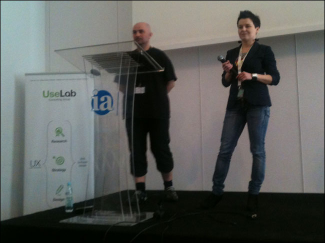
Anna Liszewska and Jakub Mielczarek - “Older people and the IA of health care: Case study”
Anna Liszewska and Jakub Mielczarek presented some findings from testing “older people” using the internet. Poland has one of the lowest take-up rates of internet connectivity in the EU amongst older residents, but an ageing European population means that we are certain to have lots of older net users in the near future.
Some of the things they uncovered - don’t use small fonts or jargon, instructions should be clear and concise etc etc - are pretty good watchwords for digital design for people of any age. Accessibility issues around video and audio content were a specific concern as users got older.
One issue they uncovered that intrigued me was users who didn’t have some of the conventional mental models of internet interaction. They showed one user, for example, trying a site search box that did not have a “search” or “go” input button. She had no idea of how to execute the query - it simply did not occur to her to press “enter”.
I do expect, though, that this kind of issue will diminish over time. As today’s forty somethings become the fifty, sixty and seventy somethings of the next three decades, they will presumably be bringing their existing online experience along with them.
Paulina Rzymska and Marcin Piotrowski - “Playmobile.pl - from concept to implementation”
Paulina and Marcin had both worked on a redesign project for telecoms and internet provider playmobile.pl, she on the agency side, he on the client side. Together they told the story of the project in a playful way. Even in translation they brought a lot of humour to the subject and made a charismatic duo on stage. Aided by having cute cartoon icons of a cat and a panda indicating who was going to be doing which bit of the presentation.
Paulina and Marcin were a charismatic duo even in translation
A highlight for me was that they showed lots of sketches from early on in the project, where they had held a joint workshop between people in both companies. I love collaborative sketching and wireframe workshops, they are great tool for breaking down the barriers between different disciplines working on a project together. Marconi also injected a good deal of humour into this section - suggesting that the sketch that had been closest to the final design had actually come from his team, not the agency, and that maybe they could run the projects themselves in the future.
Their proposed solution really slimmed down the number of options on navigation, and featured a very simple look. At the last moment, prior to launch, they looked around their competitor set and saw that, in contrast, they were adding more and more features to their websites. Marcin had a moment of doubt about the design, but in the end they decided on making simplicity their differentiator.
They other thing I liked about Marcin’s style was his frankness. After Paulina has spent some time explaining the methodology of their agency - K2 - Marcin chipped in with the rather less prosaic “We as the client are thinking ‘Let’s have a cool website that sells a lot’”.
Next...
In the last parts of this series I’ll have my notes from the talks by Claire Rowland & Chris Browne and Peter Boersma.