If there is one thing I've learned about design, it is that you can't please everybody
by Martin Belam, 15 September 2010
Last week I wrote a post about how I ended up with the current stripped down design for the blog.
The first comment left underneath suggested the choice isn't universally popular:
"To be honest I think you've went too far in this direction and your pages look very dull now. I find myself more eager to skip your blog posts because the website is so uninviting."
"Have you designed the site specifically for ease of mobile use, as the last commenter said it is slightly sparse. Web site good for mobile but needs a block of colour or gradient to make it slightly more appealing to the end PC user."
Fortunately, Twitter stepped in to help.
@themanthatfell took time out from telling the Mayor of London about his bus journeys to send me the block of colour and the gradient so lacking on my pages.
@poohugh offered me a useful graphic with which to tile the background.

And my friend Lee, whilst pointing out that my blog currently looks like his Evil Coffee blog did in 2002, took the time to rewrite my CSS file for me...
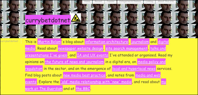
I'm especially fond of his inclusion of the 'man at work' sign...
Well if it makes you happy, I rather like it as it's pretty comfortable reading well–spaced, 18px Georgia.
You could smarten up the comments form a bit, though…
Well it makes me less likely to read your blog when you have blog posts dedicated to ridiculing comments made on a previous post. You should have put 'no criticism wanted' if you only wanted positive comments, I thought my comment was fair and didn't deserve this at all.
"Well it makes me less likely to read your blog when you have blog posts dedicated to ridiculing comments made on a previous post. You should have put 'no criticism wanted' if you only wanted positive comments, I thought my comment was fair and didn't deserve this at all."
If he only wanted positive comments, I doubt yours would have made it past the moderation queue.
You should've kept the yellow background and pink highlights. That'll keep us reading your blog for sure! (no sarcasm here!)
I'm with you man, I prefer the clean and simple designs as well. Keep fighting the good fight ;)
Hi Adam, not quite sure what to say in response. Other people picked up on your original comment without me prompting and started talking about it on Twitter. It sparked people sending me alternative designs, and I've just rounded up that reaction.
I'm more than happy to accept and publish criticism in the comments - a recent favourite was "The dick that put this up has no fucking clue.. No Political clue, No History clue,No Geography clue, No clue in life.. your a joke."
I personally feel most of the time less is more... I like the new look.
Actually, just this morning I received an email that started "Dear Martin , I visited your website www.currybet.net. I am a web designer and wanted to know if you have any work available for me". I guess that could be an implicit criticism too...
Hi Martin,
I read your write up about the problems you had after one of your blog posts became very popular and your server struggled with all the traffic it generated. I liked the solution and quick fix, very responsive!
Your content and posts are current, interesting and in-depth. The fact you have generated too much traffic for your server to handle demonstrates the topics you cover gains visitors.
So content is obviously the key reason people visit your blog and the simple design focuses people onto what you have written.
Designers are designers, they inherently want to design, and I don’t know many designers who give frequent and quality content to the web. So they are a different breed.
People who say they will not visit your blog anymore must be able to find the same level of content elsewhere. I personally haven’t found a better source for the topics you cover.
I would be interested to know the change in bounce rates; with the old design, while your server nearly died due to overloading of traffic and now you have a simple design in place. My guess would be that people are now spending more time on your blog and they are not bouncing away so quickly.
Lee
Font : Verdana, Helvetica, sans-serif; and font-size: 13px or 14px. It will look clean, professional and good. Plus it will be more comfortable while reading it.
No offence but it is my feeling. Everyone have different taste!
Cheers mate :)
I totally agree with you - there is always someone who doesn't like the design of something and you know what? I think it's good mark of the fact, that the design is good! Because if the design was meant to be appealing for everybody then it would have to be completely ordinary and boring.