The Times iPhone app review - a thumbs up from me
I suspect that most blog posts about News International this week will be on another topic, but I’ve been reviewing The Times iPhone app. Here are a few of the things I’ve noticed and liked or disliked.
Subtle Sunday changes
I’ve been banging on about Sunday newspaper branding in a couple of blog posts recently. The Times iPhone app doesn’t stop working on a Sunday which I appreciate, and it features both The Times and Sunday Times mastheads in the splash screen. When viewing the app on a Sunday the masthead changes. There is also the subtlest of changes to the icons on the home screen, which is a nice touch.
On Sundays, the news icon switches to “ST”
Front page design
I like the front page design of the app, but I have a slight misgiving about the font size for headlines. It works for me, but I think my dad would struggle to read it.
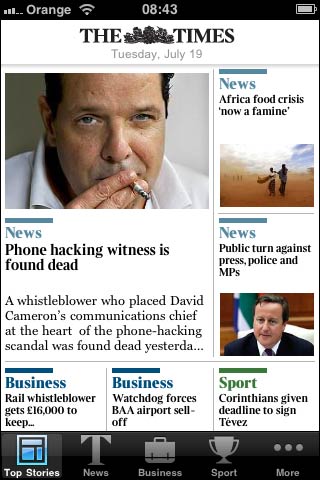
Front page of The Times iPhone app
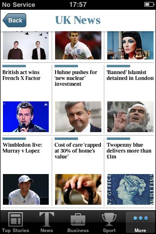
It is also quite easy, I think, during the course of a scroll down, to end up mismatching the thumbnail image with the headline. Who knew that Huhne played for England, and that Cleopatra was banned from the UK? I’d want to bring the images closer to the headline.
Customisation - with limits
One thing that did bug me - a limit on the amount of customisation. There is a “Configure” screen where you can drag-and-drop different section icons to make up your own toolbar menu. But you can’t remove the “Top stories” button.
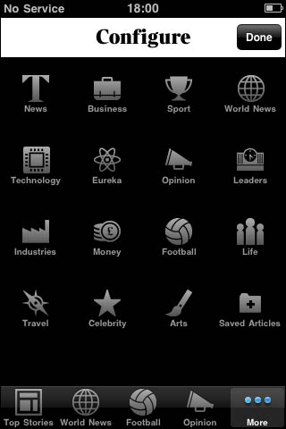
In fact this is just down to the way it is labelled. If the first button was called “Home”, I wouldn’t even expect to be able to remove it. But calling it “Top stories” makes me feel like the app is editorially saying to me that I can’t be trusted not to be interested in the main serious news of the day.
No search
Search is often quite low down on the priority list when making a news app or site - a decision I usually agree with. However, I did find that on first run of The Times app all I wanted to do was find my favourite things about The Times - Caitlin Moran and the Times Archive Blog. Without search, I couldn’t.
Disappearing furniture
I’m very impressed with the way that the furniture and navigation disappears from the article view. When you first load a story, there is a clear route back at the top of the page, and your standard toolbar navigation at the foot of the page. This then fades out, and can be recalled with a tap. It gives the app an extra 18% of screen real estate for the reading experience, which is really smart.
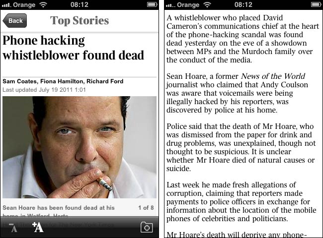
The app gains extra screen real estate by fading navigation controls away as you begin to read
And overall...
It is always easy to be picky about news apps, and list lots of features that could be there and aren’t, but overall I find The Times app really impressive. I’ve found it solid and reliable, and very responsive. The automatic caching of stories is very handy for when traveling through the patchier bits of 3G coverage near where I live.
And the main thing, from their point of view, is that having the app has made me consume more Times content in the last few weeks than I had done in the previous few months.
Do they already have an app in Android?
Yes, Mel, they do