Guardian Open Platform powers the m.guardian.co.uk relaunch
Yesterday we unveiled a brand spanking new version of our m.guardian.co.uk mobile site. It was first launched back in March 2009.
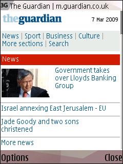
The m.guardian.co.uk site as it appeared on my Nokia N95 at launch
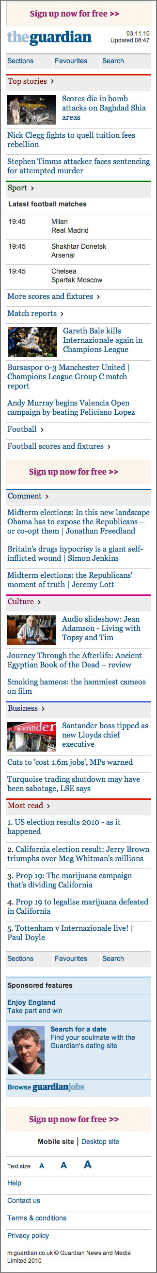
The new m.guardian.co.uk. Click the image for a full-size version
As well as a fresh look, there has been a significant change in the back-end. I blogged earlier in the week about Mike Bracken's presentation to the Gartner Symposium, where he talked about how the Open Platform saves us development costs. m.guardian is an example of just such a product, built off our content API.
The shift to using the API irons out some of the major frustrations with the previous incarnation of m.guardian.
The site had effectively been a re-skin of our RSS feeds. That meant that once articles were no longer available via RSS, they disappeared from view. It also meant that sometimes we tweeted links before the relevant RSS feed had been refreshed, so that when you tried to click on them on your mobile you'd get a message saying that the article wasn't available yet. Not a good user experience at all.
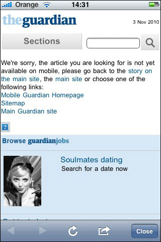
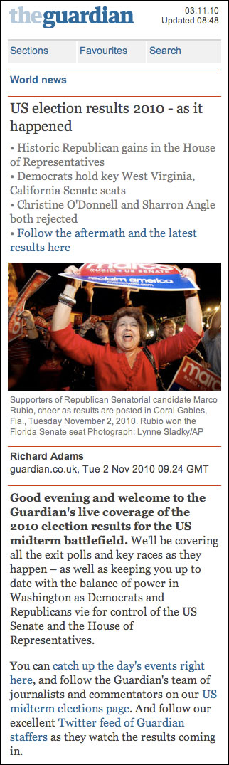
Because of technical constraints, the old m.guardian.co.uk site could sometimes have a frustrating user experience
The other thing that the API gives us is better formatting on articles, complete with inline links, and a search facility that now covers all of the ten years or so of content in our database.
The previous version of m.guardian.co.uk did not feature inline links, or support our live blogs particularly well.
Now built on the API, the same live blog appears properly formatted and includes hyperlinks
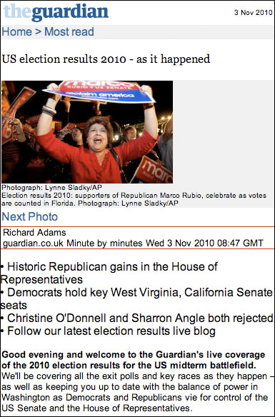
Earlier this week, for example, a vanity search for my contributions to m.guardian would turn up blank, as there was nothing in the current RSS feeds. With the API though, you can see that a full set of results featuring lots of articles I've authored or featured in are listed, and they are available in the mobile format, regardless of when they were published.
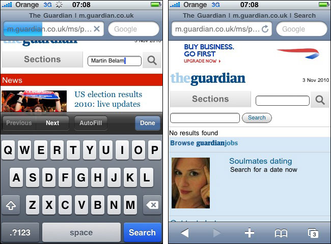
The m.guardian.co.uk search function used to be restricted to items that were currently available in our RSS feeds
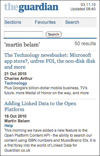
The new API-driven search looks over the full archive
Finally, a new feature which I'm really pleased with is the ability to favourite sections. Even with modern touchscreen devices, navigating through the tiered hierarchy of a news site can be tedious, and so now by clicking a little star icon at section level users can create their own menu of shortcuts which they can access from any page.
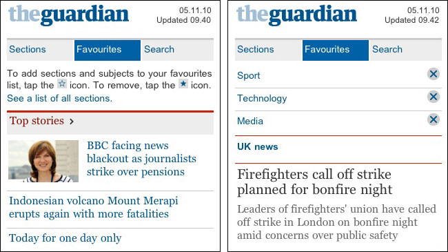
Favourites functionality on the new m.guardian.co.uk site
Guardian News & Media also took the opportunity of the m.guardian.co.uk launch to announce some upcoming changes to our iPhone app.
as a android user I was waiting for the official guardian App - but the new mobile site is very quick... even when I can't get a 3G signal in the shed.
my only small issue is when you use search in the current section - it searches the whole api and not just the current section (choice would be good)
also if you have links to the RSS feed to that section you on it so you can bookmark it on phone homescreen or is that just the browser not showing it?
wilco
This is a great improvement, good work. As well as what's documented above it's a bit more pleasing aesthetically and the reading experience looks much nicer.
It's really good (on my Nokia N78). It'd be churlish to note that it appears to be a whole site more usable than the desktop browser version of The Guardian's site.
Honestly, the new m guardian looks a whole lot better than the old site. wonder who was responsible for that. haha. good work!
Congrats on the new version of mobile Guardian. Are you able to track the ctr and effectiveness of the new version compared to the last?
The new m guardian looks great - I'm curious about the stats/user experience information.
Based on the screenshot, the app does look appealing for an iPhone screen resolution. I tried it on my blackberry, and i must agree with Matt. It offers a great aesthetic value. nice post by the way.
Congrats! New guardian mobile site is alot better then the previous one. My only small issue is when you use search in the current section - it searches the whole api and not just the current section (choice would be good)
Were the changes subject to any specific split testing or multi-variate testing? Just wonder how the final changes & design were decided upon?
yes, i'm loving the new m.guardian and it works fine on my nokia N8, feels much better than the desktop version of guardian ;)
wow, congrats! definitely a huge improvement. nice job!
I just visited the guardian website on my iphone and it looks great. Very user friendly IMO.
"That meant that once articles were no longer available via RSS, they disappeared from view"
Well, good move. :-)
I think this is a great improvement. By the way... new guardian looks better than the desktop version.
Is there an iPad version?? Some of the new newspaper apps for USA papers are INCREDIBLE (New York Times iPad app is amazing)