Reactions to The Guardian's new mobile site
Last week The Guardian launched a new bespoke mobile version of our website at m.guardian.co.uk. During the same week It was interesting to see that there was still some life left in the should-you-or-shouldn't-you have a specific mobile facing presence.

Jakob Nielsen still very much thinks you should.
"Mobile phone users struggle mightily to use websites, even on high-end devices. To solve the problems, websites should provide special mobile versions."
Bruce Lawson over at ZDnet disagreed:
"He's wrong. Making two or even three mediocre sites, designing and user-testing them, then trying to keep them in sync is a waste of time and money. Concentrate on preserving the 'One Web': that is, make one really good site that works across all devices."
I have to say that I still, at the moment, tend to be in Jakob's camp. I think there are good reasons to have a platform neutral data architecture, but to present it in very different ways on different devices. Mobile phones and desktop computers have totally different contexts of use, displays and input mechanisms.
Despite the industry love affair with the iPhone, there are plenty of Internet enabled devices that struggle with putting big screen oriented websites on the small screen. This occurs even when the content itself isn't complicated, and it is simply the design and technical implementation getting in the way.
The reaction I saw to the m.guardian.co.uk site across the blog'n'tweetosphere seemed broadly positive.
BadlyDrawnToy was pleased by the fact that they no longer had to use the full-fat version of the site which keep breaking their phone.
"The regular website proves (to me) that you can pinch and zoom a page as much as you like, but it ain't easy to read and navigate on a mobile phone. It also showed how flaky Safari is on the iPhone - wait ages for a page to load only for the Javascript to cause the browser to commit suicide."
A lot of people obviously have low expectations of newspaper new media projects, and on Twitter, Kerin posted:
"m.guardian.co.uk in not complete shit shocker."
Micycle was looking for more personalisation:
"Liking new mobile guardian at m.guardian.co.uk (except - how do I lose sport?)"
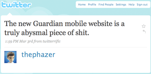
Not everybody has been impressed, especially one of the regular commenters on the paper's media section - Phazer
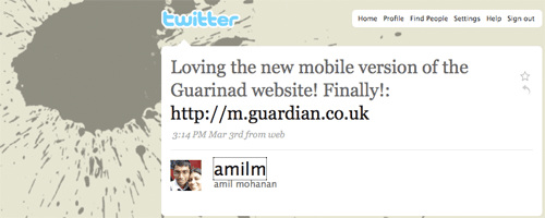
But some people seemed very happy to share their joy on Twitter.
I'm very much an 'eat-your-own-dog-food' kind of guy, so I've set it as the homepage on my N95 to see how I get on with it. Although the technical delivery of the project was done out-of-house, the fact that there is now a specific mobile portal for Guardian content will impact on nearly all of the IA work that I do on emerging products. [1]
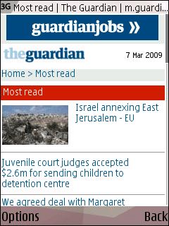
I've also bookmarked a few of the pages that I think will be most interesting on the move, including the decision to give the 'Most read' list its own mobile homepage. I think it seems like a useful way of presenting the most interesting stories across a range of genres, in one easy to digest mobile page.
[1] I didn't work on the project, but according to the press blurb: 'Development partners include marketing firm Bluestar Mobile, while technical platforms were built by Mobile IQ, Momac and Roundpoint and mobile data specialists Win'. [Return to article]
To expand slightly - the only reason an iPhone user would go to the mobile site in general is because the existing, main Guardian site is broken - it's comment system, powered by the ghastly Pluck who overscript everything with terribly coded Javascript - does not display.
The logical solution would be to fix this, so it works. Displaying comments in HTML is not that tricky a thing to do.
But instead, we've got a new site that removes all the comments functionality entirely. It's like trying to cure a cold by decapitating someone.
And the main site still doesn't work. Which is why the whole idea is conceptually shit. I'm not a great believer in mobile sites at all, but mobile sites with less content than the main site are just horrid.
But don't forget that other mobile devices that can surf the interwebz are available apart from the iPhone, so not everybody wants a fully-featured widescreen version when they are on the move.
With regards to the comments - I've done a quick overview of some other newspaper mobile versions for a blog post later in the week, and I noticed that none of them carry their UGC on their mobile versions either. There doesn't seem to be any business drivers across the industry to do that so far - proportionally on a mobile page a lengthy comment thread will have a much greater impact on page-weight, packet data download times, and ultimately, billing for users.
The design is fairly decent - accommodating mobile constraints while still being on brand. But I question the use of animated gif banners at the top - not only as they are annoying and take up (in my view) too much space but they can't be good for bandwidth either.
Absolutely there are devices less web savvy - but I would argue that those devices need a different site to the site you're aiming at smartphones with desktop or near desktop browsers. Part of the issue with the Guardian site is that it tries to conflagate the same user experience for people with iPhones as people with £30 PAYG Nokias, when they're completely different devices. The iPhone market needs a site that is either special or just the main site to work (ideally just the main site with 100% of the content and it's page layout shifted round ever so slightly so the main content hubs display nicely - but a very minor change in the spreadsheet). The site as is is still arguably too content heavy for the cheap Nokia, which really doesn't want anything more than RSS headlines and football scores (and would probably be quite well served with "GO TO LIVE SCORES" as the main hyperlink at the top of the page).
This hybrid doesn't serve anyone very well.
And the other newspaper sites might well not have their comments on their mobile sites - but the fundamental difference is, because they don't use Pluck, their comments display fine on the main site, and there's nothing to stop people with higher end phones going to the main site if they have the patience/wi-fi. Smartphone users can't do that on the Guardian site, because the main site is so badly coded and fundamentally broken.