The Winter Olympics online review: Part 2 - Visual navigation in Italy and France
I wanted to continue my round up of Winter Olympics coverage from around the world's online newspapers by saying that none appeared to be more beautiful at first glance than Dong-a Ilbo's special Olympics section from South Korea.

Although, thanks to my lack of grasp of the language, I remain slightly unsure whether the blue skier was part of the design, or part of the advertising campaign for Nike that you can see in the right-hand side of the screenshot.
Another South Korean paper, JoongAng Ilbo, also took a strongly visual and graphical approach with their Olympics section.

Graphical navigation elements
In Italy, La Gazzetta dello Sport had an interactive medal table. As well as an overall view, the user was able to drill-down into medal table breakdowns by Olympic discipline.
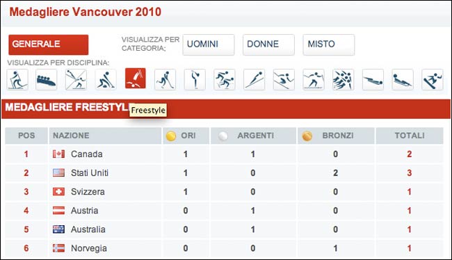
This used a graphical interface made up of the pictogram representing the different Olympic Sports. Whilst I found this to be visually neat, I do feel that the Winter Olympic discipline icon set is much less distinctive than the equivalent sets for the summer games.

Incidentally, during the course of Vancouver 2010, the New York Times published a video tracing the history of the Olympic pictograms.
Le Monde in France also used the Winter Olympic pictograms to allow users to navigate between disciplines in their Vancouver 2010 section.
Again I found this appealing visually, but not without problems. I thought it was confusing to have three tiers of navigation. You can see in this screenshot that I have selected 'Historique' in the primary navigation. This has defaulted to showing information about Turin in 2006, and above the Turin headline there is a list of years, which allows me to see an overview of previous tournaments, like Innsbruck in 1976.
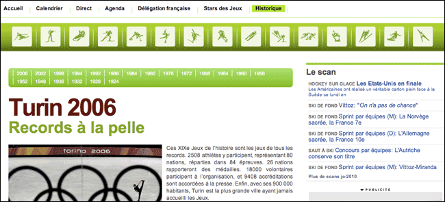
However, the discipline pictogram set interlopes visually between those two, even though the function it performs is neither related to the 'Historique' or the year. Clicking an icon takes the user not to a page about that discipline in the year you are viewing, as you might expect, but entirely out of the 'Historique' section and back into the 2010 'Calendrier' for that discipline.
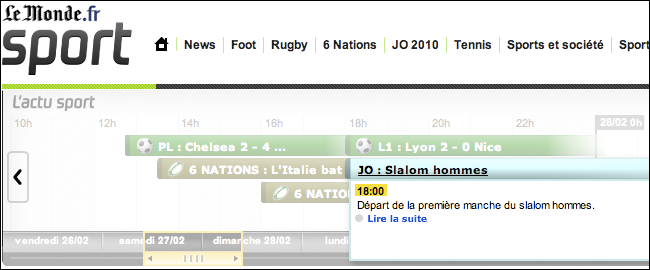
Where I though Le Monde used visual navigation much more successfully was in their 'live coverage' timeline. At the top of their sport pages was a scrollable timeline.

It shows the events that the paper is going to be covering live online. The user can scroll forward, to look at what is scheduled, and hovering over the event displays a pop-up with more details. The user can also scroll back, into the archive of live text coverage. Clicking on an event takes the user through to the page for that sporting fixture.
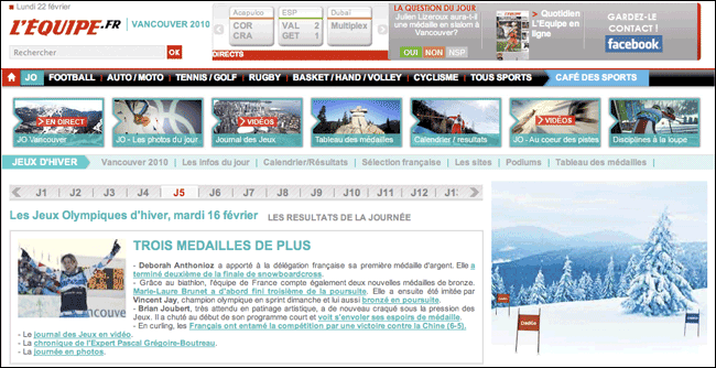
Specialist French sports newspaper L'Equipe had their Vancouver 2010 coverage on a special Olympics sub-domain, and also used graphical navigation to direct the user around their live coverage. In this case it was daily timeline of liveblogs.
This defaulted to the current day of the games, but allowed the user easy access to look at a growing archive of daily live coverage, e.g. day 5.
Next...
I'll be continuing this series next week, starting with a look at coverage of Vancouver 2010 in Sweden.
Excellent write up Martin. It is interesting to me how each country's digital media coverage is slightly different. Thanks for mentioning the 76 Olympics at Innsbrook. While staying in Bavaria a few years ago, I toured Innsbrook and really enjoyed it!
Thanks for posting this. I am always fascinated by online coverage of sporting events, along with the change in the swing of media from TV to online. There is millions, actually billions, involved in TV contracts, so much like the transition from oil to alternative fuels, the change won't come easy.
Hello, the blue skier you are talking about was a paid advertisement by Nike
-Holly