Social media unplugged: Part 4 - Google Bookmarks, Fark and Mixx
During the course of this week I've been studying the user experience when you encounter social bookmarking services for the first time. This has varied greatly, from something like Yahoo! Buzz with a comprehensive registration process which ends up asking you to confirm your 'buzz up' for the article that started your journey, to Newsvine, which just seems to throw up a browser security error if you are not logged in. In today's final part I'll be looking at Google Bookmarks, Fark and Mixx.
Google Bookmarks
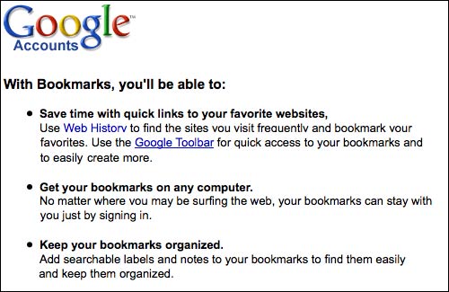
Yesterday I noted that I was unable to test the Facebook experience fully because of the overhead of having to set up a completely fake personality. There was a similar story with Google. Trying to save something with 'Google bookmarks' when not logged into a Google account left you on a page asking you to register. This did have a promotional slot extolling the virtues of Google bookmarks, but I've run out of verifiable non-Google email address to go through the process of creating yet another Google account, so I didn't go through the whole process here.
Fark
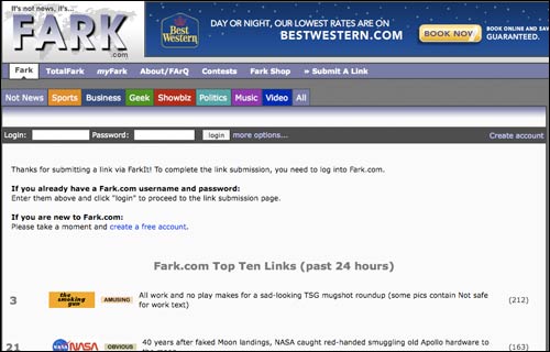
Clicking on a 'Fark' button takes you to a page where you get the option of signing up or logging in. There is also a list of the hottest fark from the previous 24 hours. Even though I was only going through the registration process for the purpose of writing this article, I ended up getting side-tracked by a couple of the stories on display.
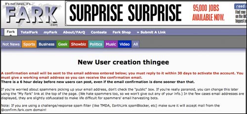
Once I was back on track, the sign-up terms and conditions very much prepare the user for the type of site they might be signing up for. Called the 'New User creation thingee', the page is very informal and conversational in tone:
"If you're worried about spammers picking up your email address, don't check the 'public' box. If you're really paranoid, you can change this later using the 'My Fark' link at the top of the page. (We hate spammers too, so we won't give out any of your info.) In the few cases email addresses are displayed, they are slightly obfuscated to make life difficult for spammers' email harvesting bots."
There is a minimum 6 hour delay between an authentification email for a new account being sent out and a new user being able to submit a story. Whilst I can see why this is great for battling against spambots and low quality self-promotional submissions, it does mean that the services loses the action that went into creating the account.
This still doesn't answer the question as to why you would have a Fark button on your site in the first place though. It may well generate some extra eyeballs - but since they will already be arriving with the idea that whatever you've written is nonsense and non-news, I'm not sure how valuable those extra eye-balls can ever be. It strikes me that just as movie posters never boast of having been nominated for Razzies, I'm not sure that credible news organisations should be encouraging their audience to describe their content as 'fark'.
Mixx
Of all the services I looked at, it was Mixx that had the most lightweight way of handling new users. Even if you had not used the service before, all you had to do was add some keywords to your URL, and your submission was accepted.
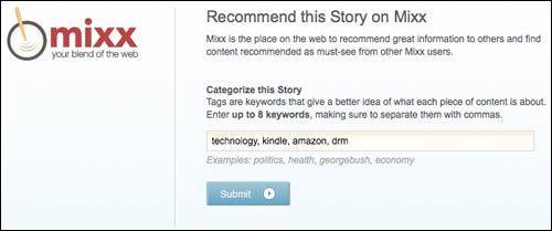
After making an initial 'anonymous' vote on Mixx, a user could go on to register in a more conventional fashion, but initially the submission is connected to the site that has been voted for. In this case it was assigned to 'Guardian Reader'.
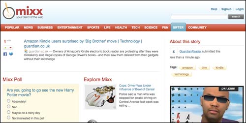
My chief concern here was that this set the threshold against spam very low indeed - especially if you compare it to a site like Fark which imposes a 6 hour delay on submissions from a new registered user. There is surely a happy medium in there somewhere.
And finally...
When I started this series I stated that I thought the page the user reached should facilitate three things:
- A route to log on. This caters for the case where the user is actually a regular contributor to a service, but is at that moment logged in.
- A route to register. There should be an easy opportunity for users to sign up to a service.
- An explanation of what the service is, and why it is of benefit. On the basis that people may end up on this page because they have pressed a sharing icon out of curiosity, social bookmarking sites have a user at the 'seduceable' moment where they can really sell their service.
Judging by those criteria, I'd say that the strongest performers in my 'social media unplugged' test were Yahoo! Buzz and Delicious. Digg also had a good system, but didn't seem to retain the URL that the user had been initially trying to Digg. Mixx and Reddit both had very lightweight user journeys, which I thought were very positive and well executed. I found the StumbleUpon process to be bit frustrating, with badly formatted pop-ups, and Newsvine's error page was a major user experience failure.
Did you get a feel for how easy it is to organize large numbers of bookmarks on the different social media sites? I found that some were easy enough to use in saving bookmarks, but it was hard to find certain bookmarks later on, especially when I had large number of them. Were any of them easier than others, or were most of them about the same?