“Experience Principles” - Christopher Lee Ball at UX People

Last week I helped host Zebra People’s UX People, a day long conference featuring talks and practical workshops from the likes of Cennydd Bowles, Jonty Sharples and Oli Shaw. You can download all of my notes from the day in an ebook for iBooks, for Kindle or as a PDF, and here is what I made of the opening talk by Christopher Lee Ball.
“Experience Principles” - Christopher Lee Ball
“I had a dream a couple of weeks ago about experience principles. Which is really sad” - Christopher Lee Ball at UX People
Christopher Lee Ball ensured that UX People met the required zombie quota, with a still from “Dawn of the dead”, showing someone’s guts being ripped out. This, he explained, is a lot like the design process when it goes wrong - everybody on the team ends up feeling “exhausted to the point of almost being shot through the head.”
His talk focused on a project that LBi had delivered for Virgin Atlantic - in which they had tried to live the brand’s values throughout the design process, so that the online look, feel and experience matched the offline one. But he started with an example of when there is a disconnect between online and offline brand. Miu Miu’s shops, he said, are a tactile and visual assault on the senses, packed with detail. Their website store, by comparison, is stark and arid, and has nothing of the brand experience about it.
He showed us one of the induction videos that Virgin Atlantic show to their staff, explaining the brand values. Or what Christopher described as the “brand onion” - concentric rings of different colours littered with words and phrases. One of the first stages of the design process was to break these aspirational words and phrases down into explanations and comparisons that designers and every other member of the team could internalise. He showed an example for one of the values - “alive” - describing what that meant to the business, and how it impacted on the types of persona they were designing for.
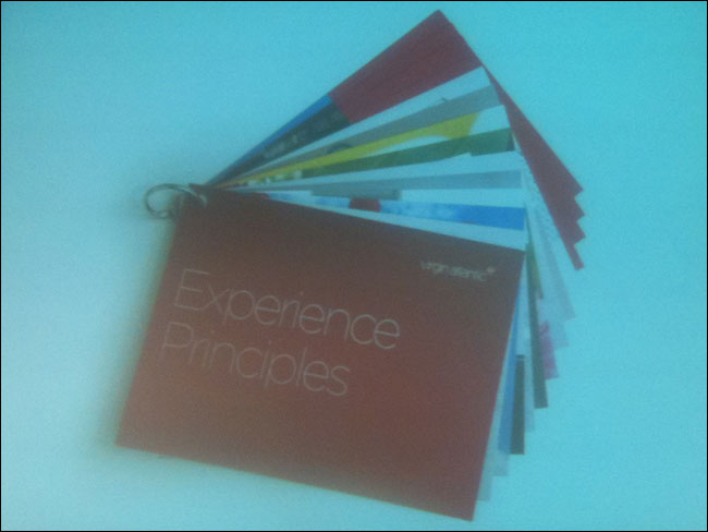
They made these into little sets of cards that everybody carried around with them. I must confess I’m sometimes sceptical about this sort of deliverable, thinking the cost of producing them might outweigh the benefit, but Chris explained they were great on this project. Anytime they were making a tricky decision “these little puppies came out”, and they’d have to align their decision to the brand values.

LBi produced this “keychain” to illustrate Virgin Atlantic’s “Experience Principles”
He described at one point standing with his back to the wall where all the business requirements had been stuck up on little pieces of paper. He ignored all that, and instead started thinking “if I was in a perfect world, what would buying a flight be like?”
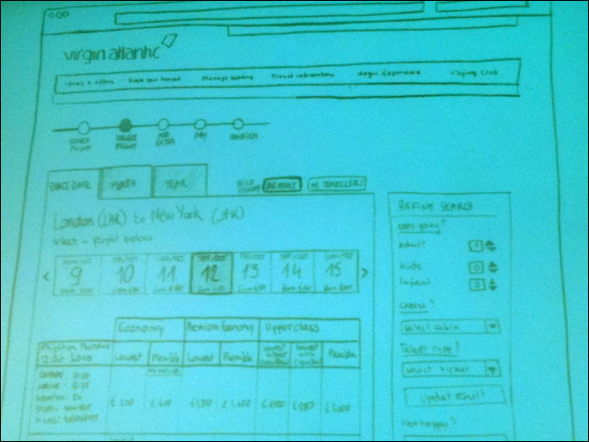
The new layout shows prices across a seven day range, which is more expensive to implement, but which the design team argued for strongly because it “gave confidence” to the customer - one of Virgin Atlantic’s values. If you are spending thousands of pounds or dollars on flights, Chris said, you want to try and avoid the user having that nagging doubt that there must be a slightly better deal out there somewhere.
They also expose the prices for all classes of cabin on the one page. This is to try and tempt the customer to “be adventurous” - another brand value - and try a higher quality of service for the first time. It helps that the expensive flexible economy ticket prices are right next to the fixed price one class up, making them look better value. It was early days, but Chris said they’d seen an uplift in sales of 17%.
One line in the talk did alarm me, when Chris said “I sit through user testing sessions all the time and I want to jump through the window because people don’t scroll.” The Virgin Atlantic solutions to this were an interaction that folds up the details of the first flight after you’ve picked it, so you can’t help but notice the options for your return, and a shopping cart that floats down the page with you.
They had done a lot of testing - eight or nine rounds of it. I asked about the fidelity of the materials used, and Chris explained that their very first round had been with the early sketches and paper prototypes, followed by using clickable prototypes in Axure.

A sketch from the Virgin Atlantic re-design process
Next...
Next up I’ll have my notes from Jonty Sharples, who was talking about why designers must “test or be damned.”
This is one of a series of blog posts about UX People 2012. You can download all of my UX People notes in an ebook for iBooks, for Kindle or as a PDF.
“Experience Principles” - Christopher Lee Ball
“Test or be damned” - Jonty Sharples at UX People
“Seeding UX into the DNA of an organisation” - Mel McVeigh
I love that he used paper prototypes. After all, that is what we use at our desks as we think thru usability and layout. If sketches make sense to us, we can certainly explain them to our customers.
I'd also love to see what information, specifically, is on those cards? Do you have more insight to that?