Wireframing the front page: Part 3 - The Daily Mail
Earlier this week I started a series called 'Wireframing the front page'. I've been looking at different ways of comparing the printed front pages of UK newspapers with their online equivalent. In today's post I'm going to concentrate on one paper in-depth.
What I've done is break up both the printed page and online 'viewport', and look at the relative percentage of space occupied by different types of content including things like the masthead, advertising, navigation, and self-promotion slots. I've also looked at the proportion of space afforded to the main story headline, image and text, compared to that given over to other stories.
I've based these figures on how the sites appear on my laptop, giving the online page a maximum depth of 615 pixels. Of course, other screen resolutions are available, which would cause some variation in the online figures.
 Daily Mail
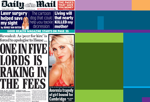
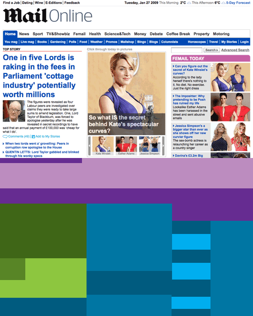
You can see that for the Mail, the online masthead area occupies a significantly bigger space - over 18% of the page compared to just under 8% in print. Navigation, as you'd expect, also plays a more significant role online. In print there is just the one strip promoting the paper's health content, plus a turn to page 5 on the secondary story. Online there is a much larger presence.
The biggest difference is with the relative treatment of the main stories. In print, the one story takes up 44% of the surface area of the front page, with the headline alone accounting for 30% of that space. Online it is a different story, with the lead story only occupying 20.6% of the visible portion of the Mail's homepage when first loaded on my laptop.
The online version of the Mail is much more picture lead. In print, on Tuesday 27th January, pictures accounted for 20% of the page. Online, pictures added up to just over 30%.
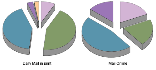
| Online | ||
|---|---|---|
| Masthead | 8% | 18% |
| Top story | 44% | 21% |
| Other stories | 43% | 47% |
| Navigation | 3% | 14% |
| Advertising | 0% | 0% |
| Promotions | 3% | 0% |
Next...
Tomorrow I'll be making a similar comparison for one of the 'quality papers' - The Times.
Man, this series is mind-numbingly tedious!
What did you use to calculate those percentages? Please don't tell me you did it by hand...
Well, I like to provide a rich variety of content types ;-)