Wireframing the front page: Part 2 - The "viewport"
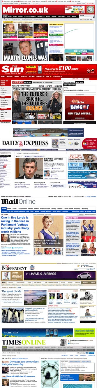
Yesterday I was comparing the front pages of most of our national newspapers with their equivalent homepages online. Reduced to the same scale, it illustrated just how much stuff is crammed into the average newspaper web homepage, and how they lack focus compared to the printed edition.
Using the whole length of the page is a little misleading in terms of judging the online version's initial impact, because users do not see the whole page at once. Users will only view a portion of the page, so I wanted to also compare the printed front page with the homepage as seen through the initial 'viewport'.
I've picked 615 pixels high, as that is roughly the height of a browser window when fully expanded on my laptop - but the usual caveat applies - other screen resolutions are also available.
Here is a comparison of 6 newspaper front pages with their online equivalents as they are first viewed when I open them in my browser on the 27th of January.
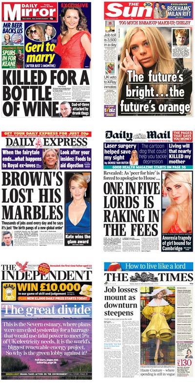
Of course there are very different use cases at play here. The print front cover is often on display next to rival newspapers, and needs to do the job of persuading someone to part with their pennies.
By contrast most users will only be looking at one website at a time. The job of the homepage therefore is to get the audience engaged with the content.
However, I do think there are some lessons to be drawn out from looking at them side-by-side.
I'm particularly interested in the way that the images on the print product are chosen for maximum impact.
The Express, for example leads with a story about Gordon Brown, but chooses the rather more attractive Kate Winslet as their main front page image in print. Not so on the web, where like many papers, they just faithfully put up the image associated with that story in CMS. So for the web audience it is the less alluring Gordon, not Kate.
The Mail does this so much better online. In print their picture also often focuses on a secondary story that has more visually appealing imagery associated with it. Online they use a similar device. The main image when you first load the page is not necessarily associated with the lead story. Instead, the rotating picture promo focuses on articles with visual appeal, and it also is a good way of showcasing four stories without cluttering the page.
Another thing I find interesting here is the comparison between The Independent online and in print. The paper has made stunning single story front pages with an eye-catching use of photography of data visualisations their trademark. Surprisingly, however, the most recent re-design of the paper's website, which was only back in February 2008, does not follows suit. Although an image from the main story is on display, it doesn't dominate the page like the print equivalent.
Next...
Later this week I'll be returning to these front pages to take a more abstract view of them.
The amazingly fugliness of the Independent webpage is one of the reasons I'm far from convinced the organisation are going to see it through the next couple of years.
I think the other interesting thing to note in the comparison between front pages is the way most newspapers are clearly unhappy using the frontpage for prominent ads, whereas the websites are coated with them. I guess they know it's the only page a lot of people will see, but it's particularly clear in the case of the Sun and Mirror how much they're willing to devote to their paymasters.