The BBC's UK website...brought to you by Airbus
On a good day to bury bad broadcasting news a couple of weeks back the BBC slipped out the message that the BBC Trust had approved adverts on the BBC website for users outside the UK.
They've appeared this evening, and somewhere I never expected them as well.
I have to say that I understood that if you were outside the UK and were looking at the 'UK Edition' of the BBC News site then you were going to get adverts. And the same applied to Sport and I believe Weather. In fact whilst I was there a few weeks back I saw a rather nifty use case diagram illustrating all the ifs, ands and buts of the issue.
But, in all honesty, I never twigged that they were going to appear if you were abroad on the UK edition of the BBC.co.uk homepage as well. The 2004 vintage of the BBC website is never going to go down as a design classic, but honestly, what did it do to deserve this?
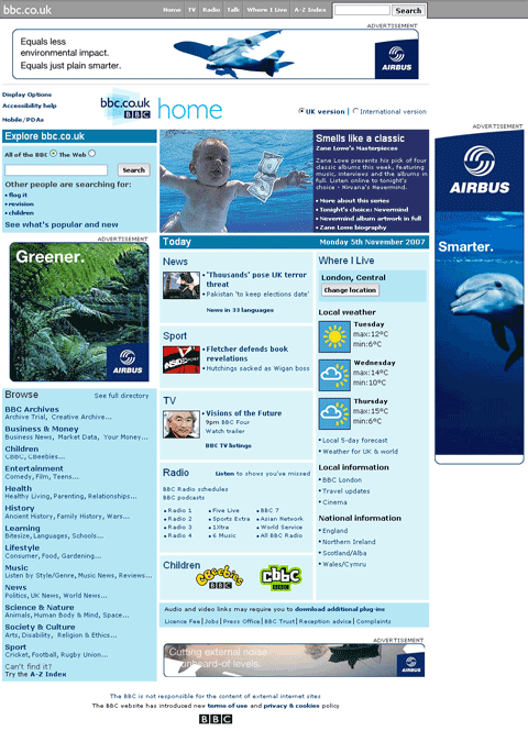
Of rather greater concern is that I saw some really interesting project work on some potential new designs for the page - none of which will seem anywhere near as cool if they have bloody great big adverts splashed across them...
Ugh. As if to underline how much the Beeb doesn't really understand any of this, they've just slapped four huge ads in there by crowbar-ing the layout apart.
Fugly, fugly, fugly.
Amusing ad at the foot of the News homepage says "Notice anything different?" with a BBC logo attached. After a fashion you can read that "You will have noticed that the BBC website features a limited amount of advertising when viewed from outside the UK," which seems to rather understate the quarter-square-foot of Flash I'm looking at.
On the plus side, unless they learn to deliver the ads properly, there's not going to be much revenue. Right now clicking on any of these ads results in... nothing at all happening. Someone cocked up the cross-domain permissions along the way and neither FF nor IE7 will allow the requested popup windows when the ads are clicked on.
[See? I'm so annoyed at how cackhandedly it's been done I just ended a sentence with a preposition.]
Apparently there's going to be a subscription version, where you log in and get rid of the ads?
(I'm not absolutely sure how simple 'logging-in' to a highly accessed and therefore very much statically-served website like BBC News is going to be to implement, however. Perhaps just a third version of the mirrored content (in addition to the high and low graphics options) with password protection.)
What does it look like when you turn AdBlock on - like it did before or large white spaces?
And is all the money from the ads going directly back into BBC News?
(John: nothing wrong with ending a sentence with a preposition, especially not in the sentence you've just used)
The ads indeed ARE ugly (not showing up in the Google cache yet though, so I can't see for myself).
Have to say, I'm not loving the banner ad at the bottom of your blog posts either Martin.
What amused me was that I couldn't see any ads on the page. Then I realised that I was running Firefox Adblock and it had taken out /ALL/ the adverts! There were just vast areas of unfilled page.
Turning it off revealed the adverts in their glory!??
I quickly reenabled Adblock!
I'm actually rather old-fashioned and don't have AdBlock installed. Two reasons really - one is that if smaller websites are providing me a service and earning their money on a 'per impression' basis, why should I use AdBlock and deny them an impression. Secondly, my job is all about the user experience of websites. If I only ever see the web in a sanitized advanced-user AdBlocked non-commercial way, how can I be in a position to judge what the average user experience is?
(I work for the BBC, but not for BBC Worldwide, who are doing the ads, and this isn't an official post, blah).
Designing web-pages with ads in mind is difficult, though I'm still quite pleased with http://www.virginradio.co.uk/music/ which does the job quite nicely. But simply crowbarring layouts apart and putting ill-fitting ads in place isn't the prettiest plan.
The BBC sites are deliberately for 800x600 screens, and not as wide as many new sites (like Virgin Radio's). Making 600x90 ads look halfway decent in the current page size is virtually impossible. I'm sure the ads will fit rather better when the BBC moves to wider pages - which I'm guessing that it might be.
Are there any recent stats on the effectiveness of text-based ads against traditional banners and skyscrapers?
I'm wondering if this, the CPC, or the belief that text ads would somehow be more editorially compromising, was the reason the BBC went with graphics instead.
@Martin
Do people still pay for banner ads on a per-impression basis? I thought pay-per-click had taken over as the dominant model?
>> Have to say, I'm not loving the banner ad at the bottom of your blog posts either Martin.
Heh, heh. You could say my original 'design' was done by the public service side of my brain, and then the commercial half shoe-horned some adverts in ;-)
Actually, Frankie, more seriously, they have been on the site for some time now, but about two weeks ago I changed the colour scheme of them from one that blended in to one with a bit more contrast. It seems to have increased revenue already. They are not really intended for regular readers of course, but more at the wandering traffic I get looking for 'big brother nipples' and the like, who hopefully click an advert when they find themselves rather disappointed by what they find here. They also more than pay for the hosting of this and http://lemontree.typepad.com, so they are here to stay I'm afraid.
I agree whole heartedly about the adverts on the new BBC web page. The BBC invite you to customise your homepage but because of two large Rolex adverts (I'm flattered that you think I can afford a Rolex) my news section has been pushed under the picture that the BBC have at the top of the page advertising their various services. Currently the BBC home page looks a mess and is nowhere near as user useful or friendly as it used to be. We'd all do well to remember "If it ain't broke, don't fix it."