How accessible are Britain's online newspapers? Part 2 - Daily Mail
Yesterday I started a series of posts looking at the accessibility of British newspaper websites with an overview of the accessibility performance of the Daily Express website. Today I'm continuing the series by looking at the Daily Mail. I'm testing each newspaper homepage, and a subsequent story page, against a range of accessibility criteria.
Text resize
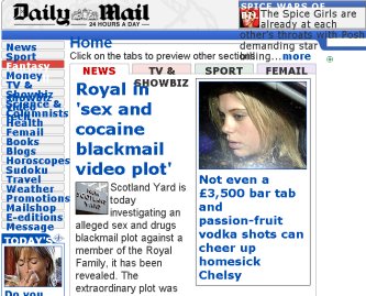
The Daily Mail is one of the newspaper sites that uses fixed font sizes in its homepage and story page display. This means that the Mail over-rides any user settings in the Internet Explorer 6 browser, and so users are unable to switch to a larger font.
The Firefox browser behaves slightly differently in this regard, and usually gives the user more control. However, because of the way the Mail's site is coded, increasing the font size in the Firefox browser breaks the layout of the page in places, rendering some of it unreadable.
Alternative image text
The Daily Mail performs better with alternative image text. The images on the homepage have descriptive text included in their <img> tag, making the information meaningful to anyone who is unable to see the pictures, and when the page is being rendered by a text-only browser.
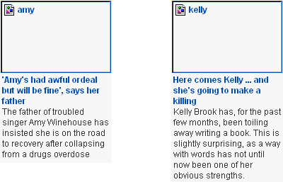
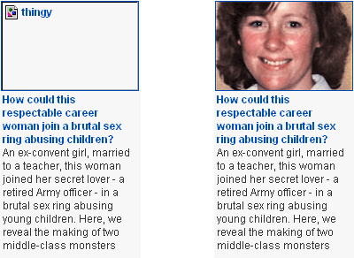
However, as I have previously noted, sometimes the content of that text isn't particularly descriptive - killer Monica McCanch was once described as 'thingy' in the alternative image text on the Daily Mail's homepage.
However, there is one severe issue caused on the Daily Mail site if you are unable to see or read the text in images. The Daily Mail has invested significantly in adding user-generated comment to the majority of their stories - but only if their would-be contributor has 20/20 vision. Before a comment can be submitted to the Daily Mail, the user has to pass a CAPTCHA test.
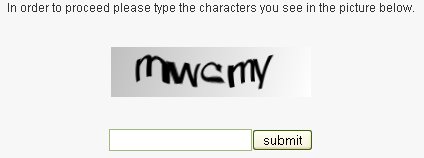
Whilst I can appreciate the Daily Mail's desire to prevent the comment form being spammed by bots, it is a pity they have chosen a way of doing it that creates accessibility problems. Unless you can read the text contained in that image, you cannot contribute to the Daily Mail site. There are ways to provide alternate routes to verify the human nature of the user, either by making available an alternative audio CAPTCHA, or using one of several other ways of making the test available to all users.
(This site, for example, requires a code word to be typed into a box before it will accept a comment - an instruction easily understood whichever software is used to access the page, but not one easily followed by a machine)
JavaScript unavailable
Not having JavaScript enabled whilst browsing the Daily Mail's site did not present any major obstacles in terms of navigation. All of the links appeared and seemed to be working.
However there was an issue with the Daily Mail's search engine. it helpfully pre-fills the input box with the instruction 'Search the Mail online'. Without JavaScript enabled, however, this doesn't disappear when you start typing, and so the user has to manually delete it.
Browsing using FANGS
I've been using FANGS to study how the newspaper sites are rendered by screen-reading software - it is easier for me to use than something like JAWS, with which I am unfamiliar.
The Daily Mail's code is quite friendly to screen-reading software users, since it includes an accessibility link to skip to the main content, and also features coded accesskeys.
However, if users don't take advantage of these features, there are quite a lot of words to listen to before reaching the main content of the page. On the homepage the main headline is 429 words into the rendering of the page, and when the user follows a link to that main story, there are a further 672 words to be read out before reaching the story itself, aking over a 1,000 in total to get from rendering the homepage to reading the main story of the day.
In the next part of this series, I shall be looking at one of the red-top tabloids online, which an assessment of the accessibility of The Mirror's site.
On the matter of the search box with its prefilled text, I've always thought this slightly mad, but the WAI guidelines say that this is what should be done.
"Until user agents handle empty controls correctly, include default, place-holding characters in edit boxes and text areas."
http://www.w3.org/TR/WAI-WEBCONTENT-TECHS/#tech-place-holders
Apparently it's because some older browsers don't allow you to tab between elements.
http://www.w3.org/WAI/wcag-curric/sam81-0.htm
How many of those browsers there are still out there, I don't know. I've always strictly obeyed it in recent years, but thinking about it today, I am wondering if there is still a point!
You learn something new every day. I worried that this series was going to turn up lots of things I didn't know enough about.
I had a big accessibility "blitz" several years ago. Not sure I can remember most of it, but some of it stuck :)
@Andrew: That guideline seems pretty old. I can't see any reference to which browsers they're talking about.
A general point at Currybet: alt text isn't meant to be "descriptive", it's meant to be an alternative representation of the information communicated by the image. The title attribute can be used for descriptive text.
Thus the "amy" and "kelly" alt text in the examples you point to above aren't really adding anything to accessibility. As the full names of amy and kelly are both mentioned in the first sentence of the news story, having their first names in the alt text is adding nothing.
What should the alt text actually be then, you might ask. Well it depends on what the pictures are communicating. As you haven't shown us the pictures I'll have to guess. If they're not really communicating anything other than being a bit of visual interest, you might decide that there's no textual equivalent, and thus legitimately leave the alt text blank. (A better example for this might be where the BBC News illustrates a story about CD sales falling with a stock image of some CDs, adding nothing).
If, on the other hand, you decide that the picture is communicating something significant to the understanding of the story, then you might try and represent this in text form. For example, if the picture shows Amy Winehouse looking healthy, supported by her father, then you might have something like this as the alt text: "A smiling Amy Winehouse stands beside her father, with his arm around her shoulders".
I make this point because lots of developers have this vague understanding that 'you must have alt text for accessibility', without really understanding how it should be used. So we end up with CMSs forcing you to add alt text, resulting in short, meaningless words entered by people in hurry to get something published. 'thingy' might look quite embarrassing, but it's a fairly understandable reaction to a system that tries to crudely force a behaviour. Bad alt text is worse than no alt text at all, and whilst it would be good if all web authors would spend the time to craft properly useful alt text, in many circumstances it might be better to just include a blank string (which is perfectly allowed by the HTML standards).
The (draft) HTML5 spec has a much better description of how to, and how not to, use alt text.
(It also recognises that in some cases alt text should be provided, but cannot be, such as in user-generated image galleries like Flickr. It suggests differentiating these cases from where there is no meaningful alt text by dropping the attribute altogether).
My personal feeling on this probably goes slightly against the grain of the standards, but to my mind the point of having the alt text on an image is to try and replicate the user experience as closely as possible. Newspaper homepages use the image to convey a lot of context about stories, and the fact of whether a story has an accompanying image or not says a lot about the relative importance of that story on the page.
I certainly don't think 'spacer.gif' as alt text adds anything to the experience of a screen-reader user, but equally I think you are looking at the problem down the wrong end of the telescope if you think the BBC shouldn't have alt text for a stock image of a CD. If it doesn't add anything to the story, why bother with it for a sighted user?
In any case, this is a fairly broad and crude set of tests for accessibility, but it is more about being able to see which newspapers are making an effort in this area, and which are not.
"If it doesn't add anything to the story, why bother with it for a sighted user?"
Heh, well there's a question. Pictures get inserted for all sorts of reasons, sometimes purely for decoration or 'because that's the way it's designed'.
A stock image of a CD adds nothing to the understanding of a story about CD sales falling, so there's no user experience to try and replicate in text form.
Likewise, when a story about a person is illustrated with a picture of that person, 'A photo of X' isn't replicating the user experience. The photo isn't telling you that there's a photo of the person, the photo is telling you something about that person, their facial expression, their posture, body language, and so on. To write the alt text, you have to work out what's relevant about the picture and express it in words. It's a similar task to that of an audio describer, who has to pick out the pertinent visual clues to be expressed aurally (of course, they are also constrained by time).
And this is all when the photo of the person is actually a photo of the person engaged in the activity of the news story. If it's just a stock photo of that person, eg a story originating from a Mayor of London press release illustrated with a stock photo of Ken Livingstone, then the photo is arguably simply acting as a visual signal saying 'this is a story about the Mayor of London', especially on an index page, where pictures can be recognised by a sighted person more quickly than text. In these cases, where the information is already present in the headline or teaser or intro paragraph, then replicating it by having 'Picture of Ken Livingstone' as alt text is pretty pointless.
This is all down to judgement of course, but my point is that it's much much more important to have alt text on text-as-images (eg navigation buttons), where the alt text is identical to the text in the image, than it is on photographs which are either purely decorative or which have a harder-to-define meaning.
I think, to be honest, that you are using a rather dry interpretation of the standards and guidelines. You seem to be basing your examples only on the one context of clicking a task-based button, or reading a newspaper today.
What about the visually impaired researcher who has been asked to find examples of the use of stock imagery in news sites - your definition of what is 'useful' alt text hides all that from her.
What about quickly skimming through articles in five years time to find out whether 'Cole dropped from England squad' refers to Andy, Ashley, Joe or Carlton? A sighted user with a bit of knowledge of football will recognise the player instantly from the picture at the head of an article. Why should a blind user have to wait to have the first two paragraphs read out to them before they get the player's first name, when the alt text on the image next to the headline would have told them straight away, even though it fails your 'not a picture of them doing the thing in the story' test.
I take your point that repetition of labels is redundant, but I think your interpretation of what is 'useful' is exceedingly narrow.
"What about the visually impaired researcher who has been asked to find examples of the use of stock imagery in news sites - your definition of what is 'useful' alt text hides all that from her."
Aha - well that's what the title attribute is for, giving a picture, which might contain more information that the picture on its own displays.
Searching for stock images is hardly the primary purpose of a website, so it's really not worth making alt text LESS usable for the people reading it as a news website just for the sake of hypothetical future picture researchers. An equivalent would be an audio-describer describing the decor of every room in a soap, just in case a future historian wanted to find examples of particular styles of interior design!
"What about quickly skimming through articles in five years time to find out whether 'Cole dropped from England squad' refers to Andy, Ashley, Joe or Carlton? A sighted user with a bit of knowledge of football will recognise the player instantly from the picture at the head of an article."
If the purpose of the picture is to communicate simply that 'this is a story about Ashley Cole', then by all means use 'Ashley Cole' as alt-text, as it's giving you an alternative, textual representation of what the image is communicating. However, if the image was taken from behind, of a player looking dejected, and the title was simply 'Player dropped from England squad', then the picture isn't communicating who the player is, so the alt text shouldn't either.
There's a fine art to writing alt text!