“The user experience of news” - Martin Belam at news:rewired
At news:rewired today I spoke as part of a panel talking about the importance of “user experience” for digital publishers. Here is the essay version of my talk.
David Eaves recently wrote for Tech President about comparisons between egovernment sites. He described being at an event five years ago, where to the dismay of the Canadians present, according to a report by Accenture, Canada’s egovernment provision had slipped from first place to second place in the world. David said he felt sick, not because Canada had lost their crown, but because the people around him were taking this report seriously:
“The problem is, Singapore and Canada, or the United States, or the UK for that matter, are not competitors when delivering online experiences to their citizens. Canadians don’t compare the (terrible) online experience they get with the government to that of Singapore, or Sweden. Rather they compare their experience to Facebook, to HipMunk, to Gmail and Flickr. All the Accenture report did was take a group of laggards who generally deliver a crappy online experience, lump them together and rank them. Rather than tell governments their online performance was in crisis, it reassured them that all was well.”
His words struck a chord with me, as I’ve watched the news industry frequently give itself awards for innovation and products in the digital space, when if you compared them to products and services outside of the vertical you’d see very little that was innovative. And you’d see that a lot of times we produce products with an inferior user experience to competitors from outside of the news industry.
What is user experience and why is it important for news?
User experience sums up how a person feels about using the entirety of a service. And we don’t have all that much to differentiate ourselves anymore. Think of all the things that used to make up the user experience of a newspaper brand. The size of the paper. The quality of the print. The cover price. The weight of the damned thing.
None of those things directly translate to digital.
A great digital user experience serves the user’s needs with a minimum of fuss. A lousy user experience is frustrating, and the kind of thing likely to lead to people changing providers and bad-mouthing your brand to their friends. A slow app that frequently crashes gets uninstalled. A difficult to read website gets dropped for one that is easier on the eye and faster loading. A struggle to complete a transaction drives users to buy or subscribe to something else.
That is why news organisations adapting to digital have to care about UX.
Think reader before editor
When they redesigned the ITV news website, ITV and agency Made By Many talked about having a focus on one use case: “As a user, I want to know what the world’s talking about today.”
A use case is a statement that describe the motivation for someone using a feature on a website or app, and the outcome they are expecting. Use cases follow the formula “As [a person of type x] I want to [do thing y] so that I can [achieve thing z]”
Unfortunately, a lot of news websites have tended to follow the use case “As an editor I want to show the reader everything that I have commissioned today so that they will at least hopefully click on one damned thing and none of my journalists will moan that they weren’t on the homepage”, which is why they tend to feature overlong lists, bombarding users with choice, rather than guiding them to what is really important.
The best way to uncover the real use cases that you need to solve is to actually talk to your audience.
Ask them what they want. Find out how they use your site.
This isn’t the same as opening a comment thread after you’ve made some changes and saying “What do you think?”
The best digital products on the market are rigorously tested for usability, and user-centred design and co-design ensure that services are tailored to exactly what a consumer is most interested in. All too often in journalism a culture that the editor knows best permeates through product design.
When you load the average length article on my local newspaper website, the article text is given around 9% of the screen. The rest is adverts, navigation and clutter. What does that tell your user about how much you value their reading experience?
The user experiences of reading sites and apps like Matter, Medium or The Atavist is notably different and much, much better. They are putting their readers first.
Just 9% of this web page is the actual text of the article
Think software before content
There was a lot of analysis this week about the demise of The Daily — much of it informed by hindsight from people who have never risked launching anything into the market themselves.
For me the most telling criticisms though were Peter Ha saying that “the publishing platform felt like it was held together with spit and chewing gum” and John Gruber’s observation that “Daily issues were almost mind-bogglingly slow to download, and even once downloaded, animations and page turning were slow, and navigation was confusing.”
There was no need for a digital news app without a legacy print operation hindering it to have a dreadful CMS or a poor front-end app for the user.
Just like those egovernment sites, users are not comparing their news app experience with other news apps, they are comparing it against all of the apps that they ever use, some of which pour huge resources into making them excellent all the way through.
You can’t afford to treat the way your content is packaged as an after-thought. The software is your brand.
When doing his brilliant design work on the Guardian’s iPad app Andy Brockie made lots of sketches and animations of how the transitions should work. But it was only when Martyn Reddington coded it that we could feel whether the app felt responsive to the user’s touch, or was laggy and kludgy.
And the software used to produce content will impact on quality. If your staff are fiddling around for ages and having to do lots of repetitive tweaks to stories in your CMS, it is because nobody has thought about the user experience for the journalist. I filmed Guardian journalists using the CMS so that developers could see the problems they were having, we observed journalists at work when they were live blogging, and when we rebuilt the live blog CMS we had them run it live as a pilot test on lots of blogs before switching over to the new system, so that we could check it met their needs.
Think simplicity before features
A lot of news organisations could think more simply. News is a messy content proposition, but the functionality on news websites needn’t be.
Polar is a new app that does one simple thing and one simple thing very very well. It is set up so that users can quickly make picture polls. They get to outline two options and pick two images to go with them. Almost every news publisher in the world has some form of interactive voting on their website. Not one news publisher thought to spin that element of their site off into a little app.
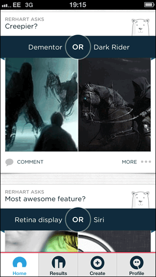
The polar voting app
Luke Wroblewski, who worked on Polar, described how they relentlessly tested it to bring down the amount of time it took for a user to set up a vote using one thumb - mimicking the distracted pattern of some mobile usage.
Time and time again when I’ve been designing software for the publishing industry, the cry has always been to add more features, to support more use cases, to complicate production flow. To build an all-singing-all-dancing set of designs on paper before shipping a single line of code that might prove whether the heart of the idea is viable or not.
Think mobile before desktop
A few weeks ago Pitchfork published a specially formatted interview with Bat For Lashes. My Twitter timeline exploded with joy, with people on the more traditional print side of the industry exclaiming that finally this might be the future of feature publishing on the web. So I followed a link on Twitter, and this is, after about 45 seconds of downloading over 3G, what I saw:
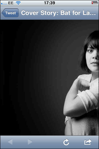
Pitchfork’s “amazing” design on my phone
Really not quite the future of publishing at all. In fact, it was impossible to scroll beyond this view. Touching the screen just caused the picture of Natasha to snap back into an absolute position in the top left-hand corner of my mobile screen.
Of course the Bat For Lashes feature looked great on the desktop, but not everybody is going to be viewing it on a desktop, or on a high-speed connection. I didn’t get the moving images of Natasha. I didn’t get the typographically rich layout. I got nothing. User experience is about all users on all devices.
You might be umming and ahhing in the newsroom about whether you have a mobile strategy or not, but your audience has already decided for you. They’ve already gone mobile first. 60% of visits to the London 2012 site during the Olympics were from a mobile or tablet devices. At some times of day the Guardian has more mobile visitors than desktop visitors. There is no graph in the known universe that doesn’t show mobile adoption as unstoppable.
Your stuff has to work on small screens. Karen McGrane’s book “Content strategy for mobile” is a must read.
The user experience of news
Think reader before editor. Think software before content. Think simplicity before features. Think mobile before desktop.
None of those statements means that the editor or the content or great app features or the desktop user aren’t important. But they do mean that if you don’t primarily pay attention to the reader, the software they and you are using, how easy it is to use and that it will work on whatever screen-size they try to read it on, you probably won’t be providing a good user experience.