How 3D wireframes help UX and Agile work better at the Guardian
For almost as long as I’ve been a user experience practitioner, the issue of how UX deliverables interact with an Agile project has been a vexed one. At the Guardian we’ve been trying a new technique based on a very old optical illusion - the red/green anaglyph 3D technique - with startling results.
Making 3D wireframes in Omnigraffle
As a kid I once painstakingly taught myself how to draw anaglyph 3D pictures - it is an awful lot easier to make them in Omnigraffle. What I tend to do now is produce an initial flat wireframe indicating the general layout of the page. I colour all the elements red, and set them to 60% opacity. I keep them all in one layer of the document.
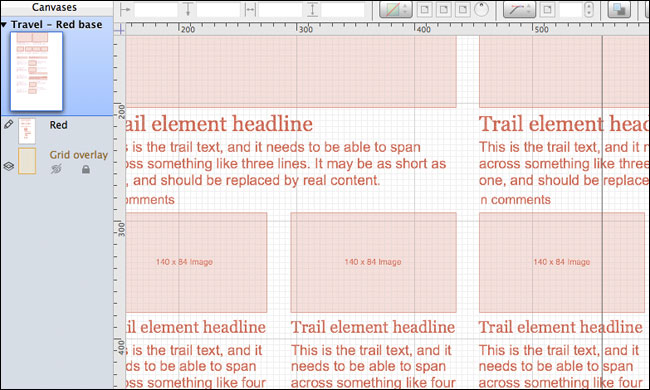
I then duplicate that layer, and change all the elements to be green - this time set to about 40% opacity. When the layers are on top of each other, the elements should appear to be somewhere between red and green. This sets the baseline for the optical illusion.
The 3D effect occurs when you move the red and green layers slightly apart from each other. I now break all of the green versions of the elements out into their own layers representing each component. Nudging them slightly to the right makes the element appear to stand out slightly to the viewer. Nudging them to the left makes them recede slightly.
You can also helpfully make any annotation to the wireframes either stand out in front of the features that they are describing, or appear in a layer behind the wireframe.
Where does Agile fit it?
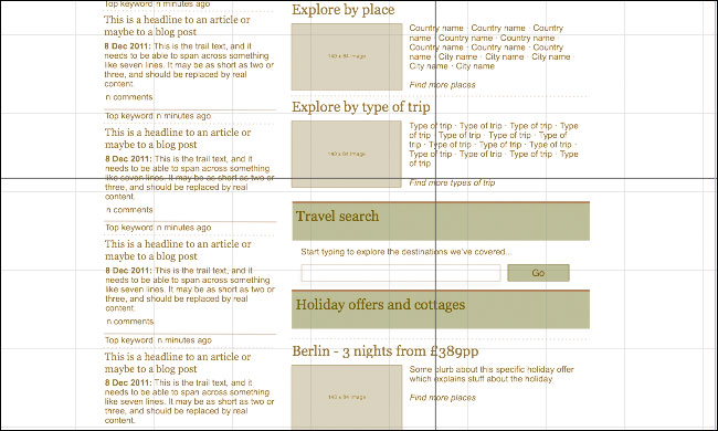
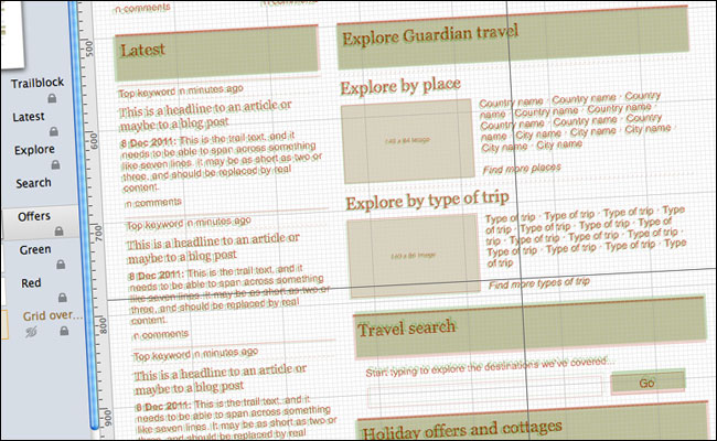
Where this technique has really come to the fore is in aligning the wireframes with the sprint backlog. Looking in Pivotal Tracker I can see the prioritised order of stories that the developers are going to be working on. I then make the 3D positioning within the wireframe reflect that set of priorities. Elements which are higher up the backlog are made to appear closer to the viewer, and I set story cards which are further away from being coded to appear to be physically in the distance.
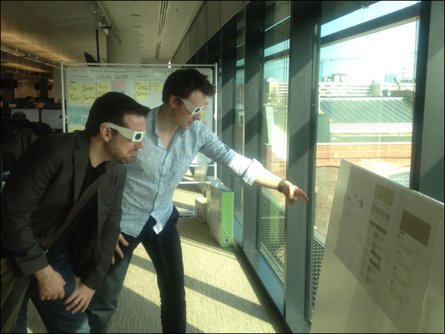
Alastair Jardine explains the system to a visiting Evan Sandhaus
What has proved to be fantastic about this technique is the value for communicating to stakeholders. A traditional complaint about Agile is that product managers and marketing people are never quite sure exactly what they are going to get and when. The 3D wireframe literally shows them which elements are closer to being delivered, and which are further away.
3D prototypes in HTML
I want to take this technique further, and work it into our HTML prototypes. I’ve begun using some of the methods outlined here to build a 3D version of the Twitter Bootstrap CSS that will allow me to start making clickable pages that also reflect the estimated delivery time of different features. This will allow me to go on and test the idea with users. The testing lab is such an artificial environment anyway that I hardly think additionally asking the user to wear 3D glasses is going to make much difference.
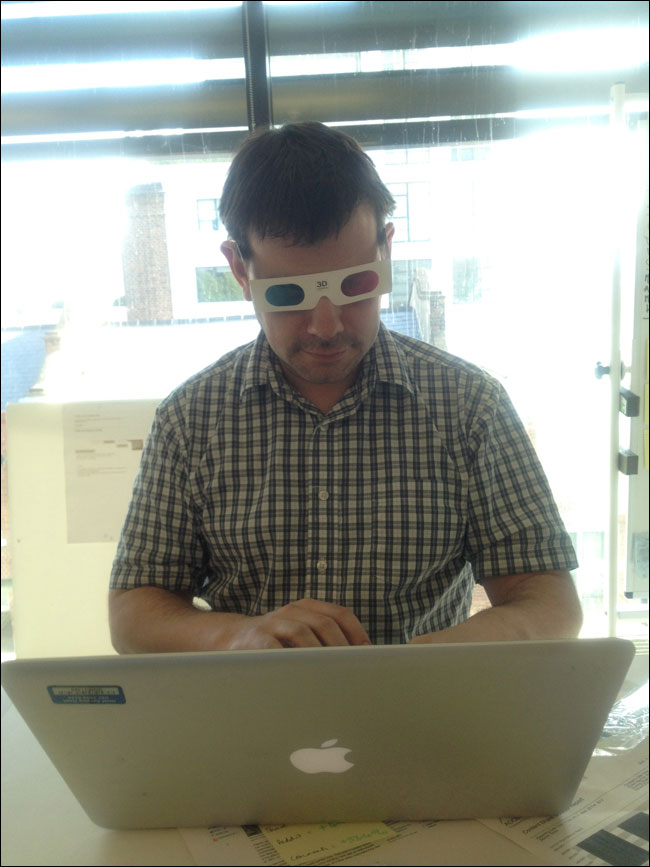
Working on my retro 3D wireframe system for the Guardian
CX Partners: 3D Wireframes, the future of wireframing today from 2011
That's very interesting Dan, but frankly, I think you just missed the whole opportunity to integrate the process with agile, which is where we are getting the value at the Guardian. Maybe it is just one of those things were agencies just can't pull off the kind of efficiencies of process that innovating like this can bring to an in-house team?