UXmas at the Guardian
Last night we threw open the Guardian’s door for “UXmas” - a chance to meet people from the UX and design teams, hear a couple of talks, and eat some mince pies before retiring to the pub.
Karen Loasby - “A year of UX at the Guardian”
Karen Loasby started the evening with an overview of a year in Guardian UX. This involved a lot of launches, including Android and Windows Phone apps that she worked on, our “mutualised arts” project delivering data-driven pages around books and music and increased opportunity for reader contributions, and our apps for Facebook, Spotify and the iPad.
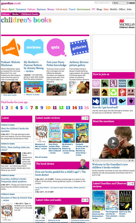
The Guardian Children's books site launched in March
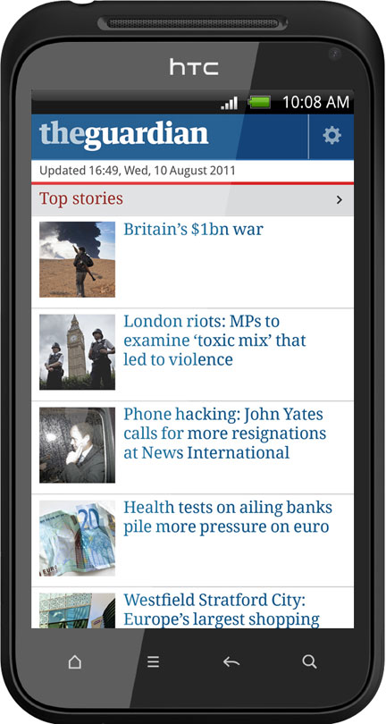
The Guardian’s Android phone app
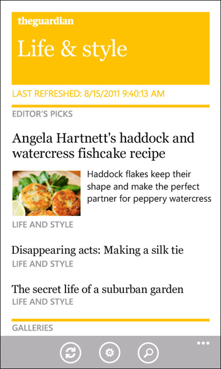
The Guardian’s Windows phone app
Karen explained that during the course of the summer we were making sure we had users into the building to test products every single week, and we also worked with students from City University on research products that formed part of their qualifications and provided useful feedback for us. Most significantly, perhaps, we’ve gone from a UX team of one to a UX team of four - naturally illustrated on the night with Lego Star Wars minifigs.
Tobias Sturt - “A week in the life of the digital agency”
One of the best kept secrets at the Guardian is that if you approach us and say “We’d like a thing like the thing you have on your website, can you build it for us?” the answer is yes - please meet our digital agency, who do work for external clients. Tobias Sturt, who heads up UX for them, gave a taste of what the average hectic week was like for them. A lot of the work is for clients involved in science and education, and a lot of it is trying to help people make better data visualisations, charts and tables. This does, Tobias confessed, mean they end up using PowerPoint a lot of the time which is, he says, the very worst possible tool for a designer to use. During the course of the slides he showed some of the great illustration work that Jamie Lenman does for the team. Jamie also did the illustrations for my recent Doctor Who ebook.
Martin Belam - “The Guardian on Facebook”
For my contribution, I gave an overview of the design of the Guardian’s Facebook app, and some of the interesting issues it has raised for us. Whilst the numbers behind the app are impressive - over 4 million installs in a couple of months, delivering an extra million page impressions per day, and a much younger demographic than usually visit the Guardian - reaction to the app has certainly been divided. In part this is due to our implementation, and in part due to some general consumer unease about the new “frictionless” sharing that Facebook has introduced.
One issue I touched upon was the fact that old content was becoming popular in the app and gaining a new lease of life. This isn’t, to my mind, much of a problem with feature content. If you’ve got a lengthy profile of the Rolling Stones in the 50th year of their career, it doesn’t matter if you read it this week, next week, next year, or even in twenty years time - it is still an interesting snapshot of that moment in time. And having comments on in Facebook means we have sparked new conversations amongst a new audience on articles like “Too fat to be a model?” or “Are female students a perk of the job?”, which, as news events, are a couple of years old, but which expose themes of continuing interest. The issue is more complex for pure news stories though, and we are introducing some subtle design changes to try and emphasise the dateline of an article more.
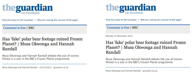
The article dateline is subtly more prominent in the app iteration on the right
I also showed some wireframes of bits of the app that didn’t get built, like an animation to indicate changes in “read” status, or the first drafts of the sign-up page, highlighting some of the differences between the original design and the live implementation.
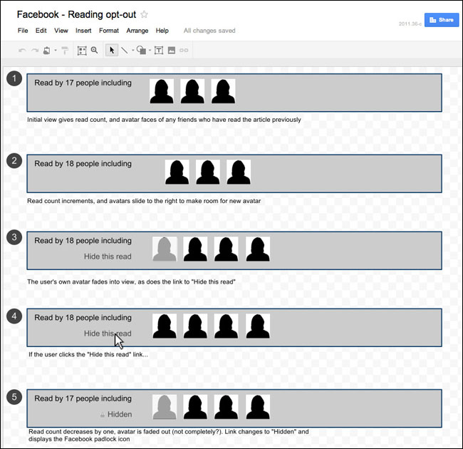
Wireframes for an unbuilt animation within the Guardian Facebook app
You might also be interested in:
Martin Belam: “Reaction to the Guardian’s Facebook app”
Andy Brockie - “Designing the Guardian’s iPad app”
Andy gave a behind-the-scenes view of the design of the Guardian’s iPad app, giving the audience the chance to see and hear about lots of different iterations of the design, and the thinking behind the use of grids to replicate the scanability and finishability of the printed product. Of particular interest, judging by the conversations afterwards, was Andy’s use of stop-motion video to prototype the interactions and user journeys through the content. Andy said he had a strange few weeks of sitting on his morning commute with loads of odd-shaped pieces of paper and cut-outs of navigation ideas, working out how it was all going to fit together. When we launched the app, Andy published a photo gallery showing some of the design work behind the app.
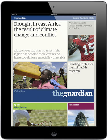
The Guardian iPad app
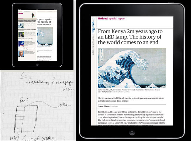
Some of Andy Brockie’s design work on the Guardian iPad app - see more here
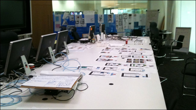
The Guardian iPad app project room
You might also be interested in:
Mark Porter: “The Guardian iPad app”
Jonathon Moore: “Guardian iPad: Product challenges”
John-Henry Barac: “A short way down the digital road”
Martin Belam: “How the Guardian’s iPad app changed the way that I consumed news”
Next time...
I’m sure we’ll hold more drop-ins like this in the new year. The main learnings for us from the night were:
- No system of ticketing is ever going to be right when you only have 25 places. But maybe the twelve days of UXmas random ticketing system I tried this time was a little too random.
- Mulled wine is a divisive product. Especially not terribly good mulled wine.
- Having to evacuate the building 45 minutes before an event starts is very off-putting.
- The feedback on Twitter was generally positive, so we are definitely encouraged to do similar events again.
Thank you
A big thank you to Andy Brockie and Tobias Sturt for talking, to Joanna Geary and Mei Tan for helping on the night, and of course to the rest of the UX team, Karen Loasby, Lynsey Smyth and Alastair Jardine.

“currybetdotnet: Best of the blog 2011” brings together over 50 of the best posts on this blog from 2011, covering topics such as live blogging, community and social media for news websites, and the future of digital media. It features write-ups of talks by Guardian journalists including Paul Lewis, Matthew Wells, Andrew Sparrow and Chris Elliot, and behind the scenes looks at Guardian products like the Facebook and iPad apps. It also has transcripts of Martin Belam's talks at EuroIA, the UPA conference, Polish IA Summit, Content Strategy Forum 2011, FutureEverything and Hacks/Hackers London.
“currybetdotnet: Best of the blog 2011” for Kindle is £1.92.