BBC homepage redesign - behind the scenes 2002-style
The user comments about the BBC homepage redesign have been scathing...
“What the hell are the bbc doing messing with the website. I hope it was done in house and did not cost hunderds of thousans of license payers money. The moto is if it aint broke dont fix it, its not about the web site the website is just a link to get to somewhere else on the bbc website. Its like the new weather may they brought out a few years ago nobody has a clue about weather symbols. BBC IF IT AINT BROKE DONT FIX IT.”
“Horrible! Looks really confused, too much style not enough readability. This is a news site, simplicity should take precedence over style. Its very bad, seriously, it reminds me of the amateur themes you see for PHP forums. Yuck!!!”
“I am glad that most of the viewers share my opinion, which is against these changes. In fact it is a massive step backwards, there is nothing good about these changes, too much empty space, too much green colour, very litle info at the glance. No no no, please bring back the old home page.”
Of course, these aren’t about the new design, these are lifted from the reaction to the 2008 redesign. The one which, judging by the comments over the last few days, was the greatest thing to hit the internet since sliced bread.
It is just the latest example in what seems to be the perennial instant dislike to major design changes on the internet. Thanks to Twitter, this seems to be easier to track in real-time, and we are getting a bumper crop this week. Changes to the New York Times comment system are also getting a pasting in the thread under their announcement, and, in the interests of balance, I should point out that our announcement of large Facebook app usage figures hasn’t exactly thrilled a portion of our audience at the Guardian.
Back to the BBC though, and the upheaval around the homepage redesign has caused me to dig up “The Glass Wall”, a booklet made by the BBC’s new media team about the project to redesign the BBC homepage back in 2002.
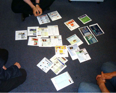
“The Glass Wall” includes a quick overview of the design development of the BBC Online homepage from launch in 1997 until 2001, descriptions of the kind of workshops they had with users in 2002, and a mood map comparing other websites. I note they put Guardian Unlimited as just about as highbrow as you can get, and slightly lacking “fun/personality”.
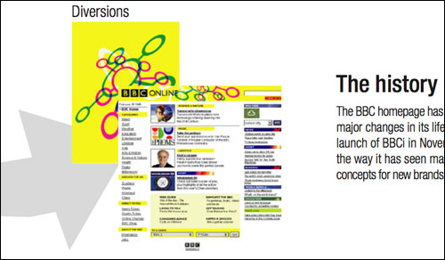

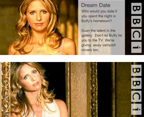
Images from the BBC’s “The Glass Wall” homepage redesign project book
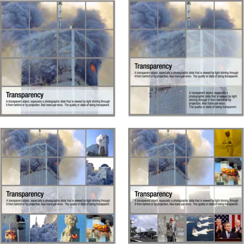
With 9/11 fresh in everybody’s minds - and how the existing homepage design had struggled to try and portray the confusion and unfolding horror - the team explored how a grid-style image promo space could be used to portray unfolding events, as well as promote lighter content like a blockbuster movie.
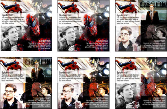
And, with official BBC Doctor Who output limited to webcasts, Currybet’s Law didn’t apply, so Buffy was the cult TV example du jour.
Looking back over that old material, I think the new design everyone is complaining about this week does say something about the shift in the BBC’s online priorities, as a result of successive reviews defining an ever tighter remit for bbc.co.uk.
In the early 2000s, the design was all about showing to the user that the BBC website was much more than news, sport and weather, the three things focus groups and card sorts most associated the corporation with. The 2001 homepage featured links to 21 top-level directories, and 77 additional sub-categories. Plus a link to “View all categories” with the astonishing promise of yet more.
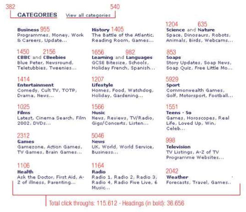
BBC category structure, with the number of click-throughs for each section on Sunday 23 June 2002
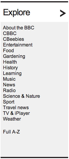
By contrast, the new BBC homepage has a top-level category structure of a much more manageable 18 ways you can “Explore the BBC”.
The trick when faced with a raft of public negative user feedback like the BBC has at the moment is picking out the signal from the noise. My maxim is always to fix anything that is actually “broken” - i.e. non-functional - but otherwise do no knee-jerk changes in response. If possible you should do some considered follow-up research amongst the users you were hoping to please, and check that you have pleased them. And, when you have a massive audience, you have to remember to design for the 80%, and to factor in the views and behaviour of the silent majority.
I’m glad the BBC audience vitriol isn’t being directed at me though - it can be very hard not to take it personally during a product launch. As Mark Hurrell said to me on Twitter yesterday:
“The first college to start teaching ‘Handling large-scale criticism & abuse in response to your website redesign’ will make $$$$”

“currybetdotnet: Best of the blog 2011” brings together over 50 of the best posts on this blog from 2011, covering topics such as live blogging, community and social media for news websites, and the future of digital media. It features write-ups of talks by Guardian journalists including Paul Lewis, Matthew Wells, Andrew Sparrow and Chris Elliot, and behind the scenes looks at Guardian products like the Facebook and iPad apps. It also has transcripts of Martin Belam's talks at EuroIA, the UPA conference, Polish IA Summit, Content Strategy Forum 2011, FutureEverything and Hacks/Hackers London.
“currybetdotnet: Best of the blog 2011” for Kindle is £1.92.