4 key pieces of audience engagement missing from Andy Rutledge’s news redux
Andy Rutledge published a fascinating blog post last week looking at the design of digital news, and to illustrate his points he did a redux of the New York Times design.
This post isn’t going to make much sense unless you’ve read that - so go and do that first.
You back?
Excellent, then I’ll begin.
I thought Andy made some very good points. Personally I despise the overall clutter and noise of news sites, and there were some specific things I really agreed with him on. Notably:
- “If you do it right you publish once and it works anywhere.”
- “Mobile presentation of a news web page should be contextual to the device and screen size/resolution.”
- “Author, source, and date/time are important.”
- “Opinion or Op Eds are distinct from news.”
- “Search should be more usable than is currently employed on most news sites.”
However, there were 4 key areas where I very much disagree with Andy’s analysis, and think it would fail to engage with mainstream news readers.
Faces matter
News is about stories, and stories are about people. In Andy’s redux, aside from the “hero” image leading the page, the only people’s faces I can see are those of the journalists and columnists. This is a very 20th century view of the news, where the only people you heard from were those with the patronage of the owners of the presses.
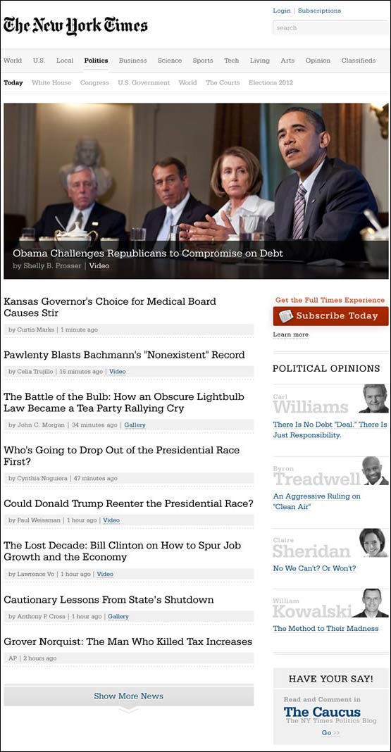
The faces on Andy’s redux are mostly New York Times staff
Users want to see the people in the stories, not the people writing them.
News stories are compelling when they speak to our hopes, fears, doubts. When we see people expressing joy or sorrow or regret or triumph. Andy’s list of headlines is clean and efficient, but it lacks the emotional pull that images lend to news stories.
Users want brief summaries
As part of his news design redux, Andy praises layouts that consist of lists of links - citing MSNBC and CNN.
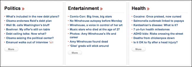
I think he has prioritised scanning the news over comprehending the news. It is very hard to convey an entire story in a headline. News is about context. Time after time in user testing I’ve seen users ask for, or prefer, the display of short story summaries underneath headlines. It gives them more confidence in their decision to click or not, and calms their anxiety about “missing out”.
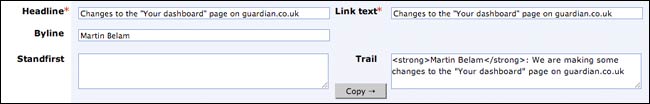
In the Guardian CMS we specifically have a field “trail text” which we use for this summary/teaser purpose. It is compulsory, even for articles which do not have a conventional standfirst.
Navigation is more than links
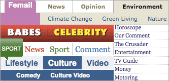
I agree with Andy that the New York Times left-hand navigation is excessively long. However, I don’t buy the argument that navigation on a news site is purely about pushing the user around from carefully categorised vertical of content to carefully categorised vertical of content.
Global navigation on a news site is not so much about hyperlinks as a statement of intent and values. There is a reason the Daily Star has “Babes” and “Celebrity” on their main nav, and the Guardian has “Comment” and “Culture”. The navigation on a news site is crucial in setting tone and editorial expectations.
News is social
Andy removes the concept of “Top stories” from the New York Times design, stating that “popularity has nothing to do with news”.
I disagree.
With linear news delivery, like a radio or TV broadcast, you had to listen to the news in the order chosen by an editor. In an interactive environment, that isn’t the case, and nobody consumes everything in the way that a bulletin or newspaper can be “finished”.
“Most popular” lists allow the footprints of site usage to provide an alternative slice of the news. There is nothing wrong with reading two serious stories, and then clicking on the popular humorous one. “Most popular” subtly drives the user towards finishing their news session with the dead donkey - or more usually the married goat.
Andy argues that “news is not social media”.
News has always been social.
Whether it was the town crier barking notices at the community, the shared experience of watching the newsreel together in a darkened cinema, gathering around for the evening news on TV over teatime, or cutting a clipping out of a newspaper and posting it to a friend, news has always been about a shared understanding of the stories that shape our world and experiences.
“Most popular” lists, comment counts, and the ability to rate and share articles are all signposts that you are not reading the news in isolation, but are visiting a website which is being interacted with by a host of living breathing human beings.
The design challenge and the Guardian API
I do like the aesthetic of Andy’s redux - frankly you can tell by the theme I’ve picked for my own blog that I don’t like much else on the page apart from the article. I also really like, for example, the design of the Guardian’s Tumblr blog as a clutter-free highlights way to present some of our content.
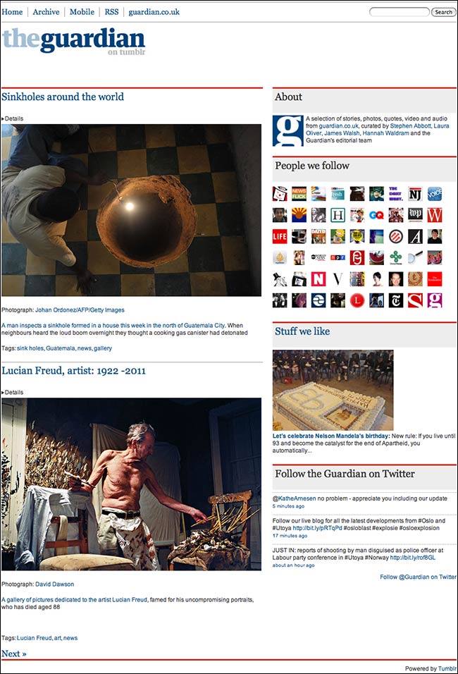
The Guardian on Tumblr
But Andy’s redux pares back the information structure to resemble a slightly dolled-up RSS reader. There is a reason that RSS reading of news never gained mainstream adoption, it simply isn’t the way that most people want to be presented with information. Or as Mark Hurrell put it on Twitter: “Here be the tension between designing for efficiency & designing for storytelling/engagement.”
One of the great things about having the Open Platform API at the Guardian, though, is that it is relatively easy for developers to quickly prototype different viewing experiences and designs for our content. Phil Gyford’s “Today’s paper” attempts to recreate the daily newspaper reading experience, whilst Paul Haine’s web app presents an optimised version of the Guardian for iPad-sized screens. Dan Catt’s “Long good read”, meanwhile, presents a curated view of our best long-form content in a blog format.
So, if anyone wants to pick up the challenge and build a prototype of Andy’s redux from our content, I’d love to see it...and test it with users.
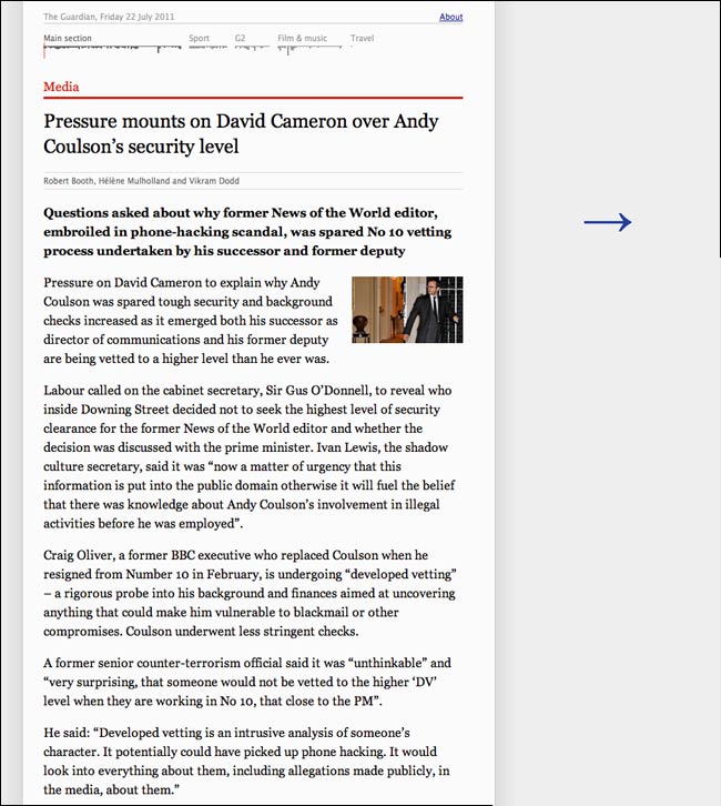
Phil Gyford’s “Today’s Paper”
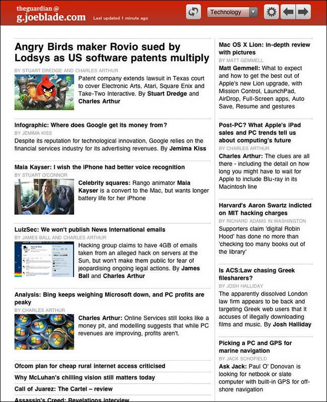
Paul Haine’s “Guardian for iPad”
Dan Catt’s “Long good read”
Oh for the freedom not to be constrained by IAB standard advertising format sizes. I love his throwaway comment that news is valuable so people should have to pay for it therefore we don't need so many ads...
This was a pretty balanced appraisal of Andy's article. Elsewhere, it appears to have annoyed a lot of people who work for newspapers. I'm guessing this is more down to the rhetoric rather than the points he makes.
I rather like the RSS presentation. I think I'd disagree that RSS failed because of the way it looks. It's probably more to do with the fact that most people don't understand it, or that Twitter and Facebook serve a similar purpose.
Also, the social stuff would still happen. It'd just be elsewhere (on Twitter, Google+, FB etc.) I think Andy is trying to make a distinction between the news itself, and the chatter around it (if that's possible). Again, this is more a rhetorical point about the value of news, which rubbed people up the wrong way.
I'm really glad you picked up on Andy's assertion that the news isn't social.
I enjoyed his post, but was a bit put out by:
"Comments are not contextual to news, but to social media"
Probably for many of the reasons you list above in your response to his point about news and social media, but also because: if we help to build and maintain a constructive and engaged community around a news site and the topics is covers, this community's input and reaction should be very contextual to news. It should be seen as a valuable resource for that organisation/individual journalist and for a user looking to hold them to account.
Agreed.
While I find some of the conclusions of Andy's analysis valid I also think his approach of "Don't you know I'm a designer, and therefore I know what's best" to be severely lacking. Not having any data to back up his opinions isn't going to win friends and influence people unfortunately. Which calls into question why he did it in the first place...
While no news website is perfect by any means I would applaud any designer's efforts to try to make news *more valuable* to it's readers. That could mean a whole host of things, and opens a world of possibilities beyond page re-designs.
But ultimately it should mean trying to find new business models to make the publishing worth paying for by readers and worth spending advertising £££s on. This means becoming a product development organisation in addition to the traditional editorial/publishing model news orgs are used to.
Have to be honest, the only news organisation I see doing that in any meaningful way at the moment is the Guardian. And I'm not sure even the Guardian's gargantuan online/digital presence is a profit centre - yet. Maybe Martin you can comment on that?
DJ