Is the New York Public Library’s “Biblion” app actually the paleofuture of iPad magazines?
Alexis Madrigal asked in The Atlantic if it was “the magazine app of the future”, and I’ve been playing around with Biblion, the app produced by the New York Public Library. Although it has generated some rave reviews, I thought there were some flaws and missed opportunities in the app.
Being clever rather than selling content to the user
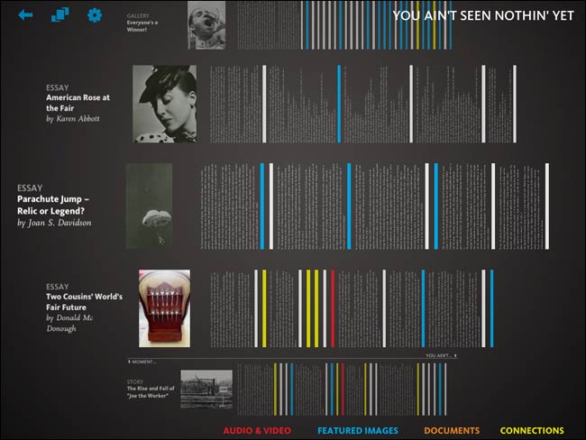
For example, in some areas I think the app makes more effort to be clever than it does to sell the content. Take these article overview index pages. The “strip” running left to right for each article gives the user a rough indication of the relative length of each essay or article, and the coloured bars indicate the different types of content an article contains - audio & video, images, documents or connections.
However, which synopsis here is more clickable?
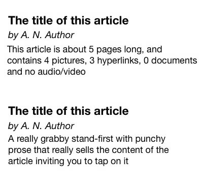
You’ll very rarely hear me say the phrase “there is too much metadata on display”, but with Biblion relying on presenting articles framed by their metadata rather than their content, I find the app makes it hard for something to grab your attention.
Article layout issues
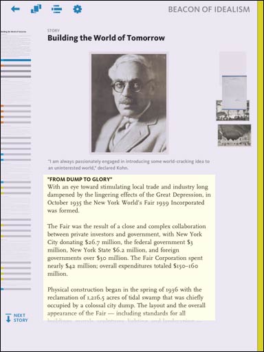
I’m also a little underwhelmed with the article layout page.
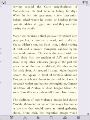
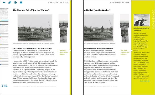
Whilst I like the idea of the thumbnail view of the article on the left-hand side giving the user the equivalent of a browser scrollbar indicating how far there is to go in a story, the actual amount of space devoted to the article text is very tiny. Just 27% of the available iPad screen space is used for article text.
Just 27% of the iPad screen is used for article text in Biblion
This compares unfavourably with apps like The Atavist (67%) or Instapaper (59%), or widgets like Readability which make use of the entire iPad screen to increase the ease with which content can be consumed. Zite, another candidate for the “magazine of the future” crown, also has a much bigger reading portal when displaying content (59%).
Apps that are driven by content consumption use much more of the screen for article text. Clockwise from the top: The Atavist (67%), Zite (59%), Instapaper (59%)
Not only is the amount of space devoted to an article quite small in terms of screen real estate, the default font size in Biblion is small. There is an option to bump up the text size, but only by a single small increment.
Navigation issues
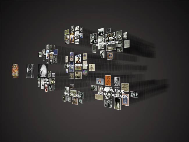
Navigation is also not always intuitive. Journeys through the app start with the “exploded content” view at the front.
Tapping on the cluster of images around “Beacon of idealism” takes you to this frontpiece for the section.
A tap on the images on the right of the screen, and you are into this article overview.
And a tap on the back button in the top left-hand corner? Well, naturally, rather than back to the page you came from, that takes you right out of the entire section again.
Intuitive is not the word.
The positives
I’m not alone - Bill Barol also found it hard work. Which isn’t to say that there are not things about Biblion that I find impressive.
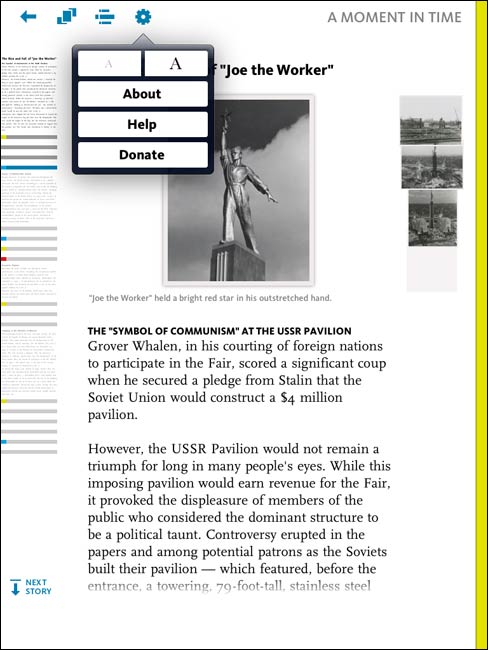
Rather like The Atavist, I very much like having a big bundle of content downloaded onto the machine to browse through at my leisure when travelling and forced to be offline by tubes or planes, and there are some beautiful pieces of archive material contained in it.
There are also some nice side-steps through the content, facilitated by “connections” that the user operates via a side panel in the article view.
The future? Or the future that never was?
The topic of the app is the New York World’s Fair of 1939 and 1940, an event which was looking forward to the future. One of my favourite blogs is Paleofuture - The future that never was, which collects together incorrect prophecies about how things are going to turn out. I can’t help thinking that apps like Biblion may end up appearing on a site like that, with some patronising caption like: “at the time they said that one day all magazines would be delivered this way”.
As I said in the recent London IA podcast, I think at the moment with tablet and app design we are feeling our way around the equivalent of the web’s “the animated gif years”. I think it is great to see institutions like the New York Public Library thinking about new digital ways to present their considerable archive of content. I don’t think Biblion does it justice in this medium quite yet.
I'm afraid I agree with you entirely.
The Brits have an expression, "too clever by half" and that's what I think of this app.
After waiting a very long time for it to download I was presented with an insensible interface that was quite cryptic and annoying. After poking at random at things that looked like links to content I gave up and deleted it.
Too bad; it seemed to have much potential.
Definitely agree, the builders of this app were going for flash over practical UX. I absolutely won't use an app on any device if the UX is obviously ignored. On another topic, I read your previous post on the future of UX designers who can code, and that is definitely the case. My wife is a UX designer for a large, well known company here in the silicon valley and with her UX and coding abilities, she's viewed as an indispensable team member and has a ton of job security with the company.