News, sport, weather, TV, radio - comments on my recent post about the BBC's global navigation
by Martin Belam, 7 May 2010
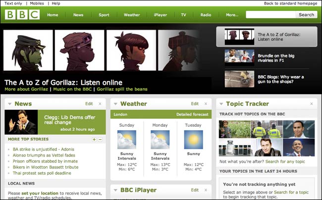
Last week I published a blog post looking at the history of the BBC's global navigation.

There have been some interesting comments left on the entry by some people involved in the project over the years. I'd suggested that the previous omission of the obvious 'news, sport, weather' labels was mostly due to internal politics.
Jon Kingsbury, who I've worked with closely over the intervening years both at the BBC and at NESTA, was in charge of launching the first version of the grey global toolbar. He wrote:
"While there was certainly an amount of inter-divisional discussion, it is too much of a conspiracy theory to suggest that News and Sport were left off so as not to upset other divisions (the inclusion of Radio disproved your theory).
In fact, the strategy for the BBC toolbar was to enable users to explore new/emerging content areas (e.g. The Radio Player or message boards). Our users told us in testing that finding News, Sport and Weather was very easy (from the major homepage coverage). Also before 2001, we should remember that a user in the News, Sport and Weather pages often found no other internal links."
"Being one of the people who designed the grey toolbar, I have to agree with Jon K... What we were trying to do was expose people to a lot more content than they would find otherwise.
As you may remember, the strategy at the time was about getting more eyeballs across all that rich content that nobody could find. It was also conceived pre-Google, when search engine results were absolute rubbish and none of the BBCs content was properly set up for indexing anyway. You couldn't rely on search. So, the nav was trying to get people to discover new stuff (as was all them links on the homepage) and understand the breadth and depth of the site.
We usability tested the heck out of the toolbar and homepage and the fundamental structure did reasonably well. It served it's purpose of making people say 'aah, I never knew they had that before!'"

Richard Titus, involved in running the design team for the BBC website in more recent years, also joined in:
"I really like the new redesign and am pleased they've updated it since our redesign two years ago. The Homepage and global nav, at their time two years ago were really about bringing consistency and commonality to what had become, quite frankly a mess (and it wasn't just the homepage of links that was a problem the entire site looked like a garden after two years abandonment). All great design involves iteration and evolution and as the BBC consolidates its online offerings and culls its services - the navigation should be refined."

He also left this interesting note about some functionality that hasn't arrived on the new homepage:
"I'm sad to see that there are still no preview overlays of the 1st two sentences of an article, something users asked for over two years ago and was ready for launch - but some of our colleagues thought would stop readers from 'clicking through' and reduce their traffic, and therefore budgets."
...And you'll no doubt be pleased to see that, as you predicted, the Barlesque team rolled out the new masthead to the rest of the site this morning. :-)
As for the politics: I believe that, as so often, it was a case of baby steps towards the ultimate goal. We could never have jumped straight to this mast from the grey one - we needed the intervening big, unbiased 15 item "Explore" panel to get stakeholders to agree to having actual BBC sites in the mast. In turn that allowed us to show which of the 15 merited pulling out as primary links (the stats were very clear on the 6 chosen).
I realise now it reminds me of another process I was involved in (warning: BBC TLAs ahead), namely the moving of our registration systems from the CUD to SSO to Identity. CUD, totally decentralised mess of different front-ends. Identity, totally centralised. SSO somewhere in between. It was hard enough to get site owners to take on SSO, with its customisable registration bar - straight to Identity would have ended in open revolt.
Alternatively maybe it's just the Beeb's now firmly in an age where the desires and whims of small fiefdoms are outweighed by the efficiency savings and outright logic of centralisation.
Here's hoping.
(PS: My views, not Auntie's.)