Fixing the IA of an IA's blog: Part 2
At the beginning of January I changed the design of my blog. As well as a new banner image, and a few tweaks to the CSS, I also made some significant changes to the information architecture and structure of the site. This came about from realising that I lacked URLs I could point people to which explained the main themes that I write about - themes like 'newspaper website design' and 'the future of news'.
Homepage changes
One area that I made changes was the homepage. Since I mostly view the web through the prism of hundreds and hundreds of RSS subscriptions in Google Reader, my view of how my content was being consumed was skewed. I realised that on the homepage, rather than just have the latest blog post, I wanted to give a clearer overview of what the site is about, and provide some navigation to find the main themes that I write about.
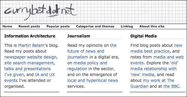
I settled on the idea of a panel that split my content up under three broad headings: information architecture, journalism and digital media. A short paragraph filled with inline navigation sets the overall scene for the blog. This is aimed specifically at new users who may be hitting the homepage of the blog for the first time. I hope this solves the problem that someone might be told "Go to currybet, he writes a great blog about media stuff", only to find the front page entirely filled with something about Walthamstow Dog Stadium or the Victorian ice trade.
I've stuck with only showing the single latest blog entry on the homepage. Most blog software templates ship with a default mode of showing 5 or more recent entires in full on the front page, but then most bloggers don't hammer out an average article length of 700 words. So I decided on displaying the day's current entry, and links with a text snippet to the previous five. A behind the scenes production change for me is actually writing these snippets by hand when I publish a story, rather than relying on the CMS to auto-truncate the opening of the article. It is a little bit of extra work - and I keep forgetting to do it - but overall I think it produces a better homepage user experience.
Moving the linklog
A second issue was that the homepage used to feature the most recent batch of my Delicious bookmarks. In my user survey they had proved to be a 'Marmite' issue with readers. Several people added comments about how valuable they were, and several others found them really off-putting. As a result of the survey I made a special RSS feed that excludes the linklog, and decided to remove them from the homepage. The linklog now appears (almost) daily in the main RSS feed, and can be reached via 'Linklog' in the main horizontal and right-hand navigation. Whilst still putting effort into producing them for dedicated subscribers, I have significantly deprioritised them for the casual visitor to the site.
Next...
In the next post in this series I'll be looking at how I've built new 'hub' and 'theme' pages that give a narrative overview of the things I write about, rather than a simple chronological list.
I think your site looks cool. I am a big believer that a well laid out and designed blog sets you apart from the rest, too many blogs these days fill there sidebars with hundreds of little widgets and apps that it takes the focus off the main point of the blog....content.
I have a rul that if i add something to my sidebar i take something else off it, i never have more than 10 itmes on the sidebar and i only have 1 on the right.
I really like your header, it is clean and fun. If i were to ctitisise one thing is that i think there is a bit too much white, a little colour somewhere might be cool.
Other than that your site is informative and has quality content which is what blogging is all about, I know my blog is in a different niche to yours but i always like to comment on good well designed blogs, good luck in your enndevours
Adam
The content is great, but I agree that a dash of colour will add a lot to the site. Maybe a textured white background?