Ecommerce Expo: Part 1 - "How little changes made a big difference at BA.com"
Last week I made my annual trip to the Ecommerce Expo in London. Although in my current role at The Guardian I don't generally deal with Ecommerce day-to-day, I've done plenty in the past for people like Sony. The exhibition had a four-track two day programme of free seminars running alongside it, and if you can pick your way through the more blatant software and service sales pitches, you can find some really interesting case studies from some big (and not so big) companies. Today I wanted to start posting some notes and quotes from the event.
"How little changes made a big difference at BA.com" - Mike Tomlinson, British Airways
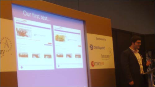
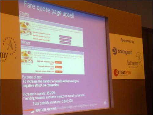
Mike Tomlinson gave a brilliant case study of how British Airways had used multi-variant testing on their website. The changes brought about by testing were not always huge. Mike showed two slides of the first real changes they'd made to the site as a result of their own in-house A/B testing system. From my fuzzy picture below you can't really see the detail, but it was a splash promotion offering upgrades on previously booked flights.
Basically the first version had two buttons - a continue through the upsell process and a 'no thanks, get me out of here' button. By changing the 'no thanks' option to a smaller text link and placing it on the left away from the 'continue' button, they increased clickthroughs to carry on the sales process. Another change was using more appealing imagery, and a small line of red text underneath the main image disappeared. It was a link to a currency calculator to work out the price in money other than sterling. They found that even though people didn't click on it, the very presence of the text dampened conversion rates.
Having proved that testing worked with their own in-house system, they moved to using Autonomy's Optimost, which meant less involvement for their tech team, and that a wider range of people within the business had the opportunity to suggest and measure changes to the site.
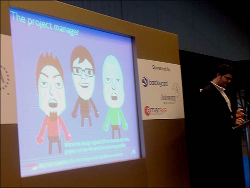
There was one area of the talk I did find a little strange - I didn't recognise his description of a 'user experience architect' as being a person who "likes to say no to new ideas". Tomlinson felt that introducing a regular programme of testing had begun to change the organisation. No longer were project managers stuck in lengthy meetings where people argued the toss over two slightly different link colours, instead they could say "Let's do both and measure!".
He also claimed it has made the organisation less risk averse, and they have even used control samples of their homepage in bright oranges rather than their red, white and blue brand palette to measure the effect on conversion. He also talked about the possibility of launching 'vanilla' applications on the site, with just the bare bones of the interaction design in place, and then gradually adding the visual design elements through testing their effectiveness.
At times the testing regime sounds like a hard grind. After 7 waves of testing on the BA payment page they produced a 0.23% percentage uplift in the completion rate. That number might make you say 'meh!', but it does means that for every 435 page views, they sell an extra flight. With a high ticket item like that, it is worth it - I'm not sure all businesses could afford that luxury.
As ever, when you try and apply some of these lessons to the news industry, it gets a bit more fuzzy. British Airways have some clear goals and KPIs. On a news site, you can set varying desired outcomes, like the user clicking on an advert, leaving a comment, viewing another article, or coming back the next day, but none of them currently carry the value of a plane ticket!
Overall BA's findings were not revolutionary. Small text changes often yielded more dramatic results than big layout changes. And they found that if you make your buttons bright red and write "Click here >>" on them in big letters, more people click on them. What was key though, was that these were firm design decisions based on evidence, that you could actually put a price on.
One of the best points Tomlinson made was that nobody being tested in a usability lab with the 'talk-aloud protocol' ever says "you know, that small line of red text under the image just threw me off there for a second. That has lessoned my chance of buying this item in the long run". The trends discovered via multi-variant testing show British Airways how even the smallest change in web design impacts their bottom line, and seem to be factors that no other method would uncover.
Next...
In the next post in this series, I'll have a write up of a talk given by Trenton Moss of Webcredible called "Persuading users to buy & eliminating checkout drop-offs".
Thanks for sharing. It is amazing how powerful is multi-variant testing as well as some other user testing tools. Still a lot of companies don't invest a lot of time and energy in making them work. I had also written a recent post on top 10 low cost ways to improve usability:
Fascinating insight into some very thorough testing. I always think that even a slight change in conversion through testing is no less of a result than something more dramatic. If nothing else, it steers you further towards the objective reality of what your visitors do and further away from your preconceptions.
That is very interesting, and it does seem applicable. I mean when I go to buy online the 'little things' are what seem to make you want to purchase. Only if I could afford to test all of these things to increase conversions!
Yeah the small things like this can help greatly. But it is of course important to keep the aesthetics and not make the buttons too small or too ugly, but im sure you guys know all that since you are professionals :)