Baby P killer images lose their impact online
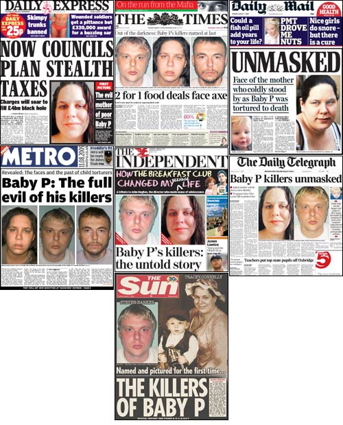
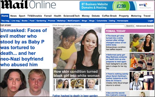
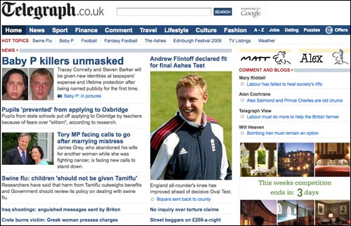
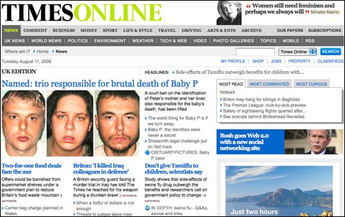
As the clock turned midnight on Monday night, the anonymity order preventing the publication of the names of Baby P's killers expired, and it was obvious which images were gong to dominate the press front pages the next morning. The chance to vilify Tracey Connelly and Steven Barker by name was something hitherto denied our newspapers, even though the public could find them out with just the briefest of Google searches.
Since the deadline was in the middle of the night, I had a trawl around British newspaper sites at half-past midnight to see how they had published the news online. Subsequently a huge difference struck me between the newspaper web and print designs.
After my 'free wifi' or 'free newspapers' question yesterday, you might be forgiven for thinking that I am being transformed into a print luvvie, but if you look at the front pages above, you can see that a great deal of care and thought has gone into which size images should be used, and where they should be placed.
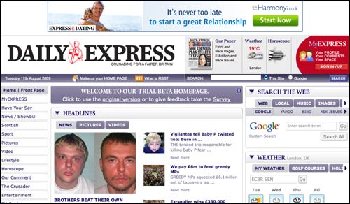
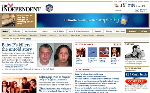
Online however, stuck with CMS templates, it seems that the art of layout has mostly been reduced to the art of picture cropping. I know that some titles, including The Guardian where I work, have different layouts available for the front page, but it seemed to me that, when compared to the print versions, the impact of these images was mostly lost online.
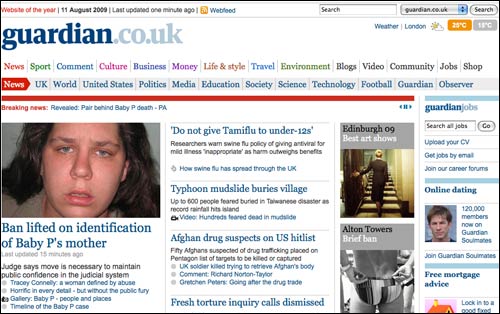
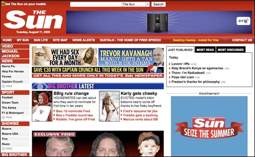
(The usual caveat with the screengrabs by the way - other screen sizes are available, and not everybody has a laptop, so they would potentially have seen more of the page at first glance than I did. I didn't include The Guardian in the print front pages because on Tuesday morning it led with a picture of pantomime villain Peter Mandelson rather than a real villain, and I have not shown a screen grab of The Mirror because it had not published an online story naming Baby P's killers when I checked the sites.)
Good contrast, and it's interesting to advance this one more step.
All those CMS templates were designed like that because there was a design meeting in which people contributed ideas of the many, many things which should be on the front page: you must be able to access the weather, we've to have a sudoku link, what about our motoring section...?
And that scenario was driven by the different nature of the media. Lots of readers of these sites come from outside the UK and are unlikely to be so interested in the Baby P case.
So: different media, which exist in different contexts, and are used in different ways, lead to different uses of the assets.
Now we ask lots more questions: are news home pages designed appropriately? Do they make appropriate use of photography? What what would it be like if the home page was radically reconfigured every day? Should the "art of layout", as you describe it, be an art or a science on the web?
All these questions I will leave as an exercise for the reader.
Personally, I prefer the clean lines and readability of the online versions. The print versions seem garish, with screaming headlines that might as well have exclamation points after them (surprised they don't), while the online versions present more of the facts-- here are the photos, the ban was lifted, here's the story.
Perhaps it's a generational thing.