Social media unplugged: Part 3 - Newsvine, Reddit and Facebook
This week I've been writing about 'social media unplugged' - finding out what the user experience is like when you approach social bookmarking for the first time via using an icon on a content site. I contend that having detected an attempt to share by a user who isn't logged in, these services need to provide an opportunity for an existing user to log in, for a new user to register, and they should take the opportunity to showcase their service and sell the benefits of registering. So far I've looked at four services which have varying degrees of success according to my measurement - Digg, StumbleUpon, Yahoo! Buzz and Delicious. Today I'm going to look at three more services, starting with Newsvine.
Newsvine
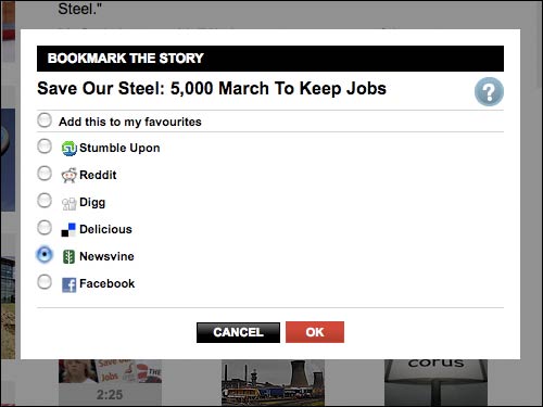
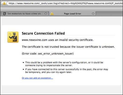
Newsvine stood out in my tests as having the worst user experience for a non-registered user. I tried to 'seed' or share stories from both the Daily Mail and Sky News.
On each occasion, something in the way that the URL tried to re-direct me to some kind of https page caused my browser to choke on the security credentials. As a non-registered and non-logged in user, my entire experience of Newsvine was a browser error page.
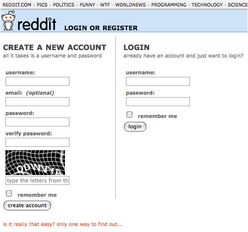
I mentioned yesterday that I thought Yahoo! had this whole process pretty much spot-on. One of my only concerns was that the form seemed a little onerous, because as well as Buzz you were also signing up for a whole world of Yahoo! services. This is certainly not the case with Reddit. In fact, if you press a Reddit share icon without being logged in, you arrive at a registration form so simple that it even asks the question:
"Is it really that easy? Only one way to find out..."
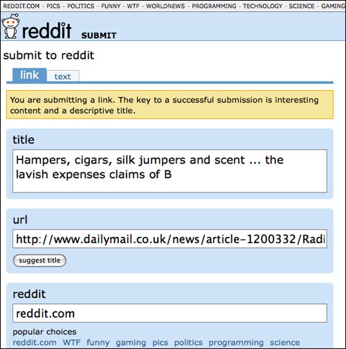
After filling in that brief form, the system remembers what you were trying to mark as 'Reddit', and takes you to a page to provide additional details on the URL.
Where I did think the Reddit user experience failed a little was in selling the service and features. Once you are first registered and logged in, using the tabbed navigation takes you to very empty pages with the stark message 'There doesn't seem to be anything here'.

There is no attempt to explain to the user what might appear there if they start using the service more fully - or indeed anything to indicate that this isn't just a friendly error message about a missing database entry.
'Share on Facebook' icons are now a common sight around the web, and Facebook is currently at the peak of social media popularity. Unfortunately, the user experience I was trying to emulate was a little difficult to test.
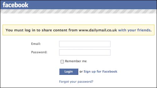
Essentially, if you click a Facebook share icon without being logged into the site, you get a choice whether to sign-in or register. If you start the registration process there isn't anything particular on this page that addresses the fact that you were trying to share a URL.
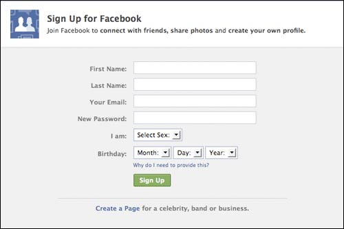
Clicking 'register' takes you to the start of the process of creating a brand new Facebook account, and frankly, there is a limit to the number of multiple online identities I can sustain. For the purposes of this exercise I didn't have time to create an entire fake persona and network of friends, so I don't know if at the end of the process the URL you were trying to share is still captured.

Actually Facebook freaked me out a little here. I started trying to set up a fake account under the name 'Eric Pickles'. However, I guess because I had used an email address which included martin.belam in it, even though in theory both 'Eric Pickles' and that individual email address were unknown to the system, it started suggesting some of my genuine friends to me as possible first contacts!
Next...
Tomorrow, in the last part of this series, I'll be looking at the 'unplugged' user experience of Google Bookmarks, Fark and Mixx.
I'm getting fed up with Reddit actually. It does not bring much traffic to my site. Most of the time, people will just play down your submission to stay on top.
While I find these tests interesting, what do you think prompts a user to click on an icon that they are not a member of? I don't think many "normal" users actually would but I guess you have more stats to prove me wrong?
Hi Agnes, I don't have any metrics to say that this happens a lot - certainly I don't think there are armies of 'normal' Internet users getting stuck when the press these buttons. My interest comes from the fact that whenever I'm producing user journeys and the information architecture for a site, I'm always looking for the edge cases and error states that might break the user experience around the edges. It strikes me that some of these services handle this case a lot more gracefully than others. However rare an event, it is still a moment when you can acquire a new user, and it seems a shame to waste it.