Functional 404s - Do beautiful 404 error pages still help users?
A 404 error page appears to a user when they have followed a broken link, an out-dated search result, or when they have mistyped a URL. It is very often an afterthought in a site design and build process, but actually it represents one of the most potentially painful user experiences. The user has been disappointed by whatever action they have just taken, and, if it is their first visit to your site, you have just a couple of seconds to re-orientate them to prevent them leaving your site and never returning.
I recently got pointed to this collection of 60 beautiful 404 error pages. There are certainly some striking designs there, but I was also interested not just in their visual appearance, but in their functionality. So I had a look at each of the 60, and noted down the features that they had in common, and the basic features that some of them lacked.
Homepage link and label
It is pretty much a web rule of thumb that every page on a site should link back to the homepage. This is especially true of a 404 error page. However, only 54 of the 60 pages in this list linked to their homepage. Something like the fuelly.com 404 page even looks quite clickable, but there is no actually link to the root of the domain.

Of those that did, only 35 of these 404 pages actually labelled their homepage link as to being to 'home'. The rest leave the user either guessing where to click, or making them hunt around to find which reference to the domain or logo actually constitutes the homepage link.
In chrisglass.com's design, for example, there doesn't seem to be any logic behind why the user should guess that clicking on the big '404' in the image will be a link to the homepage, but clicking on the mob to the left won't be.

Search
If a user has followed a link or a web search result looking for a specific piece of content, and they arrive at a 404 page, one of the natural instincts is to then 'search' the site for the new location of that content. However, only 8 of the 60 404 page designs in this study actually have a search box that the user can directly use.
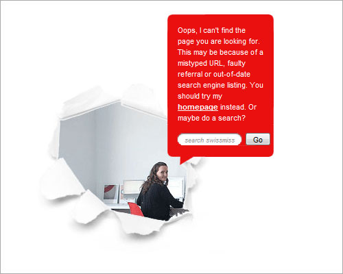
The Swiss Miss 404 design is minimalist, but in the central panel the page provides probably the two key pieces of 404 page furniture - a clearly labelled link home, and a search box.
Major navigation elements
When building a website, we generally take care about how we arrange the major navigational elements. Do they allow users easy access to all the major areas of content? Do the labels convey what the user can expect to find? Is the tone and language in tune with audience expectations?
Given that people put a lot of care into making sure that the navigational framing around content works in all contexts around the website, it is strange that many people drop their primary navigation from their 404 error page, in favour of a very customised design. In this study, only 18 of the pages had their main navigation links intact on the 404 page.
Contact details or contact link
Another important thing to provide on a 404 page is a way for the user to contact you. If they've been looking for some content that you have, and that they can't find, at least give them the chance to ask you "where did you move this to?". 27 of the 60 pages in this group either had direct contact details on their 404 page, or a link to a 'contact us' page. Which means that more than half didn't.
This is another reason to retain your standard navigation and footer on the 404 page - because any decent set of global navigation ought to include 'contact us' as an option.
Don't dismiss your user
Of course, the examples in this study feature a lot of sites which can expect an audience to be web-savvy and to appreciate creative quirks. However, for a corporate or business website, it is important not to dismiss your lost and frustrated user as an idiot.
They might have got to the page by following a broken link on your site, a broken external link, an out-dated web search result, or because they typed the URL in wrong. In only one of those four possible cases did the user do anything wrong, so in your error message, err on the side of being apologetic.
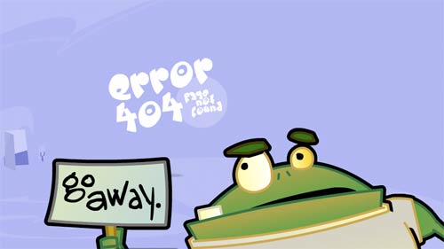
The lookitsme.com animated frog video, tapping on the screen and telling the user to go away is funny, but not the message I'd necessarily want to give if I was more of a corporate site.
Likewise if your first experience of a business is the text on their web error page, then you probably want to find them taking your attempt to get information seriously. I'm not sure that Pattern Tap's 404 page passes that test:
"Let us take that burden. It's not your fault. No, really, listen to me. It's not your fault. We have a 24 hour hotline to deal with things just like this. Okay, its not really a hotline, its really just some encouraging words to keep trying, but hotline sounds so much cooler."
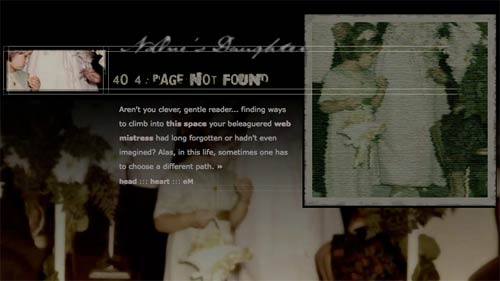
In terms of being quirky about delivering the message, but doing it a way that didn't seek to blame or irritate the user, I liked the message on nodltd.com:
" Aren't you clever, gentle reader... finding ways to climb into this space your beleaguered web mistress had long forgotten or hadn't even imagined? Alas, in this life, sometimes one has to choose a different path. "
The page also includes a link to mail the site owner, with the pre-populated subject line 'web mistress, oh web mistress'.
Nearly getting it right...
A couple of designs have nice touches, but don't quite get it right. The 404 page at jbaber.freeshell.org says:
"You have reached one of those infamous 404 error pages. This means the page you're looking for doesn't actually exist. If you followed a link here, the link was bad. Tell the person who's fault it is and tell me."
However, the page has no contact link to actually allow you to pass the information onto the webmaster.
The Big Noob uses their 404 page to place a big promo for subscribing to their RSS feed.
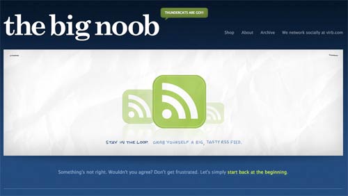
I have a couple of problems with this. The first is that if I've just followed a bad link or bad search result, and this is my first experience of the site, what on earth have they done so far to make me think that I would want to regularly subscribe to their content - I'm yet to see any. Secondly, and more seriously from a structural point of view, the RSS logo image and the text underneath do not actually link to the RSS feed. In order to follow their call to action, I have to hunt around in the footer for the tiny RSS feed link.
Special amusingly unusable merit award
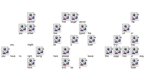
The award for the least usable 404 page out of the whole set of 60 must go to this effort from project-euh.com. It isn't just the fact that a synthesized voice keeps calling out "404 page error" at you, but the fact that the only clickable link on the page will take you not to the homepage, but to a randomly selected page from elsewhere on the site.
Conclusions
There are some great designs in this selection of 60 pages, but if you want to focus on usability, not beauty, the key 404 page elements you need to remember are a clearly labelled homepage link, a search function, your standard site navigation, and details of how the user can contact you.
PS - if you want to check how my 404 page stacks up against those recommendations, you can find it here - currybetdotnet 404 error page.
I would add a couple of extra points to this, which is more to do with routine maintenance.
At the very minimum, have an account with Google Webmaster Tools and check which pages the googlebot is looking for and cannot find - then set up server-sided redirects to the correct page.
Ideally, when redesigning a website, don't change all the URLs and then tell people their links are out of date - but set up 301 redirects from the old urls to the new ones.
That's good customer experience, and good SEO.
After a couple of casual weekends of work, I was able to get the log of 404 errors at my "day job" down to single figures each day - and they are silly glitches which really can't be catered for.