Navigating newspapers: Part 4 - The 'red tops' and the 'middle market'
Last week I started publishing a series of posts about the primary and secondary navigation on 9 of the UK's national newspaper websites. Today I want to look more closely in depth at the red tops and the 'middle market' papers.
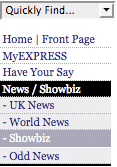
 Daily Express
Alongside The Sun, the Daily Express is the only paper I looked at to still utilise a left-hand navigation. There are a lot of links, and I didn't include in the study a second similar panel of links which look very much like paid advertising and commercial ventures rather than navigation.
The Daily Express was also the only paper not to use the plain text label 'News' - instead the paper conflates 'News / Showbiz' in their navigation scheme.
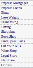
 Daily Mail
The Daily Mail uses a top horizontal navigation, which, when a tab is selected, is colour-coded, and reveals a second tier of links. The terminology is heavily tied to the paper, with branded sections like 'Femail' and 'Coffee Break' used instead of more common terms like 'Lifestyle' or 'Fun & Games'.

The paper also has some permanent links littered around the masthead area. Commercial ventures like dating, a wine shop and jobs are in the top left-hand corner, whilst content links including horoscopes and travel are always on display in the second tier navigation.
 Daily Mirror
I've written before about the Daily Mirror's navigation, and I wasn't too keen.

I find the fact that the second-tier links change as you hover across the top-level links incredibly distracting and a potential barrier to accessibility.
Like all of the red top papers, The Mirror has specific navigational sections for popular TV talent shows as a feature of their permanent menu.

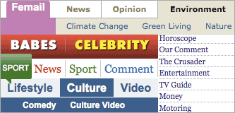
 Daily Star
The Daily Star only has 10 top level links, and with those featuring 'Babes', 'Celebrity', 'TV' and 'Fun' the paper is wearing its light-hearted approach on its navigational sleeve. I can't help wonder if there is something aspirational about the juxtaposition of the 'Babes' and 'Celebrity' links - maybe if you appear enough in the 'Babes' enough and get on a TV show, you can eventually move across into the 'Celebrity' section.

Interestingly, although all of the newspaper websites carry reviews of various types of media, only the Daily Star gathers them together under one top-level 'Reviews' section.
 The Sun
The Sun has more navigational links than any of the other papers in my study. In the masthead a horizontal navigation concentrates on more functional items like a 'Site map' and RSS feeds. Meanwhile left-hand navigation takes care of the topics and subjects.
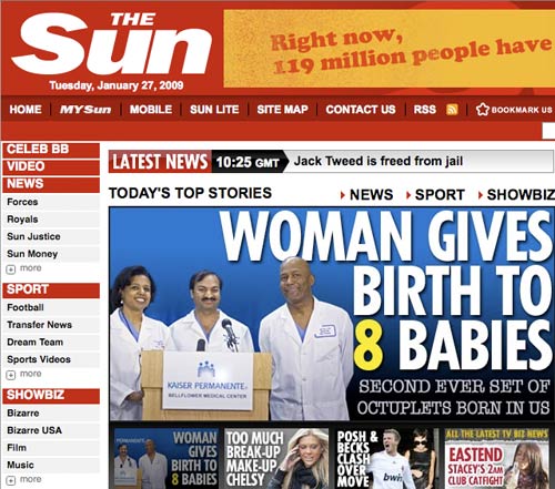
Keeping the branding similar to the paper is clearly important to The Sun. Online they don't have horoscopes, they have a link for Mystic Meg. They don't have a problem page, they have a link to Dear Deidre. Business coverage is taken care of by 'Sun Money' and 'Sun City'. The navigation strongly reflects the personality of the newspaper.
Next...
Tomorrow, in the last part of this series, I'll be looking specifically at the interesting quirks and nice touches in the navigation of 4 quality nationals - The Guardian, The Independent, The Telegraph and The Times.