"Beyond the browser: Usability in mobile interaction design" UX Corner meet-up
Last week I went to a London UX Corner meet-up entitled "Beyond the browser: Usability in mobile interaction design". The event was held in one of Sun Microsystem's London offices, and featured 3 speakers.
As hosts, Sun got to give a brief plug for their UK start-ups network, which is free to join for companies less than 6 years old with fewer than 150 employees on the books, and promises beer and pizza as well as tech help.
"Intricacies of design for small screen devices" by Antony Ribot
Antony Ribot was the first UX presenter. He identified one of the absolutely crucial fundamentals of mobile device application design - you only have about thirty seconds to get it right. Most users having a bad experience within the first 30-60 seconds of using a device or service will never return to it. He compared launching products into this space to the hostile and unforgiving environment of Mars.
Antony favoured rapid prototyping so that design and ideas could be rejected quickly as soon as their limitations became clear. This was likely to happen a lot, as the mobile space faces a lot of constraints, including things like small screen-size, network latency, minimal controls, lack of computational power on devices, battery life and so forth.
His recommendation was to re-use as much as possible behaviour the user has already learned on their device, rather than making them learn new interactions. He also stressed the importance of getting minor details right and distinguishing mobile applications with a bit of polish. One of the simple examples he cited was off-setting the title of a page slightly to compensate for the fact that Nokia devices insist on putting a 3G icon in the top left-hand corner of the screen.
He also thought that 'motion design' documentation was becoming an increasingly important part of the design and build phases of mobile application product development.
"Knitting design and development together" by Tom Hume
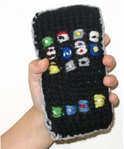
Having been to some IA talks with idiosyncratic themes, I rather hoped that Tom Hume was actually going to relate everything in the design process back to knitting, but aside from a slide of a knitted iPhone, wool hardly featured.
Tom works at Future Platforms, an agency which helps deliver mobile applications from concept through to launch and operation. With tongue not entirely in cheek, he suggested that design and user experience had been important on mobile devices even before the iPhone arrived.
Tom felt a lot of problems during software development came because of designers and developers belonging to different tribes. He used Pixar as an example of a company where developers and artists worked well together to produce something with mass appeal, and said that daily ten minute show-and-tells from designers of what they were working on had improved their own product development process. He put up a slide of a cat cuddling up to a dog to illustrate his point - a tactic which I find never fails during presentations...
I found a lot of reassuring things in Tom's talk. He argued that if you thought a project had been executed perfectly then you had missed something. He also showed a diagram which illustrated how many revisions had been made to the wireframes of an application during the project life cycle. This approached a hundred, many of which had taken place after the mythical client sign-off moment.
He did though stress that documentation like extremely detailed wireframe sets can fool you into thinking everything is specified. Too often only the 'perfect path' is documented and catered for. A man after my own heart, he went on to explain that for mobile devices there needs to be specifications for the many things that can happen like taking a call, the battery failing, or the network dropping as the user enters a tunnel. How does the application pick-up after a situation like that interrupts a process? And, just as importantly, how is that conveyed to the user?
Tom also thought that the QA teams who work on products should get more respect for what they do. After all, he argued, they are closest to the user, with the most experience of using the product's functionality across a variety of different handsets.
"Mobile 2.0 and Usability" by Scott Weiss
Scott's talk wasn't so much about pointers to a rosy usable 'Mobile 2.0' future, as much as a thirty minute rant that boiled down to "OMFG these are the most popular apps on the most popular phones and they are shockingly, shockingly, shockingly bad to use".
He had a split screen set of slides that demonstrated how you could access Facebook through 3 different mobile UIs on his Blackberry device, and that for none of them was his account properly in-synch. He didn't look at MySpace because "I'm too old for that" but did try Gypsii and MyGamma. Both of them were painful examples of poor usability - with exciting error messages like "Error 999 Tunneling", complete failures to log in, and some torturous user journeys.
A lot of his examples were from the iPhone, and he does not rate the usability of the device. In fact the first question from the audience after he finished talking was "Is there anything you like about your iPhone?". He said he liked the iPod bit in it - but more seriously he also thought that it was clear that when Google were working on the Android phone, they were using iPhones and noting exactly what needed improving.
Scott felt that sometimes "wizzy graphics and animations can hide deeper usability weaknesses". He showed a clip of him scrolling through an iPhone photo gallery, where every image required him to pinch and stretch to get the picture to a comfortable viewable focus on the main object:
"This is only fun the first 23 times you do it."
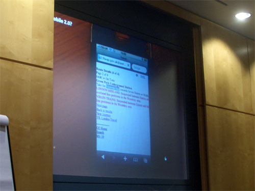
He suggested that criticising Apple in public is much more risky than criticising TfL, but that both will annoy fanboys. So he did a good job of ripping into both. His video clips of him trying to use the TfL route finder on a couple of devices were lengthy and showed another difficult user journey to accomplish a simple task. He also demoed a version of a London route finderusing Google maps which he described as:
"It is engaging...It is dynamic...It is irritating...Its the wrong route"
Verdict
I caught up with some old friends, some Twitter-pals, met some interesting new people and I thought the UX Corner meet-up was a great success. They had accepted 115 people onto the guest list, and had a very low drop-out rate, which meant that the space was full. I'm looking forward to the next one.
Nice escapade in London..