Taking the 'Ooh' out of Google: Getting site search right - Part 7
Over the last couple of weeks I've been publishing a series of posts based on an expanded version of the presentation I gave at the 2008 Euro IA Summit in Amsterdam at the end of September. There, I was talking about "Taking the 'Ooh' out of Google", and getting site search right for news.
I've looked at ways that site search can be made distinctive from Google by including thumbnail images, information Google can't obtain, providing usable 'advanced' search, and highlighting some positive examples from newspaper sites across Europe. I want to continue today by looking at some areas of interface design where care needs to be taken.
Other navigational elements
A great deal of attention needs to be paid to where you place 'other' navigational elements on a search results page. Poland's Rzeczpospolita, for example, has a search box in the banner area of the page, and then 'tabs' between the banner area and the results themselves. These tabs give the appearance of being part of the results set, and it looks like clicking them should perform some sort of filtering action on the results.
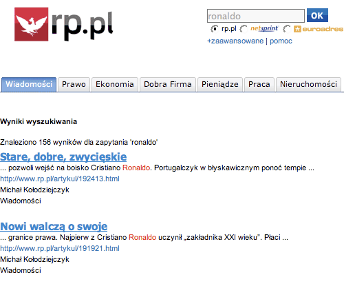
In fact, they are just the standard site-wide global navigation, and clicking them takes the user away from the results set altogether.
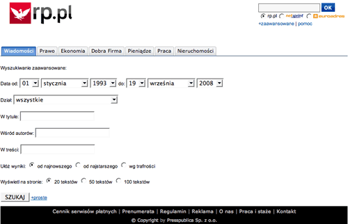
The juxtaposition is even more striking on the Rzeczpospolita advanced search form, where the navigational elements appear to be a part of the form itself.
It really does depend on the design of your site as to how to cope with this problem. I would generally advise that if you have familiar site-wide global navigation across the top of a page, then it should be retained on a search results page. However, the graphic design needs to make a clear distinction between navigation and the results. At the most extreme, the bare minimum navigation a search results page needs is a home link, a help link, a contact us link and then whatever 'about us' and copyright messages your legal team insist on.
Getting localisation right
One thing that you must also ensure, if you are to compete with Google for search users on your site, is that localisation is done properly. Kathimerini is one of the better online Greek newspapers, and one I'm familiar with because it also has an English edition. Their search technology, though, isn't completely fine-tuned for the Greek market. Their results snippets offer a publishing date which makes a contrast to the format used elsewhere on the page.
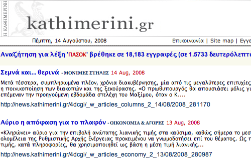
As you can see, what is listed in the header of the page as Πέμπτη, 14 Αυγούστου, 2008 is listed in the results rather less exotically as 14 Aug, 2008. [1]
Next...
Tomorrow, in the next part of this series, I want to move on from areas of design where caution needs to be shown, to look at some examples of poor interface design and implementation. These are the kinds of things that prevent a good user experience, and which are likely to drive the user away from site search and back into the arms of Google.
[1] Obviously at the moment the URL has to be in the Western alphabet, but, in time, following pressure from nations like Russia and China, this restriction will certainly change. [Return to article]