The Financial Times and "the worst online redesign I have ever seen"
Site redesigns are seldom initially popular - you only need to ask BBC News about that - but the new Financial Times homepage seems to have come in for some especially harsh criticism. On The Guardian site yesterday, Andrew Brown launched a withering attack on the redesign, calling it "the worst online redesign I have ever seen".
"It is ugly, uninformative and actively confusing. Instead of presenting a lot of information quickly and quietly, it presents very little, slowly, and with maximum confusion. It's like Powerpoint that has been dropped into a blender. It looks as if it has been aimed at people who don't want to read. No doubt this is a growing and important segment of the population."
I think Andrew is being overly-harsh here. Whilst I'm sure nobody would describe the new look as beautiful, it isn't as bad as all that. Early on in his article Andrew talks about point size and leading, which made me initially think this must be the rantings of a print dinosaur. However he then goes on to mention Wordpress templates and Rememberthemilk, so clearly he is no novice to the Internet.
I said in my Delicious links yesterday that the one tweak I would make to the Financial Times design would be in the area of the pink background. I understand it is an important element of the print branding, but I'd also like the site to be easy on the eye when reading from a screen.
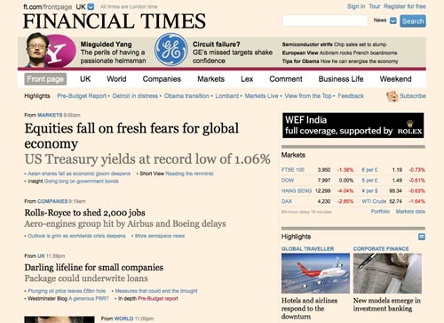
After a short while on the page, I find the pink background a little stressful. I'd rather see the pink restricted to the header area, with a more restful white background behind the text.
If you wanted to increase the amount of screen real estate that was pink, then I'm sure a better visual designer than me could come up with a balanced way to keep the right-hand elements of the page echoing the pink brand, whilst keeping the headlines and story snippets at maximum legibility.
I'd be astonished if mock-ups like these didn't crop up during the redesign project. According to this tool, the sub-headings on the new page fail the W3C accessibility test for colour contrast.
One thing I was definitely impressed with about the Financial Times redesign was the way they handled the launch. They sent registered users an email in advance of it happening:
"Here's a sneak preview of our new-look homepage, which launches this week. We're aiming for a more sophisticated look and feel that is consistent with the Financial Times brand - a clean and uncluttered executive briefing on the world of global business."
The email included a link which took the user through to a full-size mock-up of the design. Points of interest were marked on it, and hovering the mouse over them revealed a brief explanation of that change or feature.
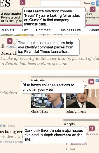
Just as with the Daily Mail's beta trial of their new design, I thought this was a really good way of introducing a loyal audience to the changes that were about to be made to the site. Ultimately, whatever I think of the new design, I got a good user and brand experience from being shown a demo first.
I've got conjunctivitis, and I assumed that was why it looked pink. You mean it's like that for everyone?!?