Telegraph redesign review - Part 2
A few weeks ago The Telegraph launched a new-look version for the majority of their website. Yesterday I looked at some of the issues I found with the new navigation system. I liked the simplicity of the top navigation, but was less-than-enthused about a big "bucket" of links at the foot of the page. Today I'll look at the visual cues the design gave to users about some of the paper's quirkier content, and the links to social media sites.
Visual cues to visual content
One thing that I particularly like about the homepage design is the prominent visual cues for their most visual trademark content - the cartoons of Matt and 'Alex'. This is very deftly done in the right-hand corner of the page, and the use of a visual cartoon icon for each instantly conveys a sense of The Telegraph newspaper's printed edition.
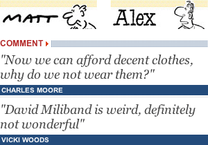
The area also serves as Matt's "Out of office" auto-reply when necessary.
Underneath the two cartoon promos is a changing teaser for two of the day's comment pieces. It is a very simple design which serves to do the promo work for the newspaper's opinion. I believe it is an effective way of presenting snippets of comment that may be off the beaten path of the user.
What about 'How about that'?
The Telegraph has made quite a stir online with content devoted to the weird and wonderful, but the new homepage design relegates this style of 'And finally...' story to a central panel low down the page. There is no primary navigational category leading directly to this style of content, nor is there an obvious direct link to this kind of content in the footer 'navigational bucket' I identified yesterday.
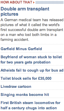
With no listing of 'most read / emailed' stories either, I wonder if this type of content will get a little lost on the site. Certainly the Daily Mail design does a better job of showcasing this with their visual 'thumbnail filmstrip' format of presenting the odder stories from the day's news agenda.

The Telegraph and Social Media
On story pages, The Telegraph is still taking a subdued approach to social media links. On the right-hand side of an article is a panel with links to enable the user to email, print, or share an article. Clicking the share link unfolds a menu with social media links to Delicious, Digg, Facebook, Fark, Google, Newsvine, NowPublic, Reddit and StumbleUpon.
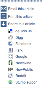
I've got mixed feelings about this.
On the one hand I think that having social media icons and placing bookmarking links on your page shows a willingness to engage with social media. On the other hand, I know full well that whenever I bookmark a page on Delicious, "thumbs up" something on StumbleUpon, or Sphinn something, I do it using the buttons I've added to my browser because I already consider that service to be worthwhile. That makes me think that The Telegraph's approach of 'showing willing' without splashing icons all over their page is a good one.
I'll be looking at this issue next month in greater depth, with a whole series on newspaper websites and social media.
Next...
Tomorrow I'll be looking at the way the new Telegraph design appears to be handling RSS, user-generated content and archive material.