Telegraph redesign review - Part 3
Over the last couple of days I've been writing about my impressions of the new Telegraph web design, looking at the way they have used social media links, global navigation, and visual cues for visual content. Today I wanted to examine how the new design deals with their archives, RSS, and user-generated content.
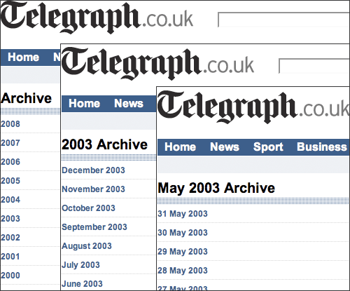
Access to the archives
Tucked in the big navigation "bucket" of links at the foot of the page is a link labeled 'Archive'. It is an unassuming link, not even in the 'bold' alphabetical section, but relegated to the same font weight as the 'legalese'.
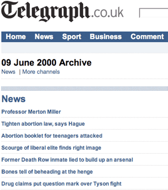
Behind this one text link is hidden a treasure trove of content. The Telegraph has organised onto a single page all of the stories published online on each individual day, going back to June 9th 2000.
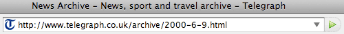
The URLs for each page are human readable and human guessable - although as a date format pedant I would have preferred to see them padded with leading zeroes where necessary to make it easier to sort a long list of them in date order (e.g. 2000-06-09.html, not 2000-6-9.html)
This is a great resource for 'on this day' junkies like me - even if at present the navigational path into the content is a little unexciting and uninviting. It might be nicer if the browse facility was presented in a calendar format, or highlighted some of the content to help the user find their way through the years.
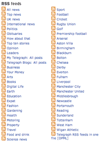
Improved RSS - better signposts and more feeds
The Telegraph has definitely made a move to improve their RSS offering with the new design, no doubt enabled by the CMS changes 'under-the-hood'. Each index page highlights two RSS links in the top right-hand corner - one being a context sensitive RSS feed, and the other being a link to all available feeds.
At least, I assume the second link will lead to an all feeds page. At the time of writing this (7th August), the RSS feeds ancillary page was still in the old format, and so only listed the 54 feeds that The Telegraph used to offer.
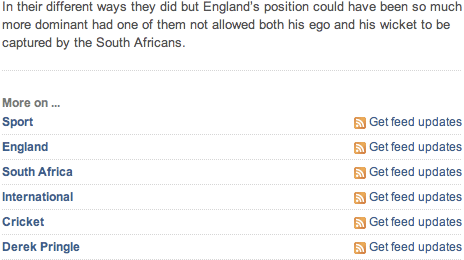
Clearly they have made great strides in making more feeds available, as at the foot of stories there is a list of multiple relevant feeds, based on the category, keywords and author of the story. A story about the recent Test Matches between England and South Africa has more feeds attached to it than you can shake a stick at, which is a very good thing in my book.
A move away from user-generated editorial
One thing that the new Telegraph design seems to do is to take any control of what is viewed on the site back from the user, and put firmly into the hands of the editor and the commercial team.
In the old design, some sections had a panel in the top-right corner which showed the 'most read' stories.
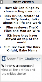
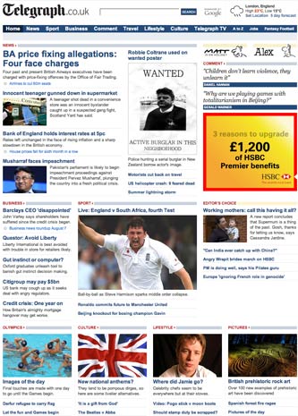
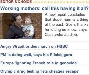
This type of feature seems to have gone, and the new homepage now has no indicators of which stories have been the most read, emailed, or commented upon. Instead, we see a very prominent 'Editors Choice' section.
New section homepages like the sport index also have no indication of what has proved to be a popular story, but have room for a raft of sponsored features about skin protection and finding a tradesman - just what the sports fan was looking for, I'm sure.

The Telegraph also used to have a blogs and comment section at the foot of the homepage, with links to 3 or 4 recent blog posts from across the site. This usually included two posts that highlighted content from the My Telegraph user blogging platform. There are now no direct links to any user-generated content on The Telegraph's homepage.
My Telegraph seems to have been a big loser in the homepage shake-up. The only link to the Telegraph's engagement in a conversation with their audience is in the 'bucket' of navigation at the bottom of the page. Stuck between 'motoring' and 'mobile', it isn't even in proper alphabetical order.

Conclusion
I found The Telegraph's redesign to be functional rather than ground-breaking. I'm greatly appreciative of an improved range of RSS feeds, and I like the archive feature. I also like the simplicity of the top navigation, but find the corresponding footer navigation to be ill-conceived.
Of course, it is the content that should do the talking for a newspaper, and I'll still be a regular visitor to the site because of enjoying a lot of The Telegraph's coverage, but in this re-design, nothing leapt out at me as being either revolutionary or truly distinctive from the other middle-market or quality newspaper websites.