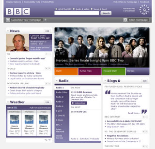
Farewell to the BBC.co.uk logo. Thankfully.
Details of the new design of the BBC homepage have gradually been 'leaking' onto the web. It was hinted at by Richard Titus a few weeks back, and then he posted about clocks on the BBC Internet Blog. Meanwhile Adactico put a sneak picture from BarCamp in London up on Flickr.
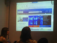
This week, upyourego published a much clearer screenshot, and Keithnet added a picture of it once he'd done a bit of customisation.
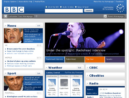
Couple all that with the fact that if you catch http://www.bbc.co.uk/home/beta at the right time of day during a full moon you can see it for yourself, it seems that there is enough stuff about it already out in the public domain for me to write about it.
I first saw an early build of this version of the page when I was last in White City in October, and my initial reaction was to rejoice that at last they had ditched the unsightly light-blue BBC.co.uk logo.
(Actually, strictly speaking, my first reaction was, "Oh, cool retro BBC clock")
I came to loathe that logo whilst I was at the BBC.
It was, to quote the in-vogue parlance of the day, "not fit for purpose". It really vexed me that it appeared to have been designed by an external agency purely to look good pulsing on television next to the standard logos for BBC channels and radio stations, rather than for the practical application of actually putting it on the website.
It was a awkward shape, using very light shades of blue that would appear with various degrees of opacity depending on what type of monitor you were using. It didn't scale down well to 16x16 or 24x24 or 36x36, or whatever standard smaller size or shape you might want to use on the web.
Nor, without a defining border, did it sit happily on any other background colour than white, as evidenced by the BBC Internet Blog banner.

I can't remember the number of times I walked into a conference, seminar or meeting, fired up my laptop, opened up my BBC.co.uk branded presentation, and realised that none of the light blues were going to appear on the screen due to a combination of the light in the room or the type of projector.
With the BBC One logo you always got a red square, even if it wasn't exactly the right shade of red. With the BBC.co.uk logo, unless you had perfect projection, you got a slight blue smudge and some tiny BBC brand blocks.
You couldn't even have much fun with subverting it. During my time on the homepage the most we managed was some cricket stumps and a semi-subliminal promo for Doctor Who.

Apparently, on the new BBC homepage you can do all sorts of whizzy customisation. As long as you can't drag that bloody logo back onto the screen, it'll be a success in my eyes.
I'm interested in the decision to drop 800x600 support (perfectly acceptable for most modern sites, but I thought the BBC had more stringent legacy browser support criteria).
Wondering also whether this is an indication that top navigation banner is going to be dropped site-wide? (Seems odd to just drop it from homepage otherwise).
And will we see any improvement on the HTML/CSS standard?
Not through want of trying Martin. I had a dozen ideas that never saw the light of day.