How many logos does one London Olympic Games need?
by Martin Belam, 4 June 2007
Do you have a logo for your business or event?
Does it neatly encapsulate the vision of what you are doing - say for example including a recognisable landmark like the Thames, in the colours of something to do with what you are promoting, I don't know, say the Olympics?
Does it carry all the vital information you need to convey, say for example the date and location of the event?
Have you sold a ton of merchandising already featuring this logo?
Repainted underground trains with it?
Has it been seen millions of times by people all over the world, and therefore has a high global recognition factor for a high profile global event?
Excellent.
Then I suggest you ditch it at once in a glitzy ceremony at the taxpayers expense.
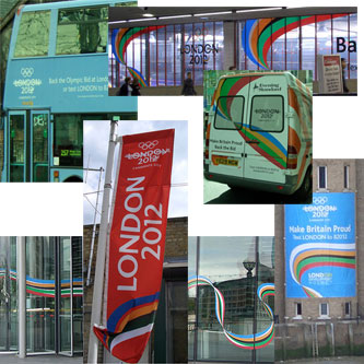
Yeah, no-one much seems to like the new logo.
I guess the original was the 'bid logo', but still, it was a better design than the new one.
I'm not really concerned about whether it was any good or not - I just don't see the point of doing anything other than dropping "Candidate City" from the bid logo