Patchy interface localisation in Salzburg Airport's touch-screen customer satisfaction survey
I had to travel briefly to London on business last week, and the first leg of my journey, from Salzburg to Frankfurt, was a bit delayed. That gave me time to explore Salzburg Airport's customer satisfaction kiosk. The departure gates have a touch-screen information point, where you can rate your airport experience. It offers a choice between German language and English language, and was one of those applications that displayed the importance of getting the little details right when localising a global product.

After choosing your language, you had to select which flight you were on. This dynamically listed the flights leaving the airport that day by destination and time. You then had to select your country of origin. This was the first place where localisation went wrong.
The list of countries is tailored to the direct flights in and out of Salzburg:
- Austria
- Germany
- Switzerland
- England
- Ireland
- Norway
- Sweden
- Denmark
- Poland
- Russia
- Other
It seemed really odd to see England listed specifically as England, rather than the UK or Great Britain.
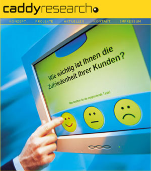
Some elements of the interface were very intuitive - for example when rating facilities in the airport you were shown a choice of five large icon faces, ranging from a very smiley one to a very cross one.
Other aspects of the interface were not so good. At the end you were offered the chance to subscribe to the airport's mailing list. The touch-screen presented a form to be filled in for email address, name and country, plus a keyboard interface to enter the data. The data entry automatically capitalised the initial letter of the email address, when it is generally accepted that email addresses should be all lower case.
Additionally, pressing the "Enter/Return" button passed you on to the next screen, rather than to the next field in the form, so I didn't get to submit all of my details. Pressing the back button from there did return me to the form, but the email address I had already entered had not been retained.
The translation was also inconsistent in the English language version. The navigational elements of the interface - forward and back buttons at the top of the screen - remained in German. Also, for yes/no questions, the choice buttons still appeared as ja/nein.
It seemed like a good attempt to gather user feedback though - I know from my wife's experience in the tourist industry that people are much more likely to give feedback if they can do it via a touch-screen interface than if they have to fill in a boring old pen'n'paper survey. Salzburg Airport just need to get the company behind the kisok - Caddy Research - to do a little more work on the localisation for them.
(Sorry - no pictures of the interface, but I was in the departure lounge of an airport, and didn't want to upset the security staff by starting to photograph their electronic furnishings. Of course, if I'd realised then that they offered a full range of webcams for the airport on the net, I might not have been so cautious!)