Coloured text in the BBC.co.uk homepage promotional space
Sometimes it is the small technical changes that can make the biggest creative difference.
The BBCi homepage redesign in 2002 featured a much commented on piece of work by Paul Hammond, the 'patina' effect. The homepage could be a variety of colours, and the exact shades of the colour on each element on the page varied over time according to how often you clicked on it. Apart from being a great way to subtly personalise the page without users having to register and select options, it gave a range of colour palettes to our picture editors, which allowed them to match the tone of the whole page to the tones of the picture they had selected to illustrate the main promotional space.
Since May of this year, when we re-branded to bbc.co.uk, the colour of the page has been fixed to shades of blue that compliment our new brand logo. This has been quite restrictive for the editorial team on the page - and the promo illustrations have had to be produced with the knowledge that they will always display set inside a blue page. The text within the promo was always black for the copy and dark blue for the links. This was even more restricting for the team, and increasingly they were producing great creative treatments of images that we simply couldn't implement because the contrast of the default text colours against the image would not meet accessibility standards. Occasionally, when a treatment was so good that we couldn't resist implementing it, we broke out of our normal content production procedures and manually uploaded a different format.
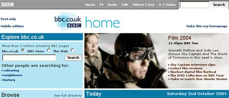
This week we rolled out a change to the content production system that schedules the promotions to give the team a variety of text colours to set against the picture. Of course we have to be careful of accessibility issues, and still make sure that people who are viewing the bbc.co.uk homepage in older browsers, those with visual impairments, or those who have images switched off, still get a decent experience. There is a limited selection to play with, but I've already been astonished by how great the new treatments can look. Even the seemingly trivial ability to match the link colour to the picture makes such a difference in providing a promotional element that can fit into the blueness of the page, yet be coherent within itself. The first of these promos made its debut yesterday, for Film 2004.
and the red variation appeared today, in a promtion aimed at improving awareness of breast cancer.

I'm really looking forward to seeing where they push that space next. Somehow I doubt this will be last time I write about altering our systems to accommodate the creative urges of the homepage team.