Putting a F__k Off Dalek on the BBC Homepage isn't big or clever - part 2
This is part 2 of a 4 part article - 1 2 3 4
![]() Download a print version of this article
Download a print version of this article
The Dalek Special Homepage - What We Did
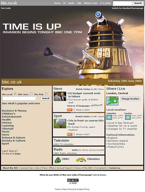
For the season finale we therefore produced a one-off Dalek version of the homepage. In order to accommodate the large Dalek image we had to make some changes to other areas of the page. We reduced the granularity of the directory section, so that it consisted of the 12 major categories titles, but lost the 3 sub-category links belonging to each section. We simplified the Television and Radio panels, removing the TV Pick of the Day, and links to the BBC's individual radio networks. We also reduced the amount of local information provided on the page, retaining only the personalised weather.
This was the first significant change to the content and layout of the BBC homepage for around two years, as our last redesign, in May 2004, consisted mostly of aesthetic changes to the branding of the page.
As we were producing the page at reasonably short notice we didn't have time to user-test any prototype designs, which is how we would normally work. Instead we decided we would try and capture feedback from the BBC's audience from the page itself when it was live. Within the team we found the change very impactful - but it was hard for us to judge whether that was because we were pleased to be working freed from the constraint of the regular layout, and whether it would have the same impact on the audience.
So to find out we did two things - starting a thread on our bbc.co.uk Points of View message board asking for feedback, and putting a link at the bottom of the revised homepage taking users through to a page asking for their views.
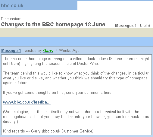
The message board approach wasn't very successful - we only got a couple of replies - the first of which was actually a complaint about the message board system itself:
"We've spent the entire week being told to hold on because we're all about to be transferred to a new (it seems inferior) message board system and it still isn't working. Indeed, bits of the old system have also stopped working."
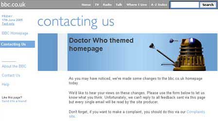
The appeal for email was very successful - perhaps too successful - with around 1,500 people mailing us in the space of 20 hours to say what they thought about the page. Still we had promised to read every one, and so whilst myself and various other members of the team dipped into the mailbox to read a sample, on diligent colleague read through and analysed all of the mail.
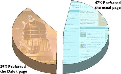
She found that just under half of the emails we received (about 650) said they disliked it, or preferred the usual page. On the other hand 39%, around 530 people, mailed to say they liked or preferred the new design. Around 9% gave mixed views or expressed no opinion, and lastly 5% of the mail was unrelated to the homepage.
Continue to find out how the audience reacted, with quotes from users who mailed the BBC.