Fine Tuning Your Enterprise Search - part 2
This is part 2 of a 5 part article - 1 2 3 4 5
![]() Download a print version of this article
Download a print version of this article
Fine Tune Your Presentation of Results
At the BBC we have carried out considerable user testing over the last few years into the interfaces that our staff use to search across our intranet, and that our audience uses to search across bbc.co.uk.
The one message that has come across to us time and time again is that users expect their results to look like results. By that they chiefly mean the visual implementation that the majority of web search engines used in the mid-nineties, which culminated in the classic clean Google search engine results page design, (before the days when they introduced AdWords, Google News links, and the other features they currently offer). Looking across the major web search interfaces these days we can see little differentiation. The essential information that the user expects to see are the three elements of a title, a description and a URL or equivalent. This last piece of information is particularly important within an enterprise, where the result set may contain HTML pages, Microsoft Office documents, PDFs and other data formats.
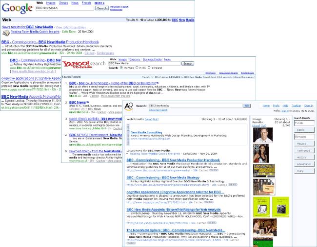
Our studies showed that users mentally judged the 'authority' of a web search result from its' associated URL, often choosing links based on how 'official' the URL looked - with a site with a URL like www.myfavouriteband.com winning out over a site ranked higher with a URL like www.mymemberpages.net/users/~someperson/myfavouritebandpage.
Within a business employees also tend to carry an equivalent mental hierarchy of the importance of documents - a PDF often represents a locked-down print ready final version of a document, whereas a Word document allows the possibility of a redraft, and a link to an internal blog or wiki implies information in its earliest stages of fermentation. A finely tuned search will present this information back to the user, and allow them to identify these different types.
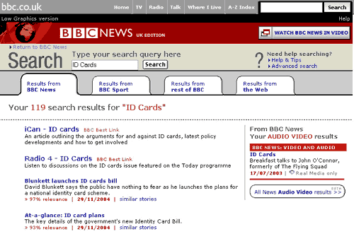
Within an enterprise it is important to consider which other pieces of information about a document may be useful. The date that a document was created or last updated may be very useful in ensuring that you have found up-to-date information. The search results page on the BBC News site displays the date that an article was published, which is an important consideration when people are searching for either the latest or archive stories from the site.
It is important to arrive at a design that conveys information in as clear a way as possible, without cluttering the real estate of the screen. Yet the design needs to give all of the useful 'information scents' to the user - so that as they examine the results they can assess the documents for relevancy to their task.
In the design of your search results page you also need to deal with the issue of what we call 'Banner Blindness'. As the internet has developed, so have the attempts of people to monetise the process of search. Today's preferred approaches, of embedding advertising within the result set and targeting adverts at the exact keywords searched for, owe their origins in part to the gradual failure of banner advertising. Decreasing click-through rates resulted from users attuning their surfing behaviour to ignore these advertising intrusions on their task.
Although the BBC site in the UK does not carry advertising, because it is funded by the Licence Fee, the effects of this 'banner blindness' have been felt. Our relaunched search service in 2001 included a boxed-out area above the result set, in which we matched the keywords searched for against the most relevant content on the BBC site, as selected by our editorial team.
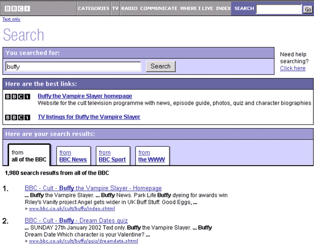
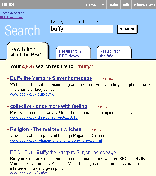
However, we soon found through user testing and observing a lower than expected clickthrough rates that our audience unwittingly ignoring them, because they mentally associated this kind of promotional space with advertising. We subsequently redesigned the service, and instead of using the 'box-out' approach, we incorporated the editorial best links within the run of results, differentiating them with a label rather than with their place on the page.
This effect has been noted amongst our staff as well. In recent work on our BBC New Media & Technology intranet site, we found that a feature we included in the right-hand navigation of every page, a link to a "Who's Who" of the department, was rarely noticed when users where asked to perform the task of finding the contact details of a colleague. We had initially used a graphical link, and found that our staff had not noticed it in another case of 'banner blindness' - they had felt it was an advert.
The lesson appears to be that once the mind and eye has been trained to ignore advertising on the web, it will continue to ignore areas of a page that look like advertising, even in a commercial free environment like an intranet.
Continue to find out how to fine tune your content to improve your search results.