News, sport, weather, TV & radio - sensible BBC global navigation at last
The BBC has been beta testing a new homepage design - and I couldn't help but notice something rather special about it. It appears that, finally, the BBC has accepted that the top-level navigation for the site should be news, sport, weather, TV and radio.
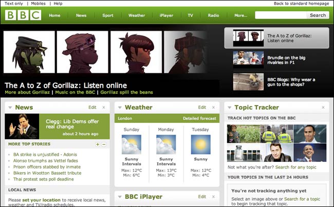
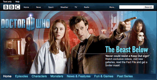
In fact, as evidenced by the new Doctor Who site, it appears that this sensible navigation is being rolled out across BBC Online.
I say finally, because during the time that I worked at the BBC in the early 2000s, the site went through a series of global navigation iterations that seemed to be in denial of the simple facts that these are the categories of content that people most associate with the BBC.
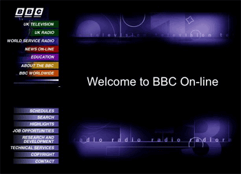
When the BBC first launched an online presence, navigation was minimal.
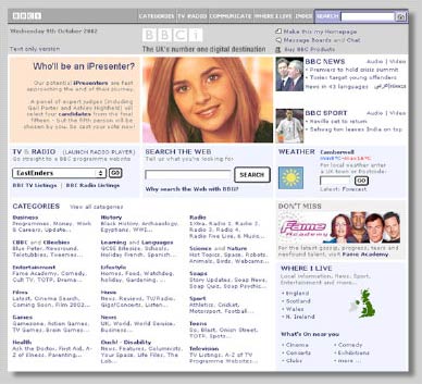
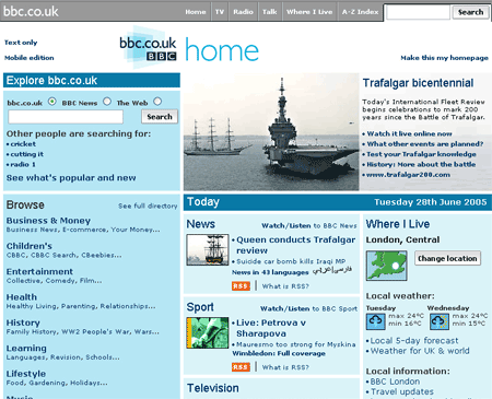
By the late 90s, the BBC had around 22 top level categories that were listed on the left-hand navigation of the BBC Online homepage. All strictly in alphabetical order...except news, sport and weather which headed the list.
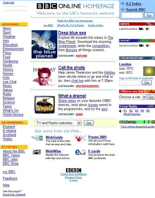
And category growth got worse after that, with a homepage containing around 80 links of text heavy navigation.
The trouble with using 'news, sport, weather, TV and radio' as five primary navigation labels had always been that they were also the names of four of the most powerful departments - or petals as the structure was at the time - within the corporation.
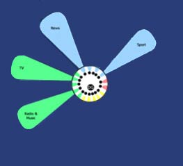
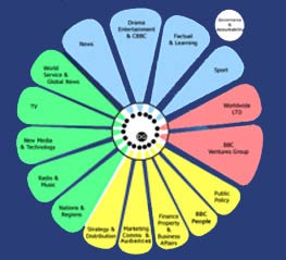
And if you were simply listing the names of departments, then at that time you needed to add Learning, Nations & Regions, Factual & Learning and Drama & Entertainment into the list amongst other things. Which clearly made it into an 'org chart', not a navigation scheme at all.
The solution, when a global toolbar was introduced with the BBCi brand in 2001, was to diplomatically avoid the names of any individual department wherever possible, omitting news and sport in particular, and instead having links things representing 'local' or 'interactivity'.
The problem with these vague compromise links like was that they had to go to a destination. The BBC website ended up with pages that were significant in the information architecture, being listed in the global navigation on nearly every page, but which were not actually significant for the organisation to maintain.
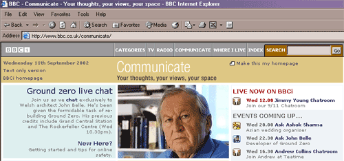
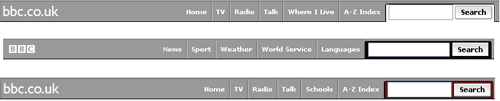
The first set of 'global' toolbar links were "Categories | TV | Radio | Communicate | Where I live | Index".
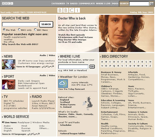
By 2005, this had changed to "Home | TV | Radio | Talk | Where I Live | A-Z Index"
During the mid-2000s, the team writing the promo slots for the bbc.co.uk homepage, seen by millions, were also having to maintain the promotional slots on a range of miscellaneous pages seen by mere hundreds. And any information architect would have been astonished to see a global navigation that included 'categories' and an 'index'.
Another problem that the BBC faced back then was that the 'global' navigational toolbar was not truly 'global'. There were variations on the toolbar if you were on international facing services, like the World Service website, or if you were in the 'Schools' section. The logic here was that schools would be happier using BBC web content in lessons providing the navigation bar was stripped of easy routes to get to non-educational content on the site. To be honest, if you were using the BBC's revision websites, and couldn't fathom out how to type 'Eastenders' into Google for your fix of soap-opera-shaped distraction, no amount of revising was likely to help you.
As an organisation it is a risky path to walk down, and this applies to any large scale internet or intranet site, not just the BBC. As soon as you allow one part of a site to 'opt out' of a sitewide standard, because there is something 'special' or 'unique' about their content, audience or purpose, it becomes increasingly harder to argue against other areas of the site also exercising an opt-out.
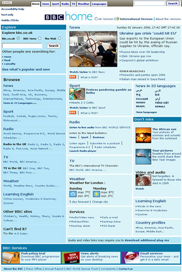
By the launch of the international facing BBC homepage in 2005, not only were the links different, but the visual appearance of the 'global' toolbar was different if you were viewing the site from outside of the UK, or were viewing a page aimed at those outside the UK.
This all added up to a big confusing navigational mess, and no amount of user testing could convince the organisation to pick the obvious links as the main navigation. In recent years the site has had an "Explore the BBC" button, which opens an overlay to reveal around 20 navigation links, which are somewhat contextual to the area of the site you are in.

All until this year, it seems.
Maybe it is the fact that the most powerful areas of the BBC are now called things like 'Vision' rather than 'TV' and 'Journalism' rather than 'News' that has freed these loaded terms up to be used as the main navigation on the site, but I welcome it.
Finally, it seems, you'll be able to navigate BBC Online by a structure that makes sense to the audience, not navigate by the internal politics of the BBC.
Thanks for the detailed, insider's view of the history around this navigation.
Apart from the fact that internal politics ruin navigation, it seems to me common sense that just because you're serving up huge amounts of content it doesn't follow that you need a huge top nav section.
I always thought The Guardian could follow a simpler route on its website and mimic the print structure in its top nav, something like: News, Sport, Business, Comment, Listings, G2.
Hi Martin,
Thanks for a very entertaining post.
For my sins I was in charge of the launch of the 2001 toolbar.
While there was certainly an amount of inter-divisional discussion, it is too much of a conspiracy theory to suggest that News and Sport were left off so as not to upset other divisions (the inclusion of Radio disproved your theory).
In fact, the strategy for the BBC toolbar was to enable users to explore new/emerging content areas (e.g. The Radio Player or message boards). Our users told us in testing that finding News, Sport and Weather was very easy (from the major homepage coverage). Also before 2001, we should remember that a user in the News, Sport and Weather pages often found no other internal links.
I often think the terms we used were not right, but we did set up and take people to new TV And Radio homepages where before user confusion reigned.
Your article raises an interesting debate - to what extent should a toolbar on a big content site (in combination with the rest of the site) meet users expectations or show them something new.
If there were politics, it was in the inconsistent roll-out of the toolbar across different divisions by technologists who were line managed by local editors.
After all that, IMHO the new toolbar is lovely.
I hated that 2001 toolbar. But mainly because I was one of the poor sods who spent something like four months manually re-coding pages that Dreamweaver had mangled so that we could actually launch the confounded thing!
Still I did build up a sizeable collection of live passwords. There was a risk log for launch that contained things like "Anthrax Attack". What it didn't include was "developers go nuts and wipe the website" :)
Thanks for that post - it's interesting how an organisation's internal politics and culture can influence something like navigation.
At the BBC, it's also evident in many of the "Where I Live", or regional, subdivisions in news. These often reflect how the BBC is divided up for its own administrative purposes, rather than in a way that makes sense to the audience.
Bundling Orkney in with NE Scotland makes sense to the BBC person who sees them as an outpost of the Aberdeen newsroom, but it just baffles the audience who can't see why they have to share a news index with Abderdeenshire.
This is a fascinating post Martin, although I can honestly say as a user I hadn't given it a second thought.
I just tended to look at the page itself, especially since the advent of movable content boxes on it.
Simpler is better though, although I hope trimming down is not an early taste of what the rest of the BBC has in store after the election.
I love the fact that the new global nav has a 'more' button, which, upon clicking, brings up a dialog with even more links.
On the one hand, you could see this as a crude way of cramming in a load of extra links and placating those departments.
On the other hand, you could see it as a useful 'discover' feature for content people might otherwise miss, in a format which allows the links to be changed regularly in a way that'd be confusing if you did it to the global nav itself.
Thanks for bringing back the memories, Martin. What a journey!
Being one of the people who designed the grey toolbar, I have to agree with Jon K... What we were trying to do was expose people to a lot more content than they would find otherwise.
As you may remember, the strategy at the time was about getting more eyeballs across all that rich content that nobody could find. It was also conceived pre-Google, when search engine results were absolute rubbish and none of the BBCs content was properly set up for indexing anyway. You couldn't rely on search. So, the nav was trying to get people to discover new stuff (as was all them links on the homepage) and understand the breadth and depth of the site.
We usability tested the heck out of the toolbar and homepage and the fundamental structure did reasonably well. It served it's purpose of making people say "aah, I never knew they had that before!"
I totally agree that the variant toolbars on different areas of the site was a terrible decision and started with trying to create a 'walled garden' for the kids area. But then the slippery slope did its thing and everybody was hacking away at the toolbar to make it suit their "special case" - much to the central NM&T divisions' chagrin. This was most certainly politics driving this nonsense.
But how much of the new toolbar is politics, I wonder? And I don't mean internal politics, either... Now that the Beeb has been utterly neutered because of it's stance in protecting David Kelly against Alistair Campbell in the case of the leaked dossier to go to war in Iraq; the anti-competition lobby; and resulting budget cuts... the service has been decimated. To look at the homepage now, you would think it is nothing more than a news outfit with various channels. And perhaps it is.
It's no wonder they've reverted to a "News, Sport, Weather, TV, Radio" nav model. There's hardly any content left to navigate to these days!
I really like the new redesign and am pleased they've updated it since our redesign two years ago. The Homepage and global nav, at their time two years ago were really about bringing consistency and commonality to what had become, quite frankly a mess (and it wasn't just the homepage of links that was a problem the entire site looked like a garden after two years abandonment). All great design involves iteration and evolution and as the BBC consolidates its online offerings and culls its services - the navigation should be refined. I will miss the sometimes "contextual" links which were concept-ed to bring value to you wherever you were on the site changing the navigation to be more relevant to where you might want to go) but they never really caught on with users.
I'm sad to see that there are still no preview overlays of the 1st two sentences of an article, something users asked for over two years ago and was ready for launch - but some of our colleagues thought would stop readers from "clicking through" and reduce their traffic, and therefore budgets. Frankly it would be nice to have more and larger images... and why limit the "feature box" to only three stories, feels like it should have more life in it.
Lastly, I do share the worries of Anthony and Jon K. that users will simply fail to visit bigger and bigger parts of the rich, diverse offering of the BBC, sad really - but balancing the tyranny of shared user requirements/wants with the BBC's Reithian goals of educating, informing and entertaining is always a challenge. I for one am pleased to see some change and hope this will signify a new period of innovation and experimentation.
Well done.