A (re)design for life - the new environmentguardian.co.uk front page
"The redesigned front page reflects our ongoing commitment to news coverage but gives greater prominence to green living, data and multimedia" - James Randerson, environmentguardian.co.uk website editor
The Guardian recently relaunched the front page of our Environment section online, and I wanted to take a look today at some of the changes and design decisions that were made as part of that process. You can roll-over the numbers on this screenshot to see a summary of the main IA changes.
(For those of you reading via RSS, email, or a syndicated copy of the article, I suspect this will only work if you actually visit the original blog post itself)
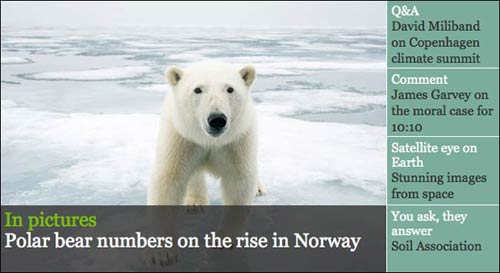
Large graphic trail
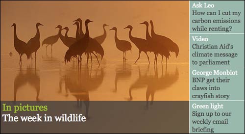
The main graphical trail area provides both a visual design and an information design function. From a visual point of view it sets the tone of the page, and the production team have used some stunning imagery to draw the audience in.
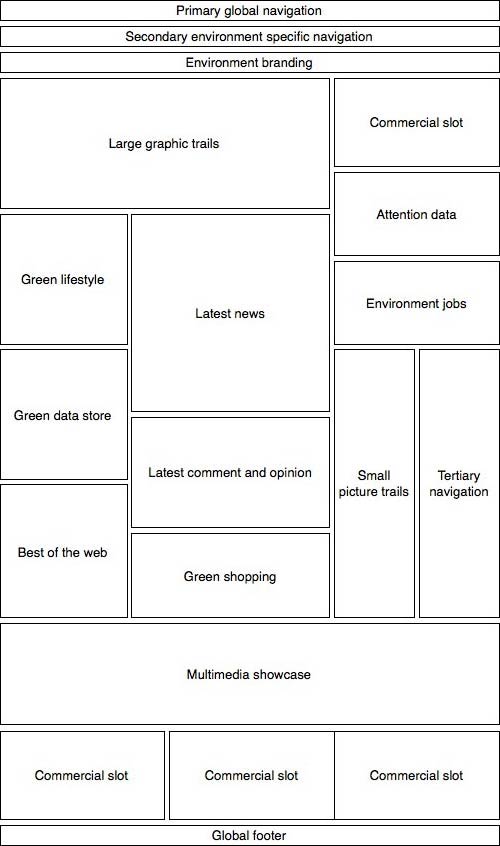
From an informational point of view it provides a very important role. If you examine any homepage, you'll usually find that content is arranged in zones or areas. On the new Environment front the main zones are, from left to right, heading down the page: 'Green Living', latest news, Environment Data store, latest comment, best of the web, green shopping and multimedia.
During the design process one of the most contentious areas is always the relative size and order of those zones. At stake are both editorial and commercial priorities, and the ordering of the content says something about the intentions of the site. You inevitably end up with a situation where there are compelling reasons for all of the sections to be near the top of the page.
The top space, however, is effectively free from mandatory content. The only criteria for a story being the dominant piece of content on the page is that there is a striking image to go with it. If the production team decide that they always want hard news to be in that slot at 9am, a comment piece to appear at lunchtime, and a Green Living piece to be highlighted in the evening, then they can do so without having to rearrange the order of the fixed zones.
'Tertiary navigation' aka 'long list of links down the right-hand side'
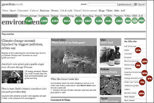
The bunch of links down the right-hand side might be considered the tertiary navigation on the page, although, to be honest, it basically looks like a list of links. The list has been refined for the redesign though. In order to help determine what stayed and what went I did some clickthrough analysis of the previous design, to determine what was proving popular and useful. I stress and useful, as popularity alone is not a good enough criteria for link selection in my view.
Part of the clickthrough analysis exercise was obviously to see which links got the most clicks. The second part is what I like to call 'looking through the wrong end of the telescope'. Although a link on a section front may only be attracting relatively low clickthroughs in the context of the page itself, it may be providing a significant chunk of the traffic to the destination. Removing a link in those circumstances can be tantamount to condemning an area of the site to obscurity.
To visualise this sort of analysis I usually overlay the numbers on top of the design, illustrating both those that command a lot of clicks, and those that are a significant source of traffic to the destination area of the site.
Hot topics
As part of the list of links, there is a new 'hot topics' section. One thing that I was acutely aware of was that the Environment is an area of the site where a large proportion of the audience don't necessarily feel like they are experts on the science of the environment. Therefore providing definitive overviews and background information to issues is important. The 'hot topics' list provides a place to rotate through a series of 'backgrounders' on the major issues behind the stories being reported elsewhere on the page.
Multimedia section
One of the new visual elements of the page is a multimedia showcase at the foot of the design. Placing this content on the page was tricky, as it occupies significant space, and any higher up on the page risked pushing a lot of the content down below multiple folds.
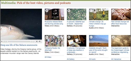
In this position I like to think that it 'anchors' the visual design, and also provides a reward to the user for scrolling down. This type of content being low down on the page is mitigated by the fact that the videos and picture galleries are often very visually appealing, and so make for the ideal kind of content to showcase in the large picture trail that is the main focus when the page first loads.
The bits behind the curtain
As ever with a redesign like this, there are plenty of changes under the hood that don't make a difference to the end user, but which are very important to the business. The way that the page template is built is part of an ongoing process to make our templates more intelligent and flexible, and the production overhead of 'curating' the Environment front has been significantly reduced, saving time, money, and stress at the weekend when the Environment team is more lightly staffed.
Engaging directly with the users
At the launch James Randerson, the Environment team's website editor, wrote a piece explaining the changes to the audience. That is pretty standard with a relaunch, but I think what was important was that both the editorial and technology teams also got engaged with the users in the comments.
There was a healthy debate, for example, about what was featured in the new navigation:
"I do not think that you should have de-emphasised Transport and Travel which is now relegated from the top menu selection to the A-Z section. From both a peak-oil and AGW perspective, transport is up their as a core issue along with sustainable food and energy."
James replied:
"This is tough. I wish I could flag up so many more sections at the top - for example carbon emissions, fishing and nuclear power. You are right to cite transport as important but we're trying to show some of the breadth of coverage, from climate change issues to green living. There's no right answer though so I'd be interested to hear the thoughts of others. Should transport be up there and if so what do we lose?"
Other issues discussed in the thread included some browser display quirks, where the links to blogs had gone, and whether the page gave the right balance between 'soft' green features and the science of the environment story.
Measuring success
The bottom line figure that our industry worries over, because of the importance of the ABCe numbers, is unique users. As well as seeing a rise in those, I've also been looking to measure whether the page has increased the somewhat mythical quality of 'engagement'. There are a couple of things in the metrics which I find very pleasing.
Firstly, we've increased the number of people who start their web journey on the site at guardian.co.uk/environment. Part of the remit of the project was to make the page feel more like a destination in its own right, and I think that measure signifies success with that aim.
The average length of time spent on the Environment front has also increased, which I think indicates that we are showcasing a range of content that is keeping people interested for longer - exactly the point of doing the redesign.
Nice site, the main navigation stands out and the content flows. I'm not a huge fan of information based sites personally but for news it's practically a standard and the main nav compliments all the information.
Great article Martin. Although the website design seems a little busy to me, it meets the need of the searcher (similar to yahoo's search approach). I also like the large graphic trail, reminded me of Bing's homepage...draws you in with a spectacular image.