"Beautiful Basics" - Ashley Friedlein at the Endeca e-Business Forum
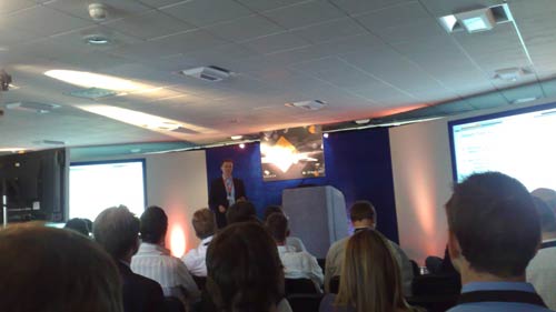
Last week I was at Endeca's offices in Richmond for their "Endeca e-Business Forum".
The keynote was being given by Ashley Friedlein of econsultancy.com, and was about "Beautiful Basics - The things you need to be doing really well online to succeed". What I liked about it was that Ashley used lots and lots of real world examples and live demos. Instead of just presenting bullet point lists of 'must do' website features, he showed excellent user experiences in action. I've listed some of the highlights for me below.
Endless shoe search
Ashley used Endless Shoes as an example of a great consumer search experience. One thing that thye do is to show the user their search results as a thumbnail strip running across the top of the product page. This means the user doesn't have to flick back and forth between products and results, but can visibly compare look and price at a glance.
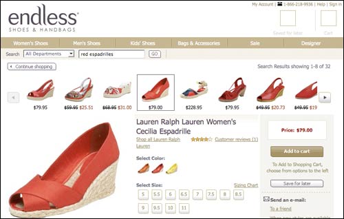
On the product page itself, users had the opportunity to look at different images and colours of the product, and the sizing chart altered to reflect what was available and in stock, preventing users getting into a checkout process which would turn into a dead end.
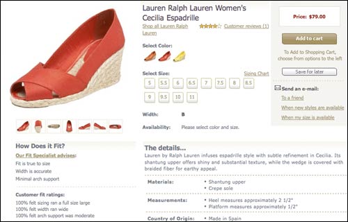
It reminded me very much of a presentation I saw last year at Online Information, about presenting e-commerce for clothes very differently for male and female audiences. The 'Endless' interface very much ticked all the boxes for female shoppers - the ability to zoom in to a highly detailed image of the item, and to do comparisons between items. Apparently for most men, showing a crumpled picture of an item lying on the floor in the bedroom and telling them it comes in 'Beer Belly Large' is a good enough e-commerce experience ;-)
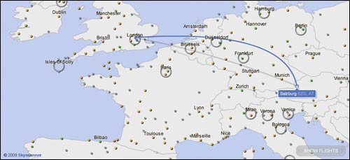
Skyscanner flight search
Skyscanner was introduced as an effective way of visually searching for flights. It catered for those times when you knew you needed to fly from A to Z, but had no idea which airlines had routes that covered those destinations. The solution is to simply draw the arc of your flight on the interface, and then the back-end lists possible options.
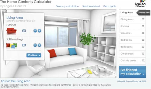
Legal & General home insurance calculator
Ashley Friedlein was full of praise for Legal & General's house insurance calculator. Instead of the standard boring forms to fill in, an interactive fly-through of a typical home splits your possessions up into easily understood categories in different rooms. This enables the user to get a more accurate quote than the usual tick-boxes that allow you to value all your possessions together in large price bands.
Wonga loans
Another very simplified financial transaction he showed was Wonga, a UK short-term loans 'specialist'. Their interface simply consists of sliders. You inform them how much you want to borrow, and when you want to repay, and the rest of the page illustrates the total repayment cost including interest, and how quickly they can get the money into your bank.
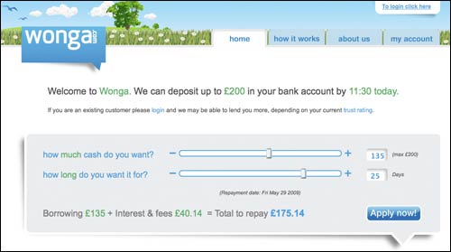
I suspect that once you get a bit further into the process, of course, the standard bewildering legal jargon kicks in for the actual contract...
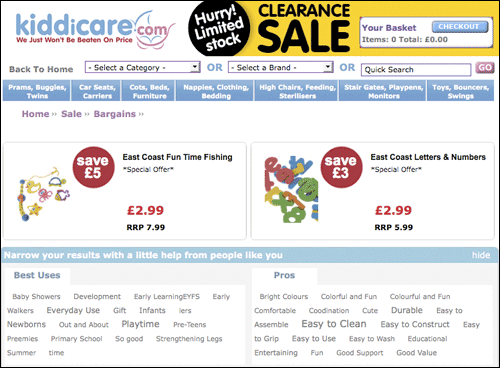
Folksonomy at Kiddicare
From an IA point of view, one that intrigued me was Kiddicare. They have started extracting terms from their customer reviews, and using those as an additional navigational element. It means that users can narrow down product ranges to things that other parents have said about them - "easy to clean", "durable" and "impossible for a 3 year old to get stuck up their nose". These are all things that are important for parents to know, but which don't form part of the standard product taxonomy.
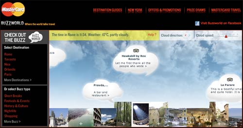
Social media is now a 'basic'
Ashley Friedlein also now suggested that 'social media' was a basic for doing things well on the web. He cited some examples of big brands doing it in a strangely disengaged way, like MasterCard's Buzzworld or Norwich Union's Aviva's re-brand promising to listen to customers whilst failing to repel criticism of them on Twitter.
He was very impressed though with The Children's Mutual. Their Twitter presence is human and personable, and really conveys a sense of personal engagement whilst, obviously, hoping it will help people to favour their brand in the long-term when planning the finances of having children.

UPDATED 7/5/2009: Econsultancy have made available a full report based on Ashley's presentation.
Next...
I was at the "e-Business Forum" because Endeca were one of the launch partners of The Guardian's Open Platform API, and their software powers our internal site search. Later this week I'll have some more of the notes I took away from the event, looking at case studies by Carzone.ie and Euroffice.
Thanks for the mention of Wonga in the examples of beautiful basics. We're so glad the speaker "got it".
Great posts. I love the home insurance calculator. You always seem to find the best stuff on the net.
You have another fan.
Thank you