Taking the 'Ooh' out of Google: Getting site search right - Part 8
A couple of weeks back I began a series of articles on currybetdotnet based upon my recent talk at the Euro IA Summit.
As well as looking at ways that site search can be made distinctive from Google by including thumbnails and information Google can't obtain, 'advanced' search, and following some positive European examples, I've been looking at areas of the user experience where designers need to show caution. Today I want to start looking at some examples of poor search user experience design that currently exist on European newspaper websites.
Multiple Search Boxes
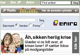
Having multiple search boxes is a sure way to confuse the user, and drive them straight back to using Google from their browser, rather than using your site search. In Denmark, the Jyllands-Posten paper is guilty of this, with one search box placed just above another multi-function web search box provided by Eniro.
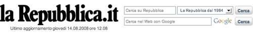
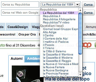
Italy's La Repubblica does much the same. In their banner area there are two search boxes. One is a Google powered web search. The other is a site search box, with an additional drop-down menu to provide the user with further options. These are clearly labelled, which is a good thing, but the 20+ options are quite a lot of information for the user to take in at a glance.
The drop-down options include the ability to search over a bewildering array of local and regional newspaper content. Whilst it is great that the newspaper has made available all this archived content via the front page, it is an interaction that I would want to study closely. Unless a significant number of searchers were utilising the drop-down menu, I'd be inclined to produce a bespoke interface to address regional news search as a separate entity, rather than incorporating it into La Repubblica's homepage.
Handling commercialisation
Commercial content on search results pages needs to be handled carefully. If advertising is to generate money without alienating users, it has to be on target and unobtrusive - just like Google's own paid search adverts. [1]
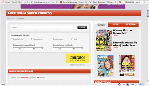
When newspapers get it wrong, they can do so spectacularly. The Super Express in Poland had a very less-than-super user experience on their search results pages when I was doing the research for this article.
First of all, on loading the page, the banner and advanced form were so large that they pushed all the actual results below the fold of the browser. Ironically, in part this was caused by a large ad spot for the search sponsor.
Then, before I could scroll down much further, a flash overlay advert arrived on the scene, obscuring the search controls.
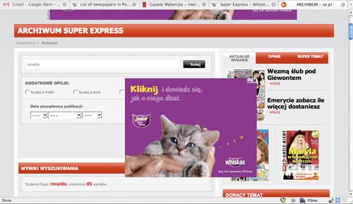
As I scrolled further down the page, the advert helpfully scrolled down the screen with me, so that I was forced to interact with it and shut it before I was able to see my search results.
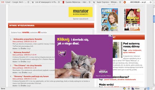
Now, cute kitten or no cute kitten, that kind of commercial interference with the user whilst they are trying to accomplish an information retrieval task is almost beyond intrusive.
Provide a consistent search experience
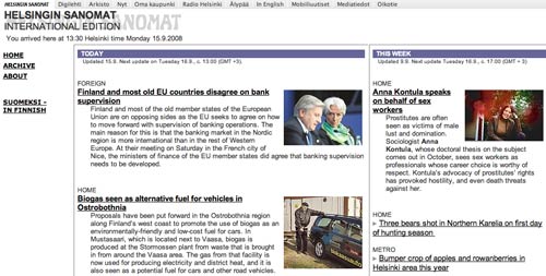
Providing search everywhere and being consistent is important - otherwise a jarring user experience can result. The Helsingin Sanomat in Finland has an excellent search interface for the Finnish edition, but no search facility at all on the English language version.
Leave the user in control
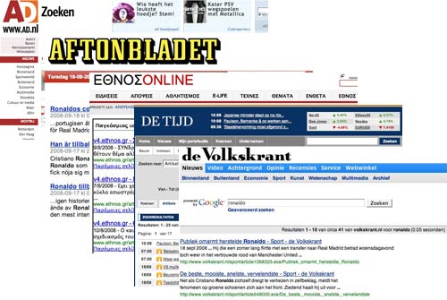
I noticed that two of the newspapers I studied from Sweden were doing something which I think is very poor practice. Both the Swedish Metro and Aftonbladet opened their search results page up in a new window. Not only is this rude and just plain annoying for all users, who ought to be able to control themselves whether new windows or tabs are spawned in their browser, it can be disorientating for users with accessibility issues.
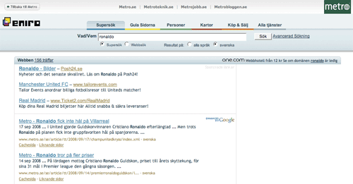
The Metro results are delivered on a very lightly branded page from Eniro, hosted on the eniro.se domain. The interface has another element about it that I don't like - just as with Poland's Super Express, there are so many sponsored links and adverts that the first results from the actual newspaper are pushed below the fold. This kind of user experience seems almost purposefully designed to make the user yearn for Google.
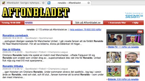
Aftonbladet has a more satisfactory interface, which at least showcases one element where it is possible for site search to be smarter than Google. Underneath the title of each search result is a 'crumbtrail' explaining which section of the site the story was originally published under. These act as links through to the relevant section of the site. With structured information like this, a site search can provide a vital information 'scent' that the user is getting relevant results, and provide a lateral navigation path at the same time.
Next...
Tomorrow, in the next part of this series, I'll be continuing to look at some examples of interface design that may deter users from site search and make them turn back to Google. In particular, I'll be looking at how straying from established search design convention can be a very disconcerting experience.
[1] Wasn't one of the strangest things about Google re-releasing their c.2001 search index that it had no adverts, no YouTube and no Wikipedia in the SERPS? [Return to article]